3

3Grids, fonts, columns and responsive design

Placeholder

This is the first part of the website design section, and in it I address the problem of laying out the webpage — I do this in some detail and this is largely because I found the whole process quite interesting and enjoyable; in fact the more I looked into it the more interested I became — there is lot to it, a lot of history too.

Now, I recognise that not everybody shares this interest, the finer details of point construction, line spacing, grid layouts and economics magazines from the 1960s are not for everyone, and some of you just want to get on with using the website (I know, let’s just call you “Barbarians”).

Well for the Barbarians amongst you, just skip to section 3.4 where I summarise what I did and how it works — it’s ok, I use short words that are easy to understand.

For the rest of you I spend a good deal of time explaining about grid arrangements, fonts, point size and line spacing — and particularly, how these thing apply to websites (and Microsoft Word).

Broadly, this section sets out the following:.

  1. How to layout the website in columns

  2. The size (width) of the website

  3. The best fonts to use on the website

  4. The size of the website body text

  5. What line spacing to use

3.1

The Gerstner grid

The appearance of a website, its layout and the guidelines for creating it are many and varied. There is no end to the theories and opinions: golden ratio, Fibonacci series, his spiral, two columns, three columns, flat design, parallax, material design, single page scrolling — all sorts of things.

This is the field of graphic design and it’s a bit complicated (apparently some people even make a living out of it). I looked at many different styles and did some research — I started with the Gutenberg Bible (1455) and learnt all about the Van De Graaf canon†1 (no relation to the Van De Graaff of generator fame); and this was good, but only really for printed documents. I wanted something that works on the web.

I finally settled on the Gerstner grid. This was developed by Karl Gerstner†2 in the 1960s for laying out magazines. And it’s clever, really clever — those of you (and me) of a certain inclination are going to love this — let’s call ourselves pedants (or engineers).

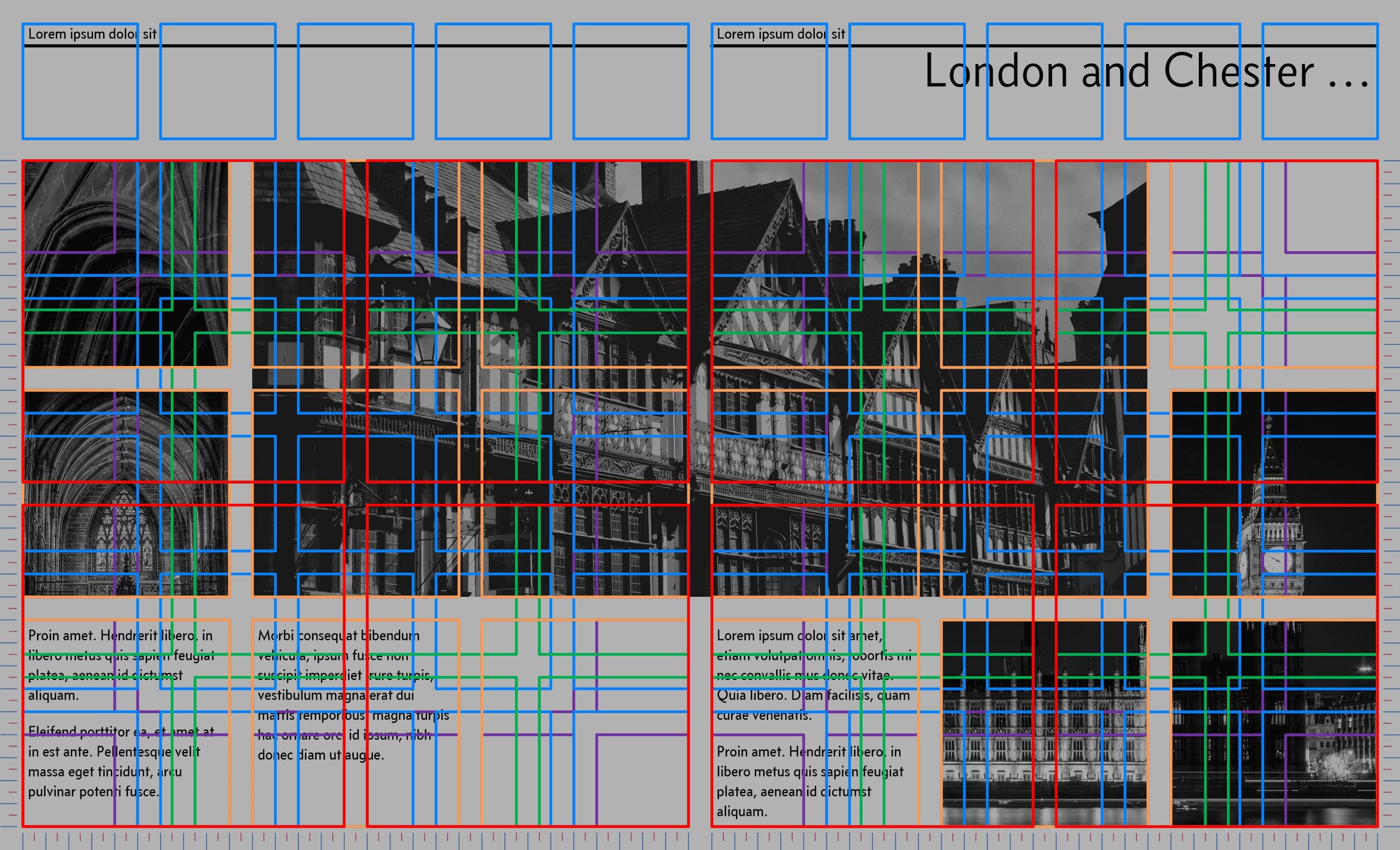
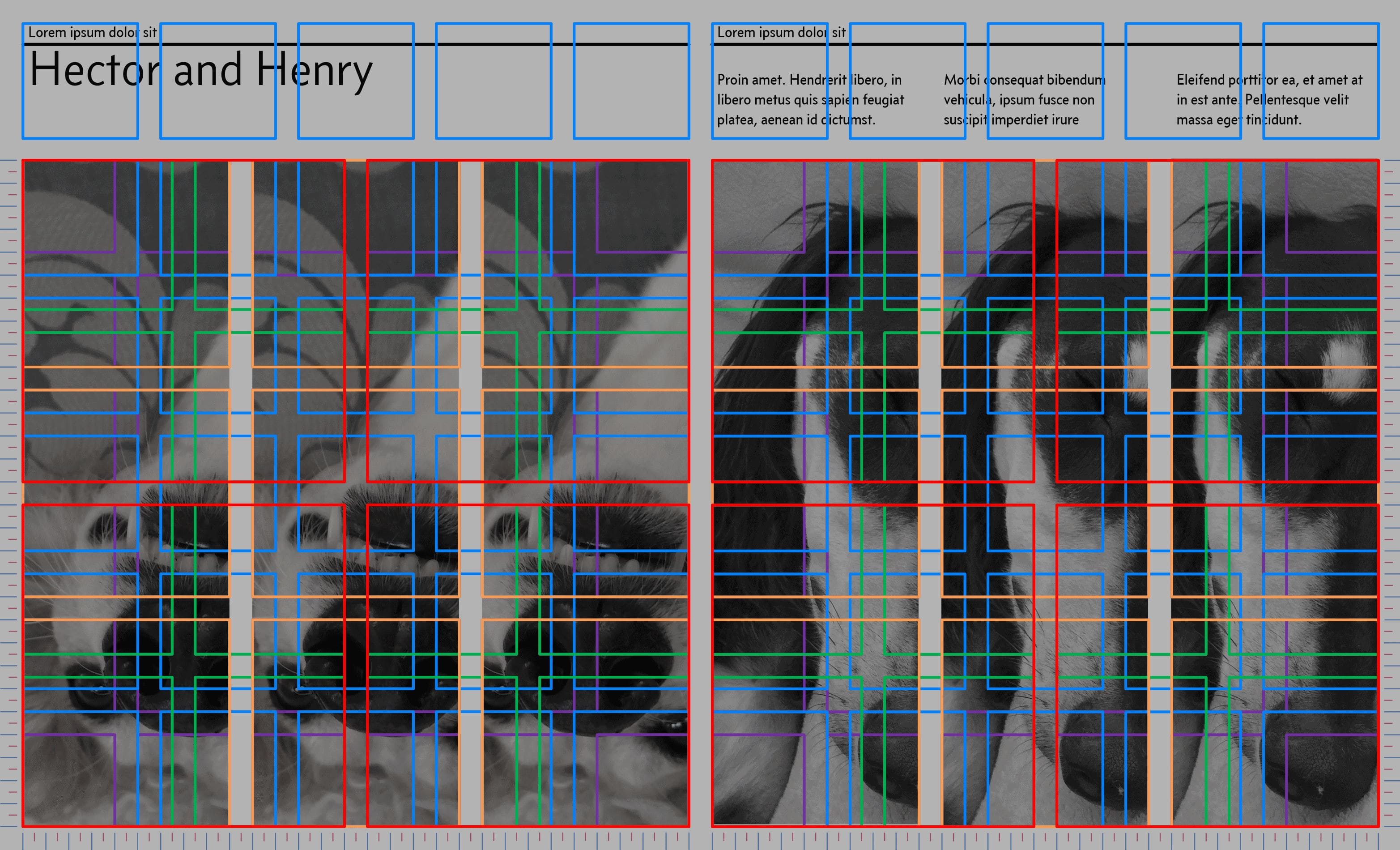
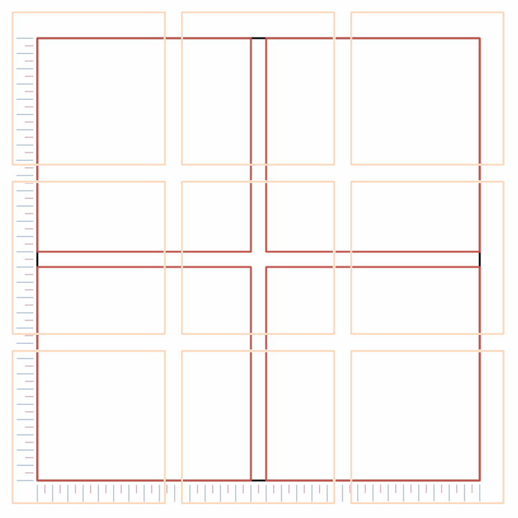
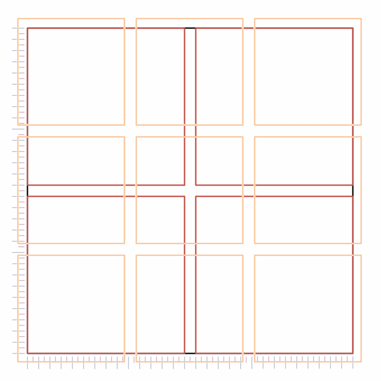
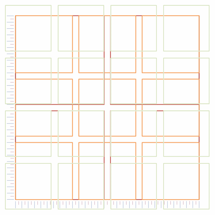
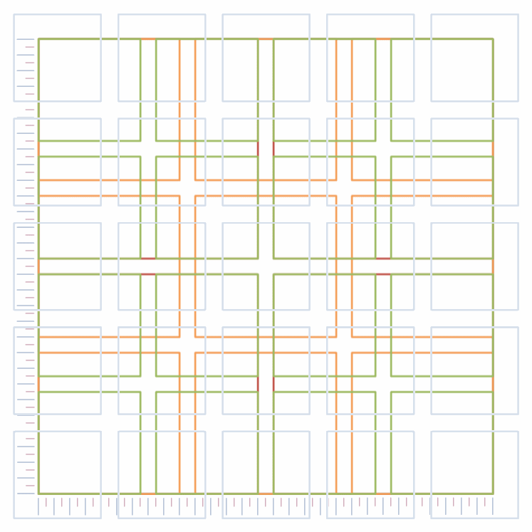
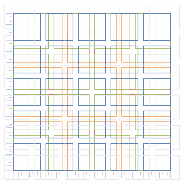
The Gerstner grid arrangement was developed for the publication of a business and economics magazine (Capital) in 1962 (Figure 3.1):

†1 For those of you that still have a will to live, the pdf version of this document is constructed using the Van De Graff cannon, it gives margins that are pleasing to the eye when viewed in a double page layout, the margins are in the ratio 2:3:4:6 (inner, top, outer, bottom).
†2 Karl Gerstner (b.1930) is a Swiss graphic designer who worked in advertising from the 1950s onwards. In 1962 he worked on the design of a business magazine called Capital. It was while working on Capital that he developed the grid arrangement that determined the layout and appearance of the magazine. The same grid I’m using here.
Figure 3.1a - Capital magazine Figure 3.1b - Capital magazine
Figure 3.1   Capital magazine

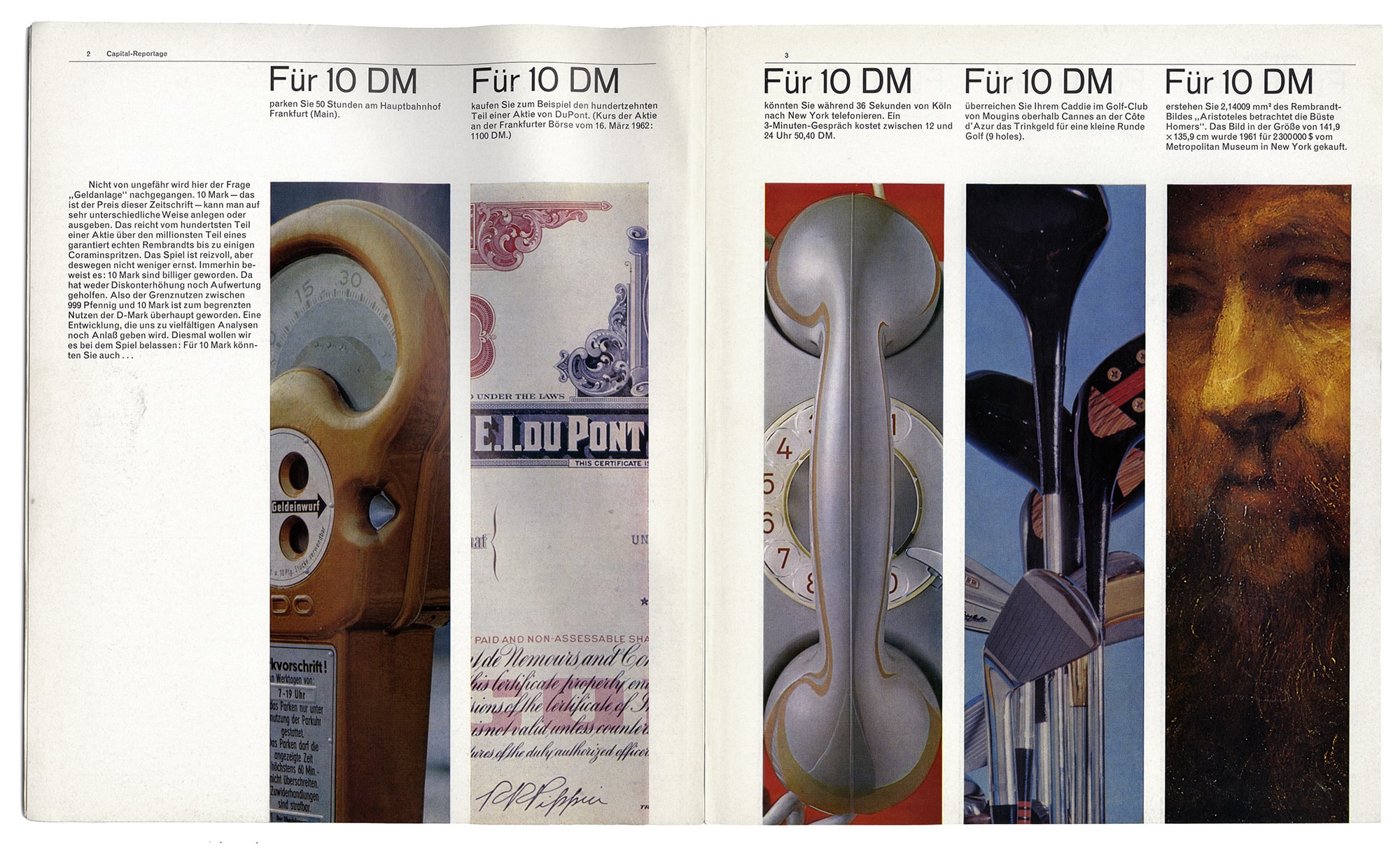
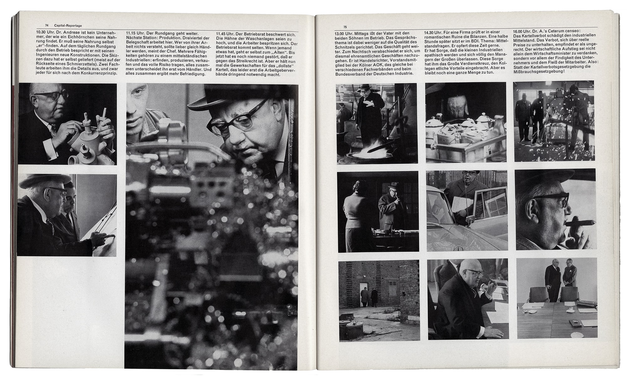
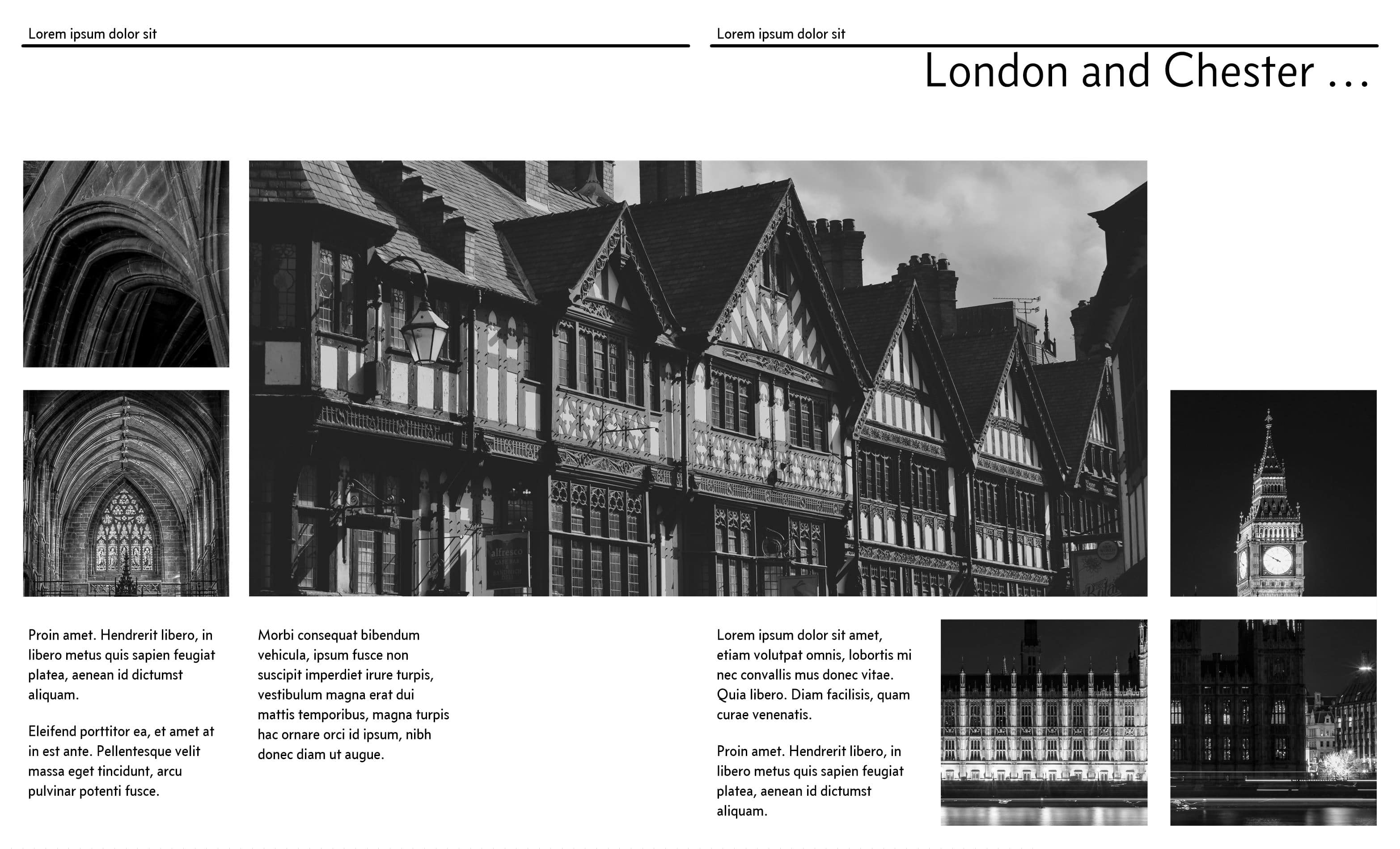
These images are reproduced courtesy of the Herb Lubalin Study Center at The Cooper Union, New York.
Their website is: lubalincenter.cooper.edu

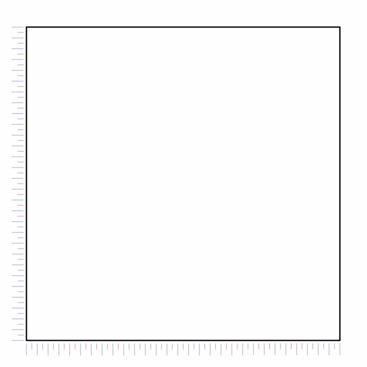
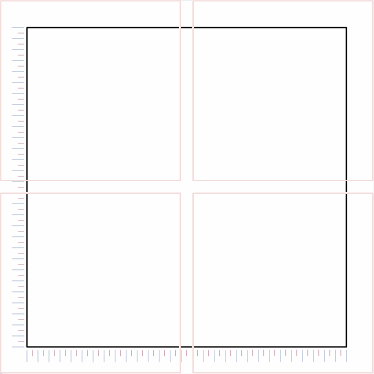
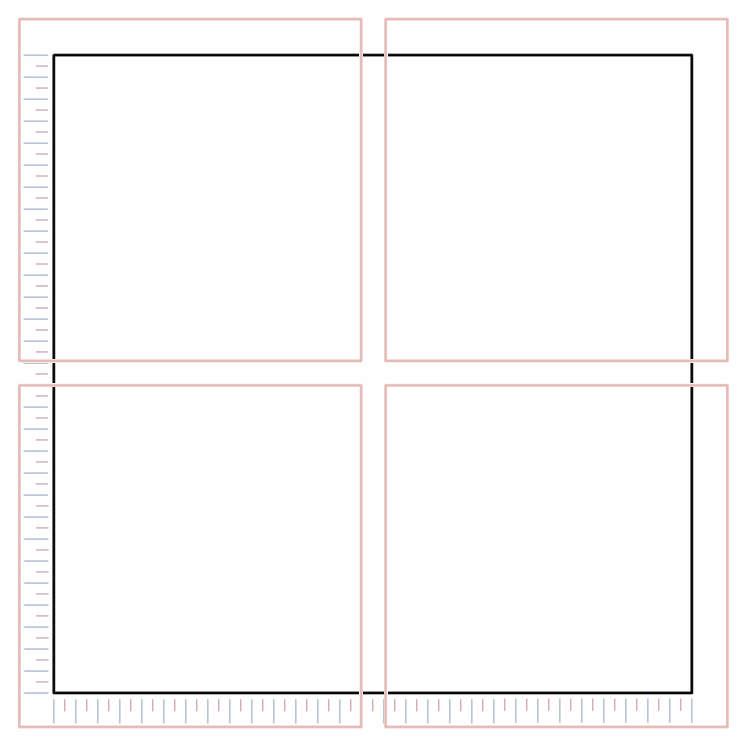
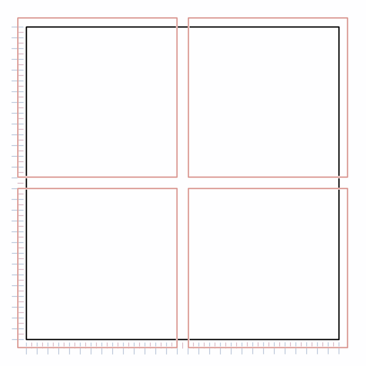
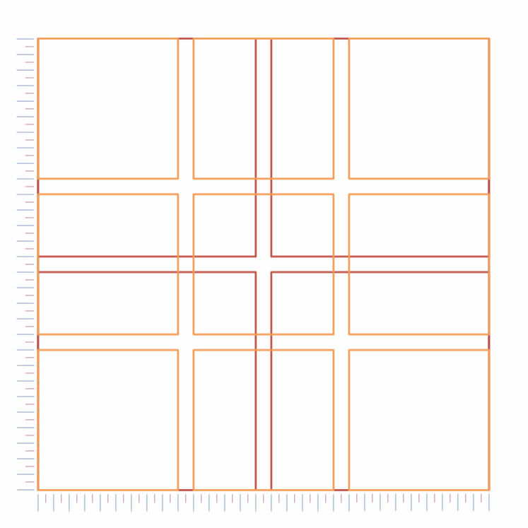
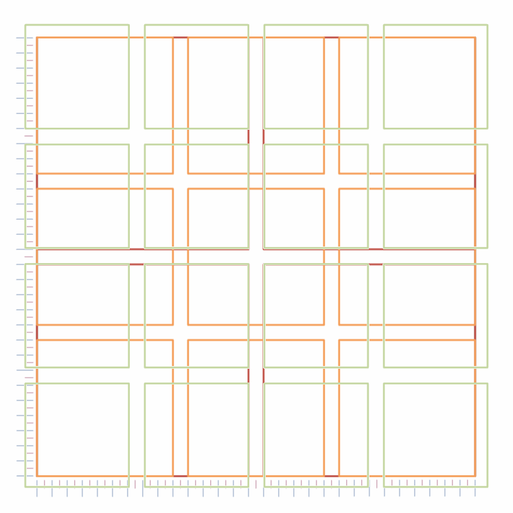
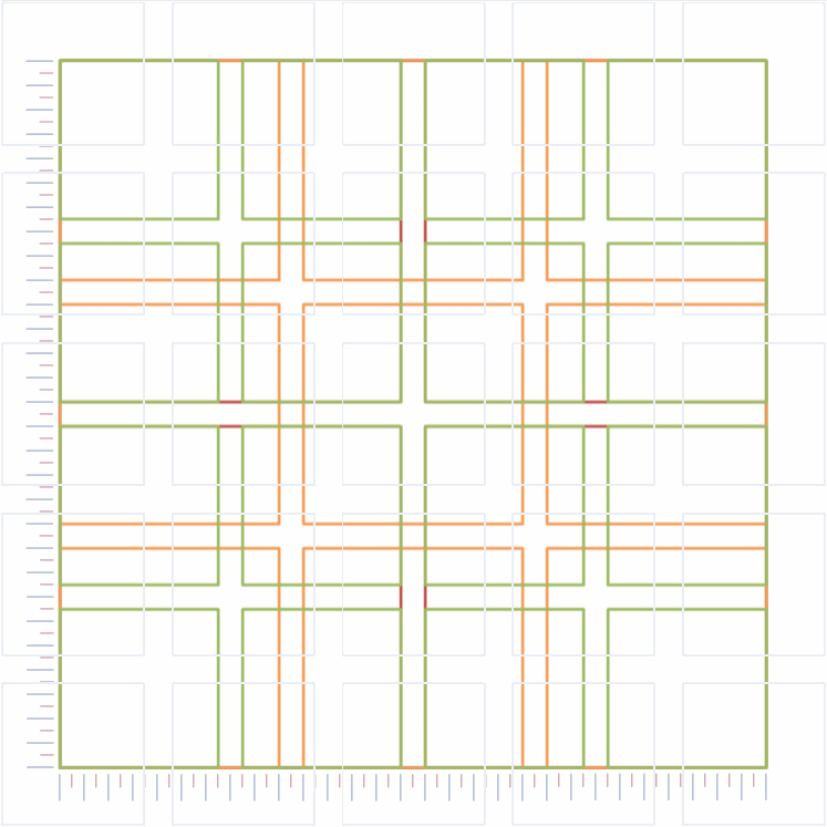
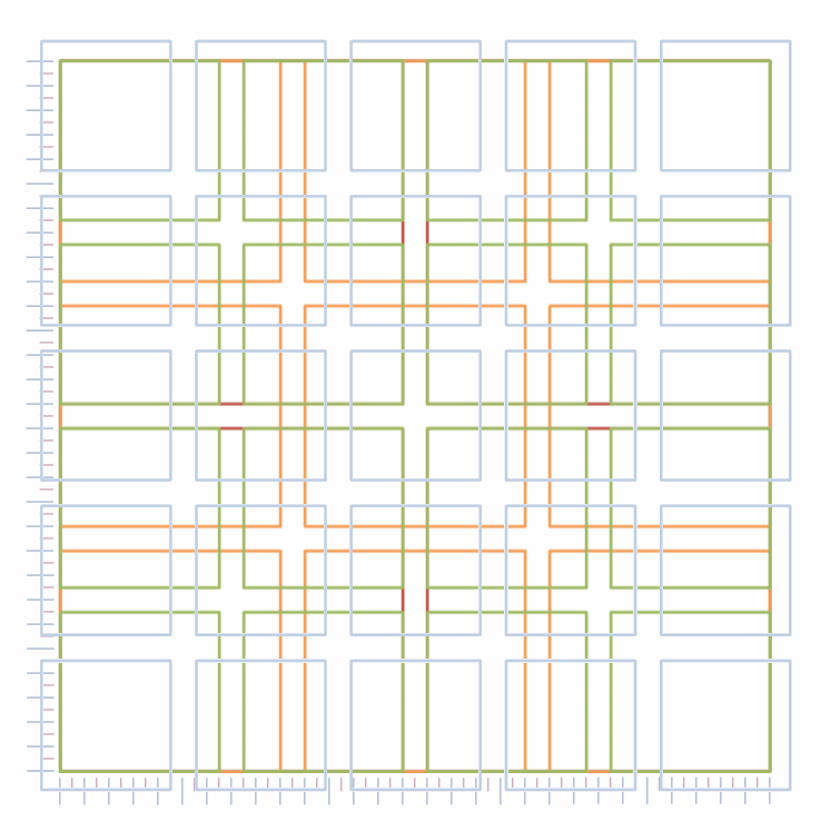
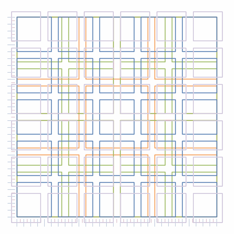
The Gerstner grid is a modular grid arrangement in a square of 58 units by 58 units. It looks like this:

Figure 3.2 - The Gerstner grid
Figure 3.2   The Gerstner grid

This I agree is a bit confusing; but really it’s just squares laid on top of each other — you can see an animated version of this below; just scroll down, you’ll get the idea of how it works:

slideshow image 01 slideshow image 02 slideshow image 03 slideshow image 04 slideshow image 05 slideshow image 06 slideshow image 07 slideshow image 08 slideshow image 09 slideshow image 10 slideshow image 11 slideshow image 12 slideshow image 13 slideshow image 14 slideshow image 15 slideshow image 16 slideshow image 17 slideshow image 18 slideshow image 19 slideshow image 20 slideshow image 21

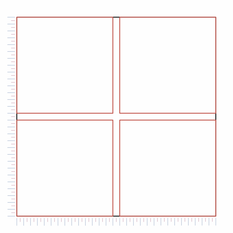
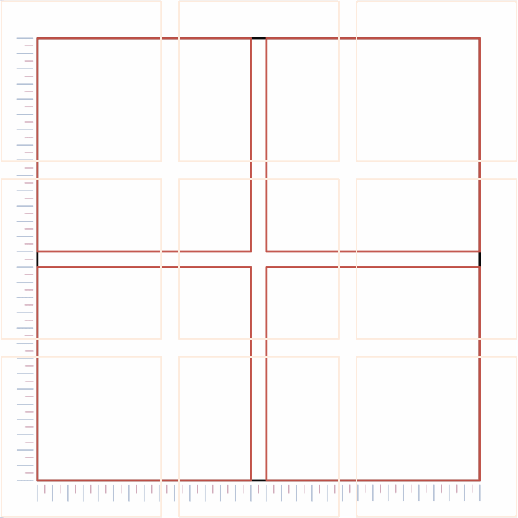
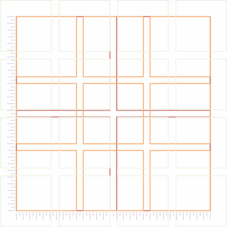
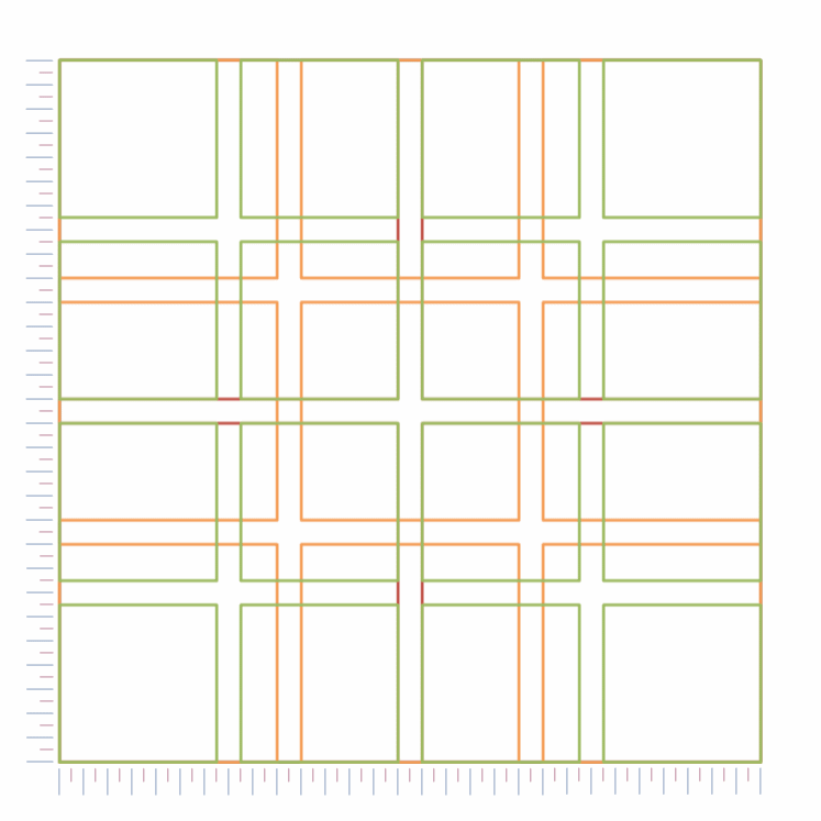
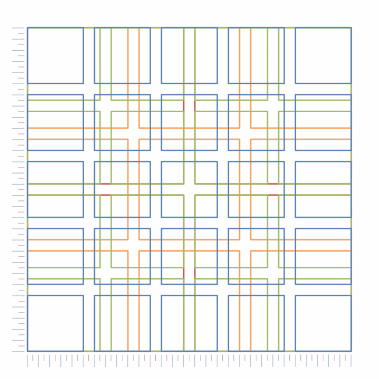
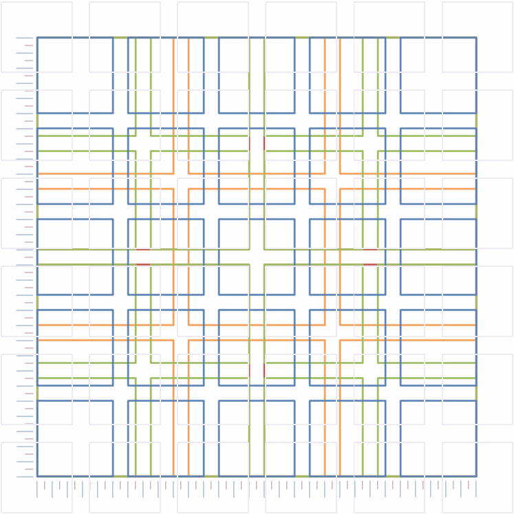
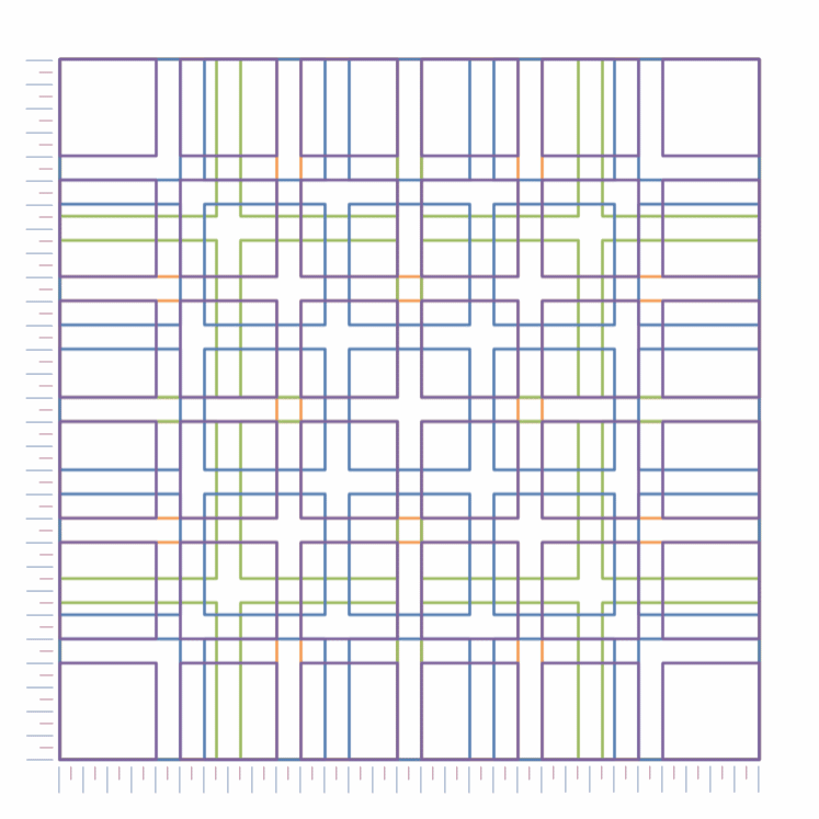
Things become clearer if I show this as a series of columns, and after all, the website is based upon columns (Figure 3.3).

Figure 3.3 - Gerstner grid as columns
Figure 3.3   Gerstner grid as columns

3.1.1

How the Gerstner grid works

How does it work?” you ask; well, this is how it works — and this is the clever bit.

The Gerstner grid is based on a square of 58 × 58 units (I’ll come to what a unit is, but for the minute it doesn’t matter).

So in its simplest arrangement, it is a single column of width 58 units.

Now, when the grid is split into columns, each column is always separated from its neighbour by 2 units.

So if we want two equally sized columns, there will be one gap between them (2 units), this leave 56 units for the columns, dividing this by two gives a column width of 28 units.

If we want three equal width columns, there would be two separating gaps each of 2 units (4 units in total), this leave 54 units to split into three columns, giving a column width of 18 units; and so on.

The equation for working out column widths is:

`Width_(col)=(58 - 2(N_(col)\ – 1))/(N_(col))`
(3.1)
Where Widthcol is the width of the column (equally sized)
Ncol is the number of columns

The elegance of this is that the column width gives an exact integer (whole number) when the number of columns is 1, 2, 3, 4, 5 or 6 — it falls down at seven, but six columns is enough.

The Gerstner grid allows for columns of unequal width, I’ve put together a poor approximation of the Capital magazine arrangement to highlight this:

Figure 3.4a - Variations of the Gerstner grid (with apologies to Messer’s Gerstner and Theobald)
Figure 3.4b - Variations of the Gerstner grid (with apologies to Messer’s Gerstner and Theobald)
Figure 3.4   Variations of the Gerstner grid (with apologies to Messrs Gerstner and Theobald)

The three images of Chester are courtesy of Michael D. Beckwith, the image of the Houses of Parliament is courtesy of Samel Zeller
(all images are via the unsplash website under the creative common zero licence).
The dogs Hector (left) and Henry (right) are my dogs (at least they condescend to live with me) and I took the photographs.

By overlaying the Gerstner grid on the pages, the flexibility of the arrangement can be seen:

Figure 3.5a - Gerstner grid overlay
Figure 3.5b - Gerstner grid overlay
Figure 3.5   Gerstner grid overlay

Ok, so I can see the potential in all this, it’s a columnar arrangement and it’s driven by mathematics — I like mathematics. None of that airy-fairy it just feels right stuff.

Now we come to the dimensions of the unit, the basis of the Gerstner grid.

Gerstner designed the grid with a unit equivalent to the smallest point size used on the page; this leads to a discussion of fonts and point size. — Read on:


End flourish image