This section is just for information; the max-width media query discussed in the previous section is pretty much the only media query we use. This section expands on what we’ve used so far and shows how to do different things with media queries.
Let’s look again at the media query syntax shown in Figure 8.15 and reproduced below:
Figure 8.23 media query rule structure
The first thing is the mediatype is entirely optional, if you miss it out it defaults to all.
@media all and (max-width: 520px) { ... }
Is identical to:
@media (max-width: 520px) { ... }
The second thing is you can test multiple features in a single query:
@media (max-width: 520px) and (orientation: portrait) { ... }
Here, the expression is true if the screen is 520px or less wide AND its orientation is portrait.
8.4.1
Logical operators
Media queries have the following logical operators:
AND
OR (comma separated list)
NOT
ONLY
Taking these in turn:
The AND operator
This combines multiple features and they must all be true if the declaration block at the end is to be executed.
@media screen and (max-width: 520px) and (orientation: portrait) { ... }
In this example, the mediatype must be screenAND its width must be ≤520pxAND its orientation must be portrait before the rules in the declaration block are executed.
The OR (comma separated list) operator
There is no OR keyword, the OR function is achieved by separating features with a comma. Like this;
Here the declaration block would execute if either the screen width was ≤520pxOR the orientation was portrait. Only one condition has to be true to execute the declaration block. If both conditions are true, it will still execute (it is not an exclusive OR function).
The NOT operator
The NOT operator is really confusing; I recommend you don’t use it.
The NOT function inverts the result of a media query; if the query were false, then applying the NOT would invert this and make it true.
The problem with the NOT operator is that it has to include a mediatype as well as a feature, it can’t be just applied to a feature.
To see this let’s use the previous rg-span examples and make it so that the text colour of the central column (the rg-span3-5 class) goes white if the screen is wider than 520px. Add the following media query:
@media not all and (max-width: 520px) {.rg-span3-5 {color:#fff;}}
The NOT operator requires a mediatype so I’ve put the all in the query. The all condition is always true (essentially it means any device) and normally the max-width feature would be true if the screen were ≤520px. By using the not operator, we’ve inverted this function so that it will be false if the screen ≤520px and true if it is >520px.
The NOT encompasses the whole media query, read it like this:
@media not [all and (max-width: 520px)] { ... }
Right
Do not read it like this:
@media [not all] and (max-width: 520px) { ... }
Wrong
My best advice for using NOT, is to find some other way.
If you changed any of this code in grid.css, DELETE IT. We don’t want the text to change colour.
The ONLY operator
This is another funny one, I know I’ve used it in the grid.css file but I’m not sure it’s necessary.
The ONLY operator is one of those browser compatibility things, it stops older browsers that don’t support the features bit of media queries, it forces these older browsers to ignore the media query altogether.
I’m not sure it is really a logical operator.
Combining logical operators
It is perfectly possible to combine logical operators, this is usually the AND and OR operators:
This is the formal list of media features that can be tested with media queries:
Item
Function
aspect-ratio
Width to height ratio of the viewport
any-hover
Does any available input device allow the user to hover over an element?
any-pointer
Is any available input device a pointing device and if so how accurate is it?
color
Number of bits per colour component of the output device (zero if monochrome)
color-gamut
Reflects the colour standard of the device — sRGB, DCI-P3 or Rec2020
color-index
Number of entries in the output device's colour lookup table (zero if the device does not use such a table)
grid
If true identifies the device as something like a tty terminal that can’t display images
height
The viewport height
hover
Does the primary input device allow the user to hover over an element
inverted-colors
Is the browser or operating system inverting colours
light-level
Gives the current ambient light level being experienced by the device
monochrome
Number of bits per pixel available to the output device (zero if device is not monochrome)
orientation
Orientation of the viewport — portrait or landscape
overflow-block
How is content that overflows the containing block handled — can it be scrolled or paged &c.
overflow-inline
Can content that overflows the viewport be scrolled
pointer
Is the primary input device a pointing device and if so how accurate is it?
resolution
Gives the density of pixels of the output device (e.g. in dots per inch)
scan
Identifies if the output device is interlaced (old fashioned television) or progressive (all modern computers and monitors)
update-frequency
How quickly can the output device update changing content — none, slow or fast (all computers, smart phones and tablets are fast)
width
The viewport width
Table 8.4 Media query features list
“Hang on a minute” you’re thinking — “where’s max-width? We’ve used it and it’s not in the list”.
We’ll no, there is no max-width, there is only width; max (and min) are qualifiers that we can apply to the features, it works like this:
* Test the viewport window for exact width */
@media (width: 520px) { ... }            /* executes if window is exactly 520px wide */

/* Test the viewport window is at least as wide as a value */
@media (min-width: 520px) { ... }        /* executes if window is ≥520px wide */

/* Test the viewport window is no wider than a value */
@media (max-width: 520px) { ... }        /* executes if window is ≤520px wide */
Max and min work with most features that can return a number, the following are all valid:
/* Aspect ratio — detect if browser is square or landscape*/
@media (min-aspect-ratio: 1/1) { ... }   /* executes if aspect ratio 1/1 or more */

/* Monochrome — test for low quality */
@media (max-monochrome: 8) { ... }       /* executes if output is 8 bits per pixel or less */

/* Resolution — check for low resolution */
@media (max-resolution: 150dpi) { ... }  /* executes if res is 150dpi or less */
A note on usage:
If you use MAX, the result is TRUE if the returned number is LESS THAN OR EQUAL TO the given value.
If you use MIN, the result is TRUE if the returned number is MORE THAN OR EQUAL TO the given value.
8.4.3
Breakpoints and media queries
What I describe here is a useful technique rather than something new about media queries, but it is something we will use a lot when making the website responsive.
In the column example in the previous section, the columns became progressively narrower as the browser window narrowed, but they kept their correct proportions to one another.
What didn’t happen was any change to the font size; the visible text just stayed the same size all the way through. Now I’m going to look at how I change the font-size responsively for the website in great detail in § 10.1, but I want to explain the concept of how it’s done here — it’s all to do with media queries you see, and we have a nice little test example already set up.
Imagine that as we narrow the browser window, we want to change the text colour of the outside columns (I’m changing text colour rather than font size because it is more noticeable, but the principle is the same). Let’s say we want it to do this:
Browser width (px)
Text colour
>1000
Black (#000)
801-1000
Red (#ff0000)
601-800
White (#fff)
≤600
Green (#00ff00)
Each point at which the colour changes (1000 px, 800 px & 600 px) is called a breakpoint. This is common terminology when talking about responsive design, it just means a screen width that when reached changes something.
There is a fairly standard way of doing this, add the following code to the end of grid.css.
grid.css
@media all {.rg-span1-5 { color: #000; }}
@media all and (max-width:1000px) {.rg-span1-5 { color: #ff0000; }}
@media all and (max-width:800px)  {.rg-span1-5 { color: #fff; }}
@media all and (max-width:600px)  {.rg-span1-5 { color: #00ff00; }}
The first line is a bit different to what we’ve seen before:
@media all {.rg-span1-5 { color: #000; }}
For a start there is no feature component and with the mediatype being set to all, the result is always true, it will always set the rg-span1-5 text colour to black (#000) no matter what.
Now let’s suppose that the browser is 1200 px wide, the first media query will execute (it is always true) and the rg-span1-5 text colour will be black. The next media query is testing for the browser width to be 1000 px or less (just like the media queries we used setting the column widths in the previous section). The browser window is 1200 px so the result of this media query is false and its CSS code does not execute (it does not change the colour).
The same is true of the last two media queries; these are both looking for progressively smaller widths and both are false.
So the only media query that is active is the first one making the text black.
Now let’s reduce the browser width to 900 px (in the middle of the red band):
Once again the first media query is true and the text goes black, but now the browser is less than 1000 px wide, so the second media query is also true and this turns the text red; the final two remain false.
We now have two media queries that are true and they are both changing the text colour (this is the cascading thing again), the second media query wins because it was the last one to be executed — so the text goes red.
You can see how this is going I’m sure.
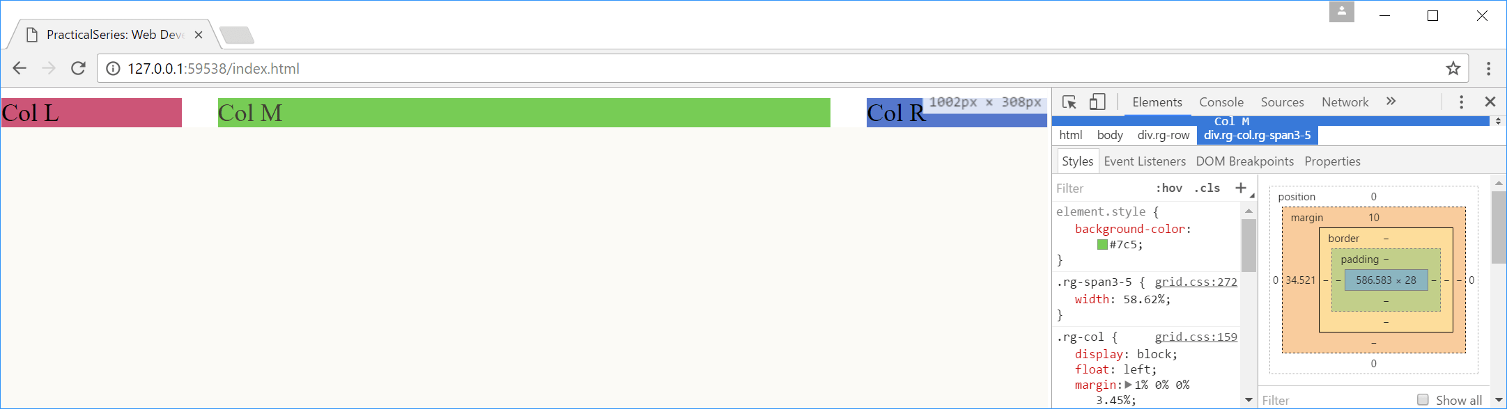
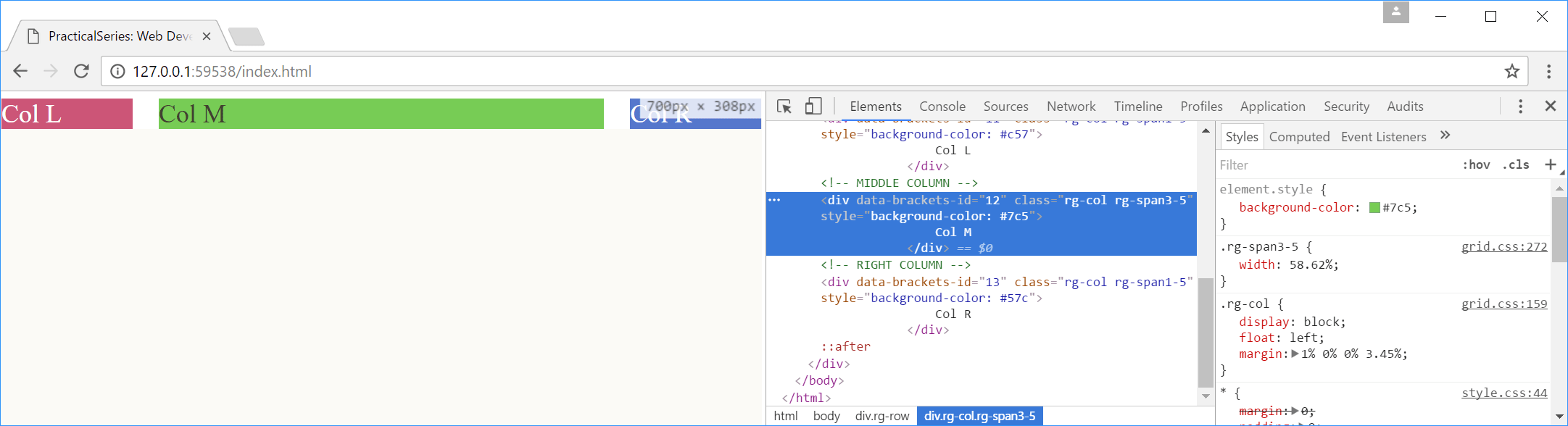
If we reduce the browser width further, to 700 px, the first three media queries are true, they all try to change the colour, but the last one has priority (just because it is the last active query in the list) and the text goes white.
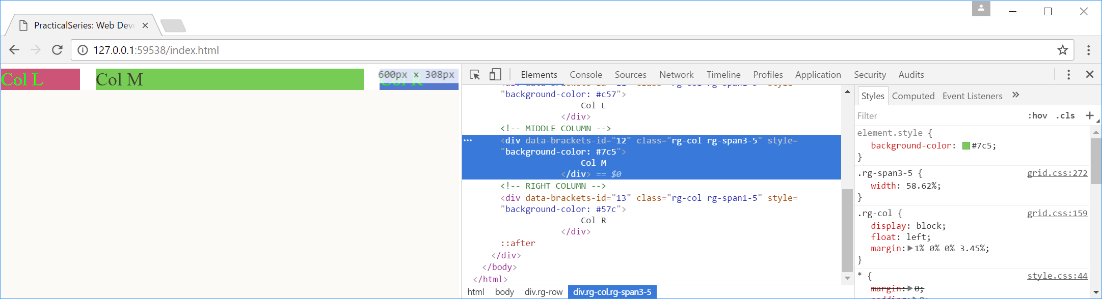
Finally, at a width of 600 px or less, all the media queries are true, this time it is the fourth media query that executes last and therefore has priority and the text goes green. The following figures show all the combinations (you can see the true browser width in each case in the indication box, showing over the blue column):