Here we discuss the basic appearance of a website page, the fonts used, the size of the text and how we space the text to make it pleasing to the eye.
The bulk of what I talk about here concerns the body text of the web page. Body text is the main content of the website; it’s what you are reading now. It is also the most common element of a document — there is more body text than anything else. It is important to get the body text right, if you don’t, the whole website will look wrong.
The four main elements to be considered when choosing the style of the body text are:
Font (this is the most important)
Point size (generally larger for websites, smaller for documents)
Line spacing (the gap between lines of text)
Line length (how long the line is on the page)
Looking at these in turn:
3.2.1
Fonts
Fonts are a personal choice — and I have chosen to use a series of fonts called the Equity fonts, these being Equity, Concourse and Triplicate.
Fonts broadly come in three styles: serif, sans serif and monospaced.
Serif fonts have flourishes (serifs) at the ends of the vertical and horizontal bars. This sort of thing:
Figure 3.6 Serif font
Probably the most well-known serif font is Times Roman:
Sans serif fonts (I’m assuming “sans” as in the French “without”) don’t have these flourishes:
Figure 3.7 Sans serif font
The most common sans serif font is Arial:
And then we have monospaced fonts, these can be either serif or sans (usually serif). Most fonts, are proportional fonts, that is to say the width of each letter is different, ‘I’s are narrow ‘M’s are wide. With monospaced (non-proportional) fonts all letters occupy the same width on a page; typewriters are monospaced, that’s where it comes from:
Figure 3.8 Monospaced font (red boxes are all the same size)
Courier is the best known monospaced font:
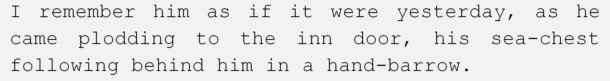
The Equity fonts
Now as I say, I’ve chosen to use the Equity fonts and these are Equity (serif), Concourse (sans serif) and Triplicate (monospaced); to give you some idea of what these look like, I’ve put them in the following table along with their common counterparts Times New Roman, Arial and Courier New:
Table 3.1 A comparison of the Equity fonts
Broadly, I use the three fonts as follows:
Equity (serif) is used for the main body text in the document (it’s what you are reading now).
Concourse (sans serif) I use for headings, smaller text in tables and annotations.
Triplicate (monospace) I use for code and code fragments. Code is traditionally shown in a monospaced font (usually one with a line through the zero and curvy ‘l’s to distinguish them from ‘O’s and ‘1’s), it generally makes the code easier to read:
ABCDEFGHIJKLMNOPQRSTUVWXYZ0123456789
abcdefghijklmnopqrstuvwxyz0123456789
So why have I chosen these fonts? — Well, only because I like them, they seem to complement each other and the weights of the fonts (how dark they are) match (you can see this in Table 3.1 above, the Equity fonts on the left look better together than the Times, Arial and Courier combination on the right.
These fonts were not free, I had to buy them — but as my old Dad used to say, “Tha gets what tha pays for” (he also used to say “I, ’trick is not to mind”, “Tha’ll never see a farmer on a bike” and “Remember lad, tha didn’t invent sex”) and it’s true (all of it — wise old bird my Dad).
The Equity fonts are well equipped; for a start they come with proper Small Caps, they also have various stylistic sets that allow certain characters to be adapted according to taste (displaying an ampersand as & or & for example). The Equity fonts also come in a variety of weights allowing differing degree of boldness to be used under different circumstances.
They also look nice.
It is perfectly possible to use fonts that you don’t have to pay for, Google fonts for example, or the fonts that came with your computer, these are essentially free too.
The problem with Google fonts is that I struggled to find fonts that I really liked, and the ones that I did find acceptable where used absolutely everywhere and I wanted the site to stand out from other sites.
I could have just relied on the system fonts installed on every PC, but this isn’t ideal either, different systems have different fonts; Macs have different system fonts to PCs — and if a specified font is not installed a browser will just use a font that it thinks is similar.
I wanted good looking fonts that weren’t overused, fonts that were flexible and fonts that I could readily convert to a web font so that browsers could download them and use them to display the web page as I intended.
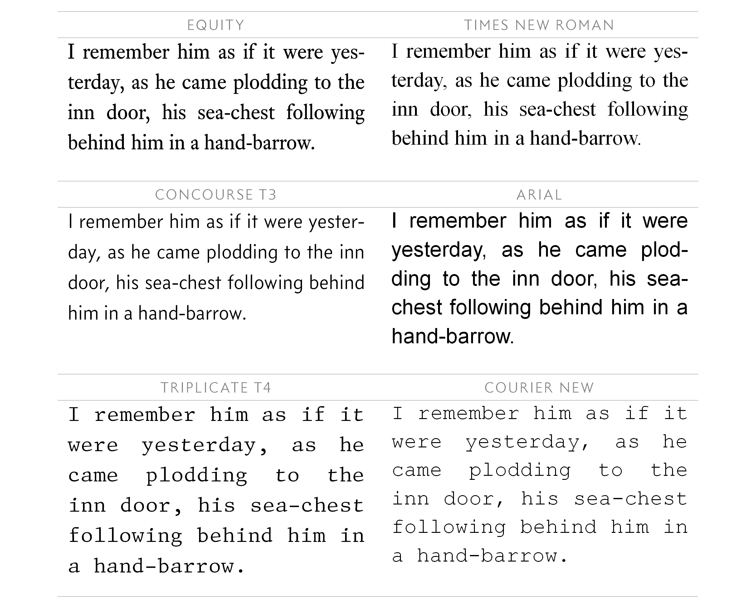
System fonts
In my day job I have to use system fonts — it’s not practical to transfer documents to customers with third party purchased fonts — the redistribution of non-standard fonts and problems with licencing make sharing such fonts prohibitive.
I exclusively use Windows for my engineering work and Word for documentation and so I use the system fonts that come with Windows. The system fonts I prefer are:
Calisto MT (serif font), Gill Sans MT (sans serif) and Consolas (monospace).
They look like this (I’ve compared them to the equity fonts):
Table 3.2 Best system fonts
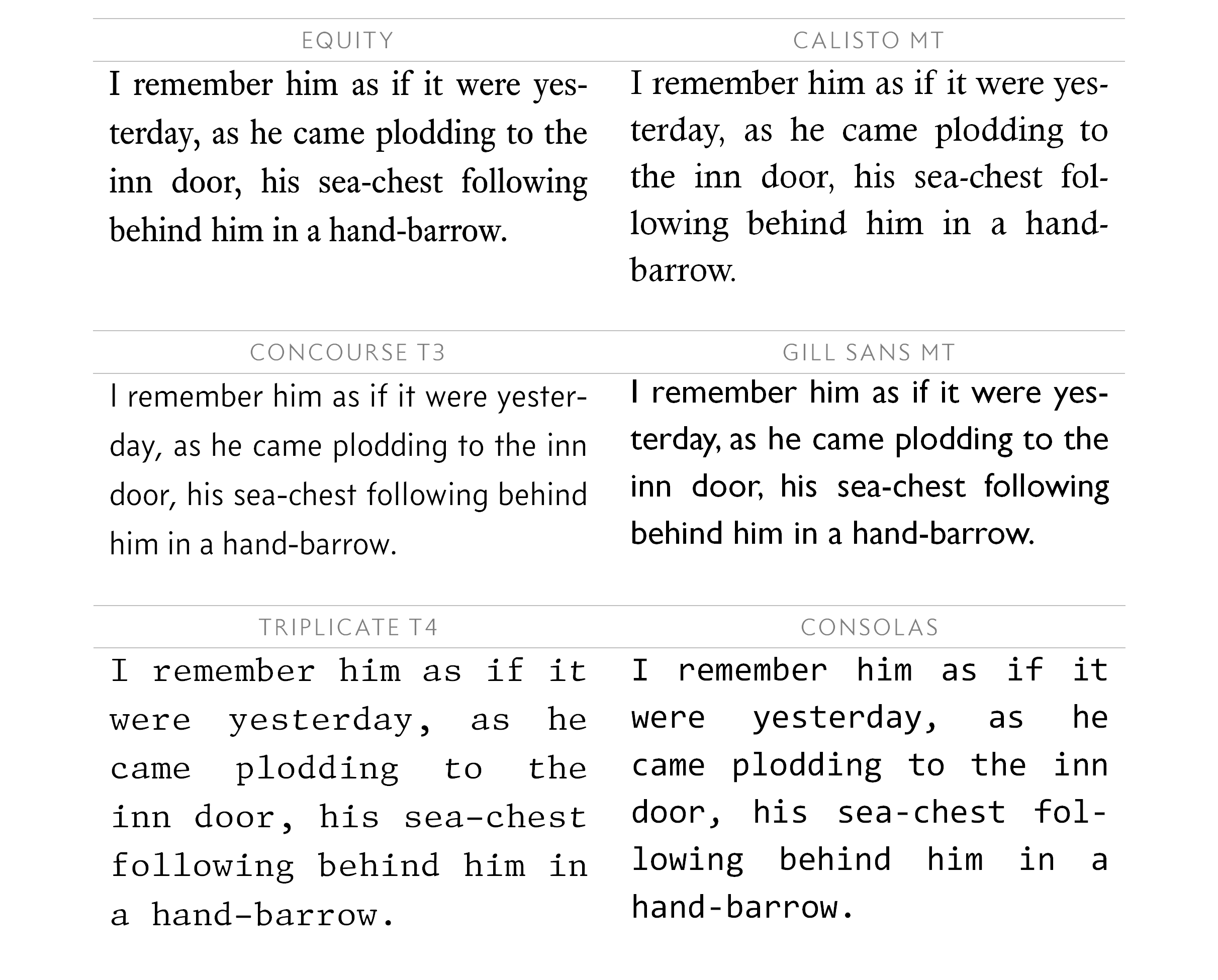
Open source fonts
So there we are — I’m using the Equity fonts.
The downloadable version of this website uses open source fonts for reasons I explain in section 1.3. The fonts are:
PT Serif (serif), Source Sans Pro (sans serif) and PT Mono (monospace), amongst others.
They look like this:
Table 3.3 Open source fonts
They’re not brilliant, but they’re the best I could find.
3.2.2
Point size and the anatomy of a font
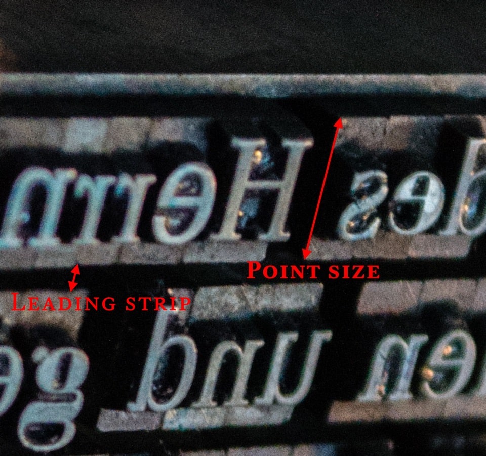
The point is a unit of measurement for typesetting a page; the size of a point has varied considerably throughout the history of printing, but it is now standardised at 1/72 of an inch or approximately 0.353 mm.
The point size of a letter was originally set by the size of the metal block upon which the letter was cast; this was in the days of metal type and printing presses (Figure 3.9).
This was further complicated by the spacing between the adjacent rows of text; this was referred to as leading (to rhyme with bedding not speeding), in the days of metal type, these were strips of lead that separated the blocks of type.
Things become even more complicated when using digital type and viewing characters on a screen. Broadly, point size and leading are defined in the following diagram (this is one I drew, sorry):
Figure 3.10 Point size
All letters are on a baseline; this is where the bottom of any capital letter rests. Lower case letters like p and g have parts that descend below this line and these are called descenders. Other lower case letters like h and b have parts that extend up to the height of capital letter, these are called ascenders.
Lowercase letters, without ascenders or descenders (a, c, e, m, n, o, r, s, u, v, w, x and z) reach from the baseline to the mean line (although it isn’t actually the average of anything) and this is referred to as the x-height.
Lowercase letters with ascenders (b, d, f, h, i, j, k, l and t) extend above the mean line up to the ascender line.
The ascenders on lower case letters can exceed the height of a capital letter (it depends on the font); hence separate cap lines and ascender lines. It is also true that ascenders needn’t reach the height of a capital letter (compare the height of the Hh and Tt in this Equity font, the lower case t does not reach the same height as the capitals — unlike the h which exceeds it); it’s clearer with a larger point size:
Lowercase letters with descenders (g, j, p, q and y) descend below the baseline (generally only j and some stylised fs have both ascenders and descenders).
For most fonts, ascenders and descenders are of a similar height with, generally, the descenders being if anything, slightly shorter.
The point size of a font character is the height of a rectangle containing the character. This is called the em square†1.
In the days of metal type, things were clearer, the point size (or the em square) was the size of the metal block that the type was cast onto, these were all the same height for a given point size, but all that did was define the size of the block, not the print; the block could have had very small letters that would only fill half the block or it could have large letters that would fill all of it (Figure 3.11). Both characters in this image effectively have the same point size (because the blocks on which they are cast have the same height).
†1
Traditionally, the em square represented the uppercase M character, the M being almost square and the widest letter — with digital print, this definition doesn’t quite hold true anymore and the em square is essentially just a virtual container holding the character.
Figure 3.11 Point size with metal type
Digital type also conforms to this idea; although in this case, the em square is just a virtual, imaginary container that holds a character.
This can lead to problems, physical type is rigid and fixed; digital type, by its nature, allows for more — let’s say — flexibility.
Before we consider these problems; let’s complete the examination of a font with a brief discussion about line spacing.
3.2.3
Line spacing (leading)
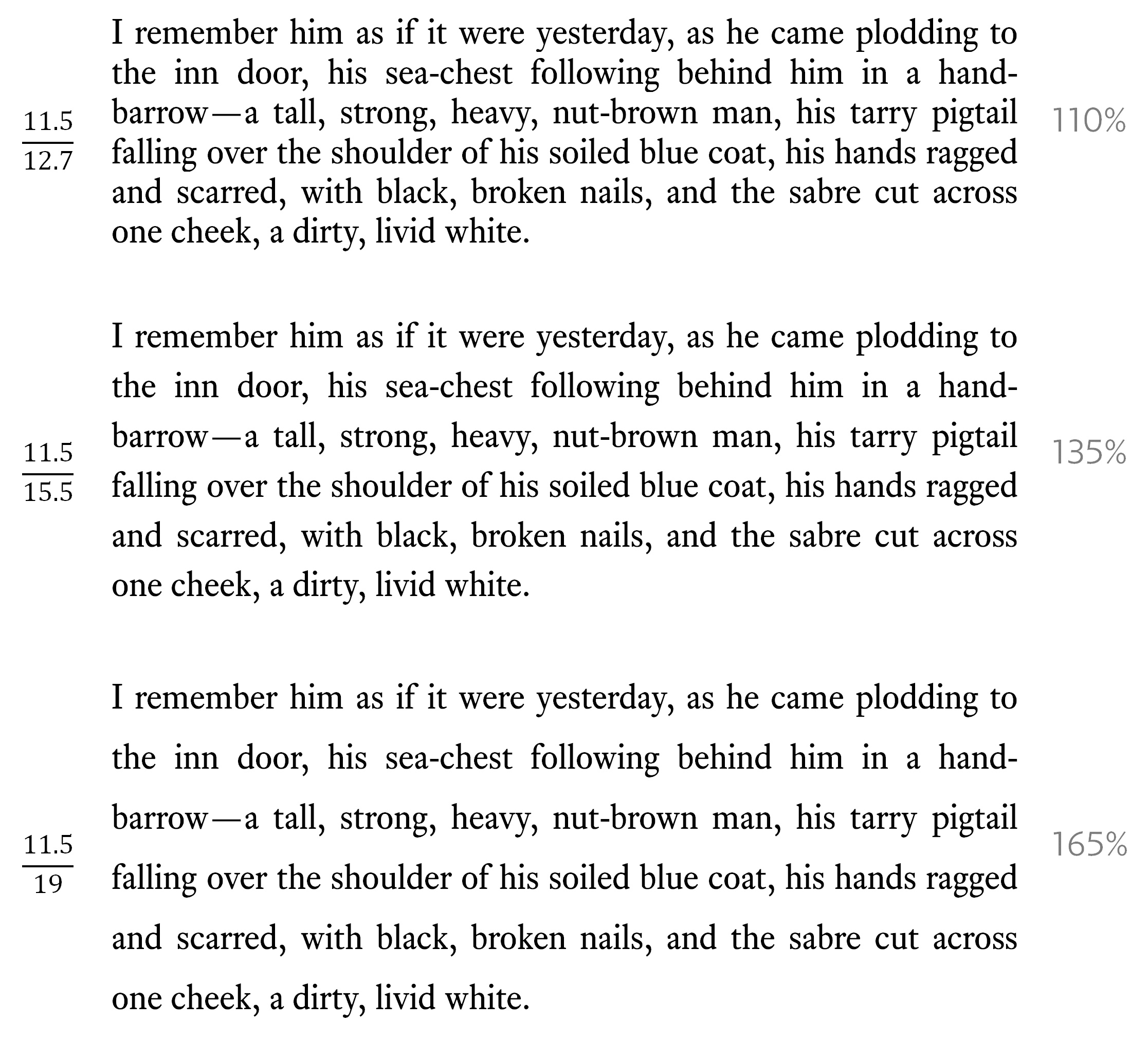
Line spacing (sometimes called leading) is defined as the distance between two baselines and is again measured in points.
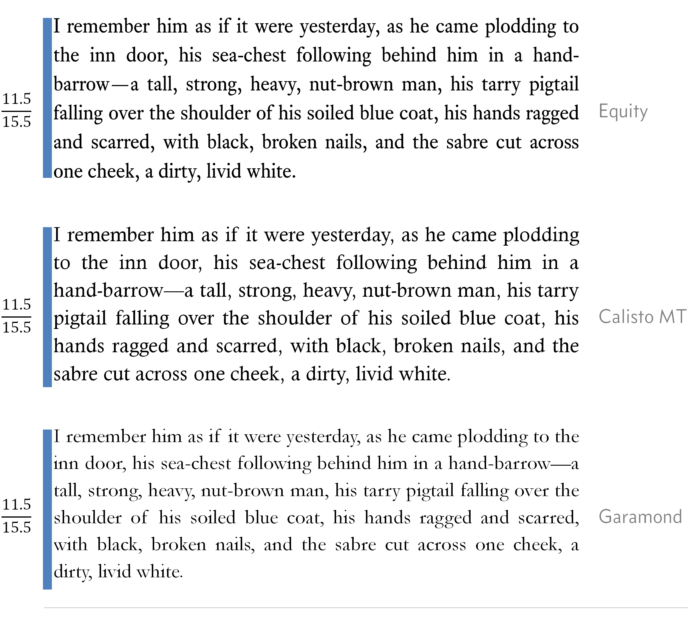
For most text, line spacing should be between 120% and 145% of the point size of the font (i.e. the em square size multiplied by the percentage); the text you are reading now has a line spacing of 135%.
To illustrate the use of line spacing look at the following:
Table 3.4 Line spacing (Robert Louis Stevenson’s “Treasure Island” 1883, Cassell & Company)
The table shows three different line spacing settings for text at 11.5 point. The one in the middle seems best to my eye; and this is the line spacing I have chosen to use on the website (135%).
Point size and leading (line spacing) are expressed as one over the other (the figures on the left in the above table):
`(text{Point size})/(text{Line spacing})\ \ \ \ \ text{e.g.}(10)/(12)\ text{is point size of 10 pt, line spacing 12 pt}`
All clear, straight forward isn’t it — except it’s not, as we’re about to find out:
3.2.4
Different fonts, same point size
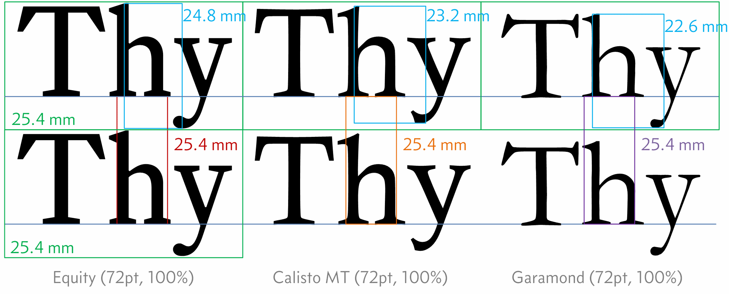
Look at this; this is how I think it should work:
Figure 3.12 Point size with different fonts in Visio
This is two lines of type in three different fonts; all are at 72 point (which we know is the equivalent to 1 inch or, as shown here, 25.4 mm), the line spacing is 100% in each case (these are the red, orange and purple lines)..
With a line spacing of 100%, the baseline to baseline distance should be the same as the point size (green lines) i.e. 25.4 mm and it is — good.
The body height of the text (distance from the top of an ascender to the bottom of a descender) is different for each font (24.8 mm for Equity, down to 22.6 mm for Garamond, blue lines); but each font is aligned on the same baseline and the body height has no effect on line spacing — also good.
So I think you will agree this is exactly how it should work. The above figure is a screen shot of text written in the Microsoft product, Visio.
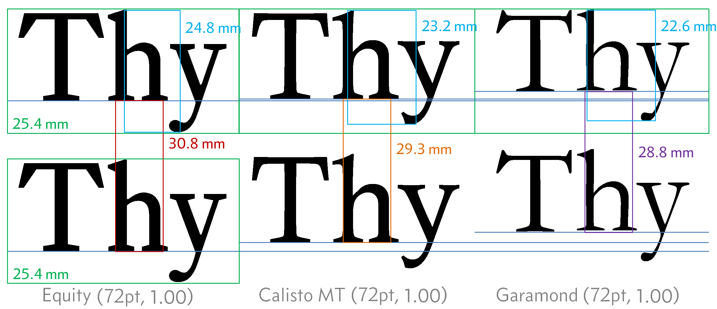
Now look at the same arrangement in another Microsoft product, Word 2010:
Figure 3.13 Point size with different fonts in Word
Word uses a peculiar line spacing arrangement, the line spacing is set to a multiple value and a scaling value is entered (that is the number 1.00 shown above). See the explanation here.
Ok, this is all over the place — each font is on a different baseline and the distance between the baselines is different for each font — wtf is going on?
I tired the same thing in Inkscape and it was exactly the same as Visio (i.e. just how I think it should work).
So is it just Word? — Well yes, I think it is. At first I thought it might be how I was positioning the text (the above example is done in a table with three columns, one for each font).
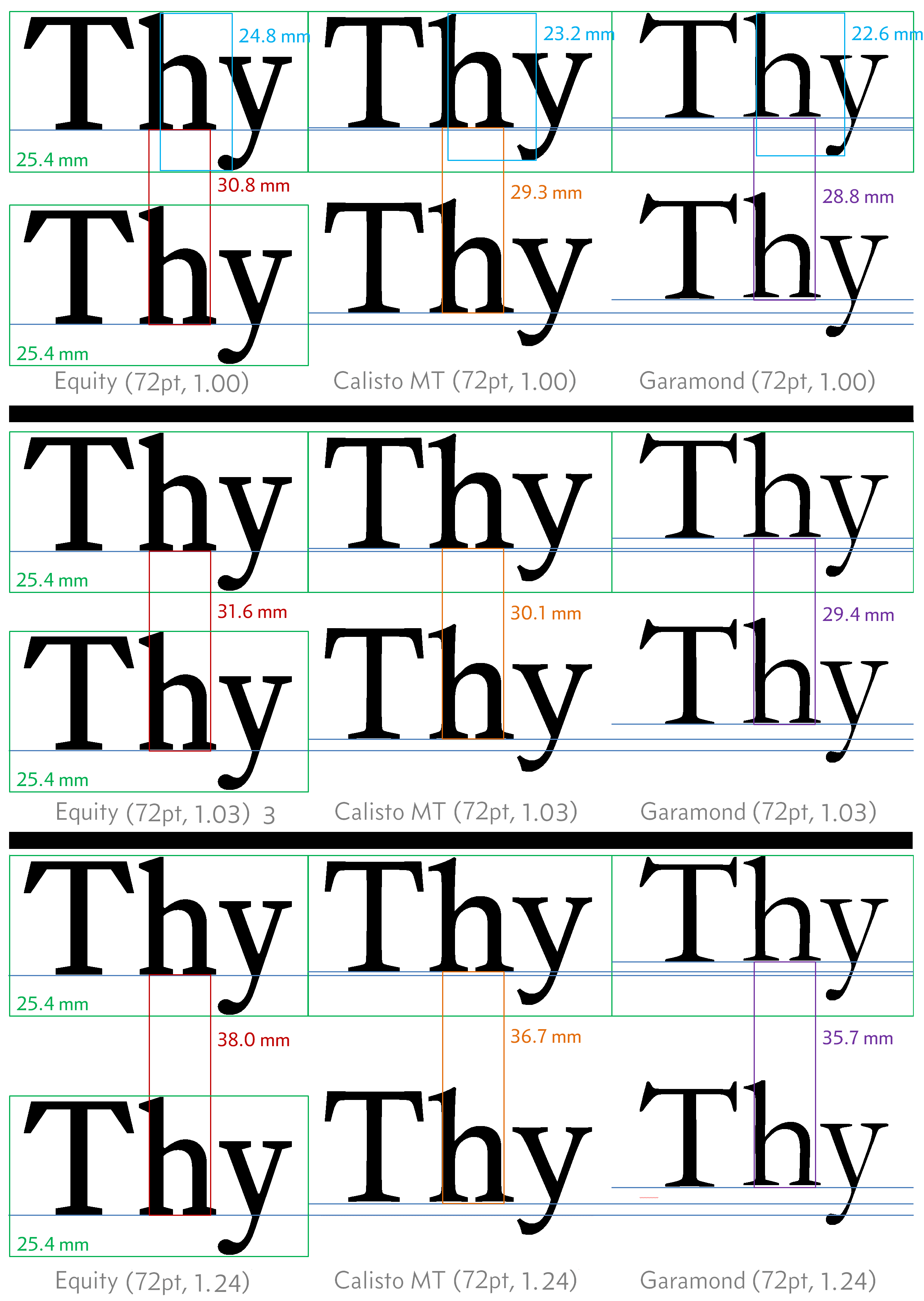
Have a look at the following, here the three fonts are organised into six line paragraphs. All three fonts are at 11.5 point and all with the same line spacing (135%):
Table 3.5 Same point size, different fonts
The blue line on the right is exactly the same height in all three cases and is set to be the height of the whole six lines in the top (Equity) paragraph. In all cases, the top of the line is aligned to the top cross stroke of the ‘I’ on the first line.
Here it is again — in Word, the font is changing the line spacing — why?
Well the honest answer is “I don’t know”, I’ve spent a long time looking at it and trying to work it out — I’ve even read a bit about font design, and while it is true that I don’t know for sure, I think I can guess a little bit about what is happening.
Here’s my best guess — I did the same experiment above with different line spacing, this is the result:
Figure 3.14 Line spacing with different fonts in Word
One thing is for sure, Word is not using the point size of the font (em square), if it were the line heights would all be the same.
The following table summarises the line heights and gives them as a percentage of the body height:
Line Spacing
Font
Body height
× 1.00
% Body height
× 1.03
% Body height
× 1.24
% Body height
Equity
24.8 mm
30.8 mm
1.24
31.6 mm
1.27
38.0 mm
1.53
Calisto
23.2 mm
29.3 mm
1.26
30.1 mm
1.29
36.7 mm
1.58
Garamond
22.6 mm
28.2 mm
1.25
29.4 mm
1.30
35.7 mm
1.57
Average
1.25
1.29
1.56
Table 3.6 Line height as a function of body height (Word)
What do we conclude from this? Well allowing for errors in my measurements, I think we cans say that:
In Word, the line heights are all multiples of the body height — not point size
Now, while I think this is wrong, it helps us in one important way: this is also how web browsers calculate line height (see § 3.2.5).
But this leaves an important question: “What line spacing value should I use?”
And the answer is “I’ll be buggered if I know.”
I know what I think I want — I think I want 135% line spacing — why do I think this?
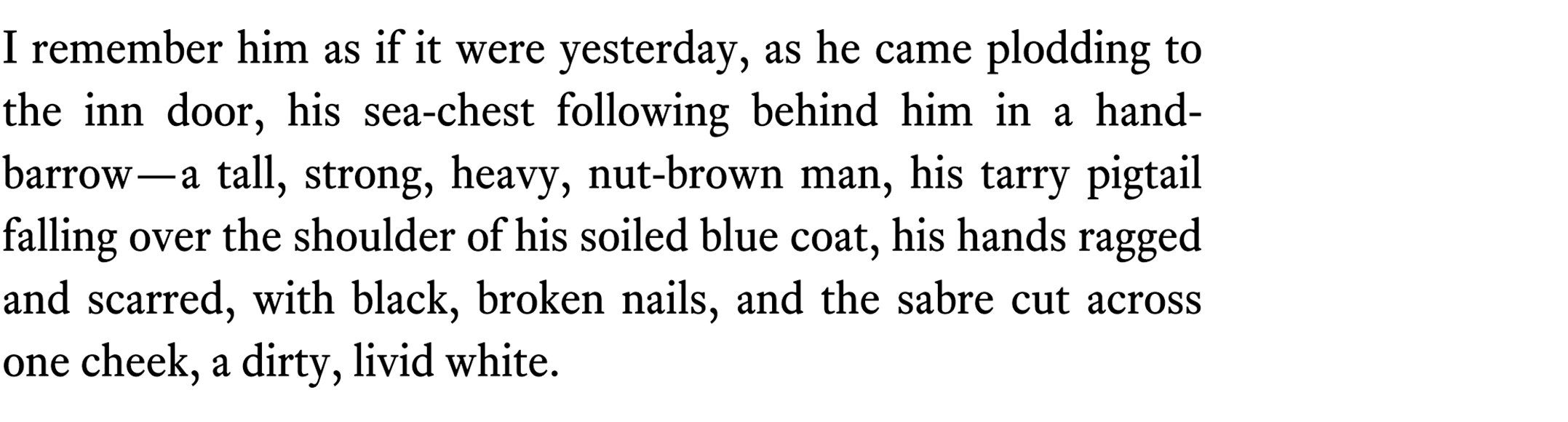
I think this because I’ve experimented with it, I put the same paragraph into Visio (which I think calculates line spacing properly) and adjusted it until I got something I liked and it turned out to be 135%; it looks like this (Figure 3.15):
Figure 3.15 Equity with 135% Visio
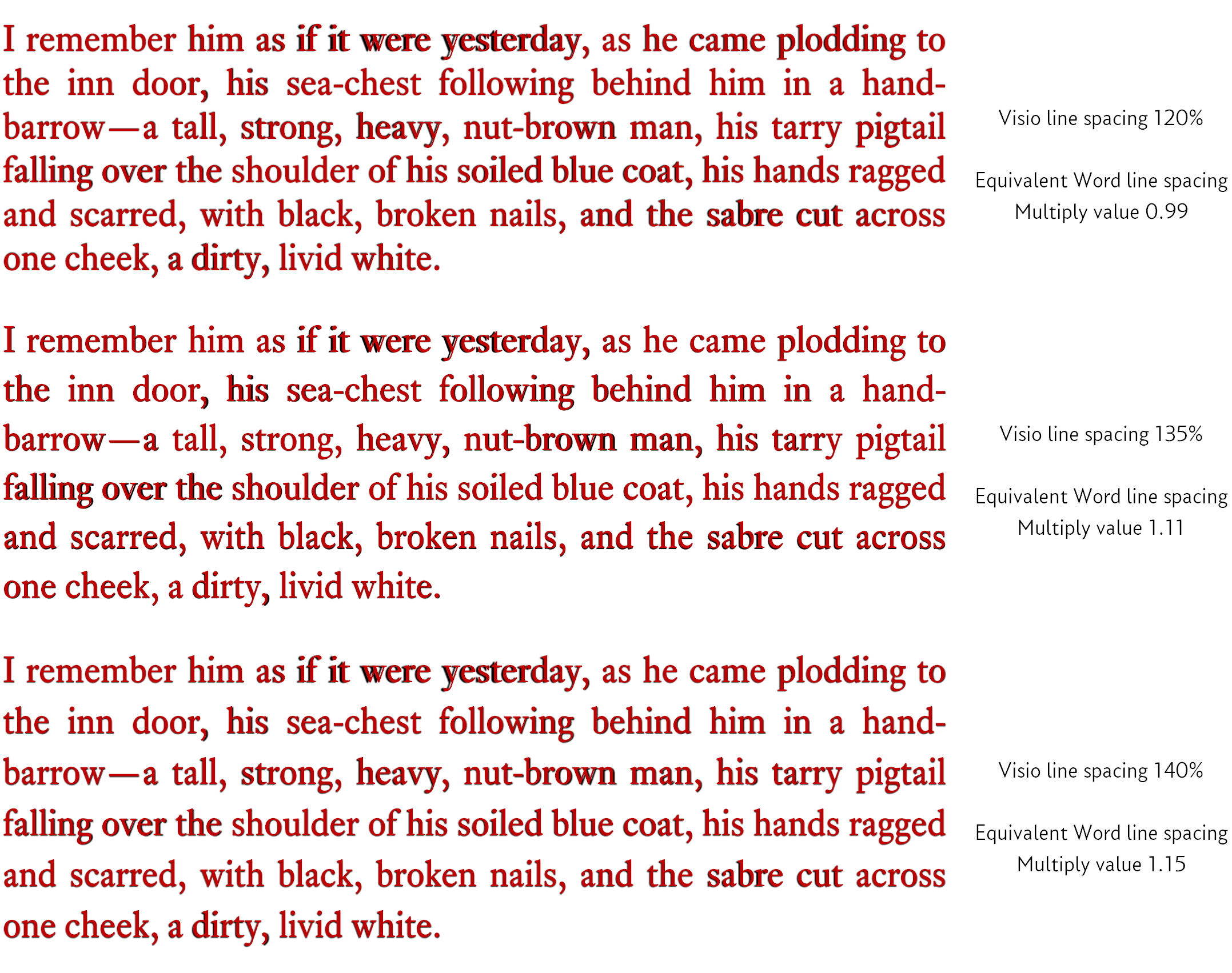
I then overlaid this with the same text in word:
Figure 3.16 Line spacing comparison, Word and Visio
I did this by entering the paragraph in Visio, taking a screen shot and inserting the resultant image behind the equivalent text in each row above, I scaled the image until the text was the same size as the Word text (Word text is in red, Visio text is black and behind the Word text). I then adjusted the line spacing in Word until the height of the whole paragraph matched.
The difference in lateral positioning of the words (seen most clearly with “if it were yesterday” in the top line) reflects the differences in how Visio and Word justify the text — it has no bearing on the line spacing.
I repeated the exercise in exactly the same way with Calisto MT and Garamond (I haven’t included the images here, they’re just more of the same), this gave the following results:
word multiply value for line spacing of:
Font
120%
135%
140%
Equity
0.99
1.11
1.15
Calisto
1.03
1.16
1.21
Garamond
1.07
1.19
1.24
Average
1.03
1.15
1.20
Table 3.7 True Word line spacing by font
Where does this leave us? — Well it means that: line spacing in Word is entirely dependent on the font being used.
Here is a rule of thumb (based on the average of the above figures):
Line spacing in Word†2
Line spacing in word is dependent on the font being used. As a rule of thumb, the following line spacing (multiple) values give the following (approximate) line spacing:
Word multiply line spacing value
Equivalent approx. line spacing
1.03
120%
1.07
125%
1.11
130%
1.15
135%
1.20
140%
1.24
145%
Line spacing is set in Word as part of the paragraph properties: right click the text and select paragraph from the drop down menu, it’s under line spacing.
To set line spacing between 120-145%, set the line spacing box to multiple and enter a value between 1.03 (equivalent to 120%) and 1.24 (equivalent to 145%).
So here’s the thing — in Word point size is not an absolute measure of text height and line spacing — dig deep and let it go. The best thing to do is to judge by eye. With a document, this is by printing it out and reading it. With a website, it is by viewing it on different monitors.
Remember that airy-fairy thing I said earlier, I knew it would come back to haunt me.
†2
The figures listed here were determined empirically by printing out sample text and measuring it with a ruler (old fashioned engineering). I did find it satisfying that my figures also matched those derived by some other people: Mr Matthew Butterick (practicaltypography — no relation). I would be interested to know how Mr Butterick arrived at his figures (I imagine it was a more elegant method than my clumsy attempt) — should he ever read these pages, perhaps he would be good enough to let me know.
3.2.5
Anatomy of fonts on a website
When writing a document we set the font size in points (usually, especially if using Word, see above).
On a website we set the font size in pixels or ems or rems or as a percentage.
The basic measurement (and least confusing) is pixels.
Now from what I’ve read about font size on the web (and there is a lot to read and many contradictory opinions), I thought that specifying a font height would be just as confusing as it was with Word (see § 3.2.4), but I did some experiments and I’m not entirely sure I agree with what I read.
Figure 3.17 shows a blown up screen capture of the website using the Equity font; the font is set to 24 pixels with a line spacing of 137.5%. I’ve added the coloured bands to the image; each band is exactly one pixel high. Figure 3.18 shows the same arrangement but with the Garamond font (the screen shots were taken at a browser zoom of 100%):
Figure 3.17 Pixel height and line spacing Equity
Figure 3.18 Pixel height and line spacing Garamond
If we look at font body height first (blue and red bands), the height from the top of the ascender on the ‘h’ to the bottom of the descender of the ‘y’ is exactly 24 pixels. This is true in both Equity and Garamond fonts.
Now the line height — this is set to 137.5%, so with a font size of 24 pixels, the line height should be 24 × 1.357 = 33.0 pixels. The line height is easy to measure; it is the distance from baseline to baseline (green and brown bands). In both cases, Equity and Garamond there is exactly 33 pixels between the baselines.
So, it seems that websites and web browsers consider the font size to be the distance from the top of the ascenders to the bottom of the descenders (a bit like Word) — line spacing is the straight forward percentage multiple of this value.
3.2.6
Pixels, percentage, ems and rems
With websites, it’s possible to set the font size in pixels, percentage, ems, rems and even just using keywords†3 (xx-small, medium, large &c.). I don’t recommend the latter, it’s a bit imprecise.
†3
Font size for websites can also be specified in points (pt), this is generally only intended for printed output — pt is not generally used, it produces very different results in different browsers. — Don’t use point as a measurement on websites.
Pixels as a basic unit of font size
Ignoring keyword assignment, the four remaining options are pixel, percent, em and rem; of these only pixel gives an absolute measurement. Specifying a font size of 24 pixels will make it exactly 24 pixels from the top of the ascenders to the bottom of the descenders (see § 3.2.5 above).
It will only be 24 pixels if the browser is set to 100% zoom (actual size) and no scaling is applied to the monitor by the operating system. But for our purposes we will consider it to be an absolute measurement.
The other measurements are relative measurements.
Percentage as a unit of font size
If the default font size is set to 24 pixels, declaring text to be 200% will make it 48 pixels high. Easy.
The problem with percentages is that they cascade (and they cascade like a bastard), I’ll come to cascading styles later (it’s what the C stands for in CSS), just accept for the minute that this is something we will use a lot; in essence, it means it’s possible to set a style (of text, say) based on a parent, but with some slight modification (like font size for example).
If we define the base font to be 25 pixels, and we then derive a second style from this and give it a font size of 80%, it will be 20 pixels high; if we now define a third style based on this second style and give this a font size of 80% too, it will give text that is 16 pixels high — it takes 80% of the 80%.
It pays to be careful when using percentages.
Ems as a unit of font size
Ems are derived from the old typographical nomenclature (the em square), see § 3.2.2, but this is pretty much as far as the comparison goes.
Ems are just like percentage (normalised to 1). Setting a font size to 1 em will keep the font size exactly the same (1 em is equal to the current font size).
Thus, if the base font is 24 pixels, setting a font size of 0.5 em will give text that is 12 pixels high; an em of 2 will give text that is 48 pixels high.
Like percentages, ems cascade down through the styles effectively multiplying the previous setting by the new value (rather than the original base value.
Finally, rems
Rems are a new invention (relatively), introduced in CSS 3 (second draft, 2005, so not that new) and they get around the cascading problem suffered by ems and percentages.
The rem is a relative unit exactly like an em, if the base font is 24 px, setting a font size of 1.5 rems will give text at 36 pixels.
The difference is that rems do not cascade, they are always relative to the root <html> element (I discuss this in section 5.6.2, but for the time being consider this to be the default font size for the web page).
This is good; we will use rems a lot.
Specifying font size within the website
Generally, within the website, I set an absolute size for the default text on the website in pixels; the actual size used depends on the width of the web browser viewing the page. I use 24 pixels for any browser window wider than 960 pixels and I gradually make the font size smaller until it reaches a minimum value of 12 pixels at a browser width of 520 pixels.
This is one element of making the website responsive; it adjusts the text size in response to the width of the device viewing it (i.e. a wide screen on a PC, a narrow screen on a mobile phone).
Everything else, heading, sidebars, footnotes are all specified in rems to give a size relative to the current default font size and this means that when the default changes in response to the browser window, everything else changes too — clever eh?
Web fonts
In the old days, the fonts displayed by a web browser were the system fonts — those fonts that were already installed on the machine viewing the web page.
Webfonts were introduced as part of CSS 3 (the latest version) and this allows fonts to be stored within a web page itself (they are downloaded by the browser from the website, just like images); this allowing the browser to render the font exactly and not have to rely on system fonts.
These web fonts are accessed using the @font-face commands (see § 9.3), they are generally (but specifically on this web site) stored in .woff files (there are other alternatives, they can even be hardcoded in CSS, but I only consider .woff files here).
I converted the Equity fonts to web fonts (I’m permitted to do this by the licence I hold for the fonts) and these are the fonts rendered by the browser.