20

20Lightbox

20.1

Getting and installing Lightbox

I’ll go through the steps for downloading and modifying the original files, I have to do some cosmetic modifications to make it find all the right directories, I also have to modify some of the files to make it work properly with my website.

I’m doing this for the sake of completeness, the easiest thing for you to do is just use the downloaded file and jump to § 20.2 (how to use it).

Here’s the website:

https://lokeshdhakar.com/projects/lightbox2/

It looks like this:

Figure 20.3 - Lightbox website
Figure 20.3   Lightbox website

First thing, download the software (hit download highlighted).

This downloads a file called lightbox2-master.zip. Copy it somewhere and extract it.

Everything we need is in the src subdirectory:

Figure 20.4 - Lightbox downloaded files
Figure 20.4   Lightbox downloaded files

There are several files that we need:

src
directory
src
filename
target directory target
filename
src/css lightbox.css 21-global/01-css lightbox.css
src/images close.png 21-global/01-css/01-css-images/lightbox lb-close.png
loading.gif lb-loading.gif
next.png lb-next.png
prev.png lb-prev.png
src/js lightbox.js 21-global/05-js lightbox.js
Table 20.1   Lightbox files

The target directories show where I want the files to be copied to in the website folder structure, note also that I’ve renamed the image files, they’ve all got lb- in front of them.

Copy the files to the correct directories and rename them, you will have to create the 01-css-images/lightbox directories, the final thing should look like this:
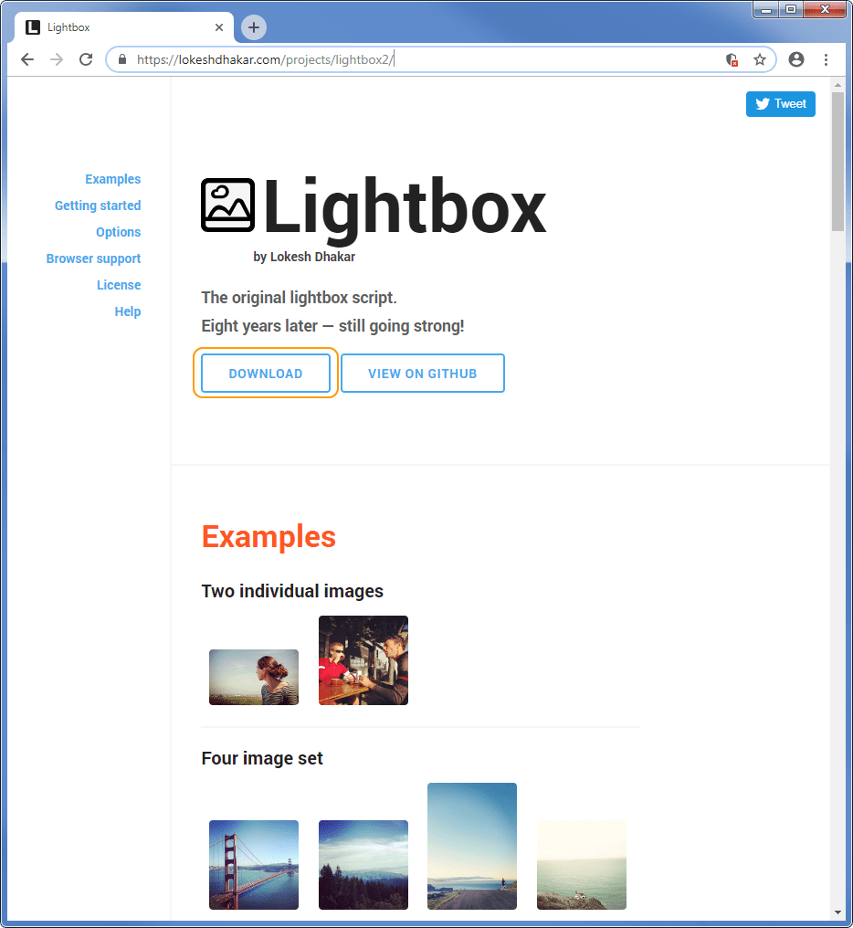
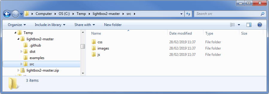
Figure 20.5 - Lightbox files in the web template folder structure
Figure 20.5   Lightbox files in the web template folder structure

20.1.1

Modifying the images

Easy bit first, the images. The images from the download look like this:

Figure 20.6 - Lightbox original images
Figure 20.6   Lightbox original images

The ones I use are:

Figure 20.7 - Lightbox modified images
Figure 20.7   Lightbox modified images

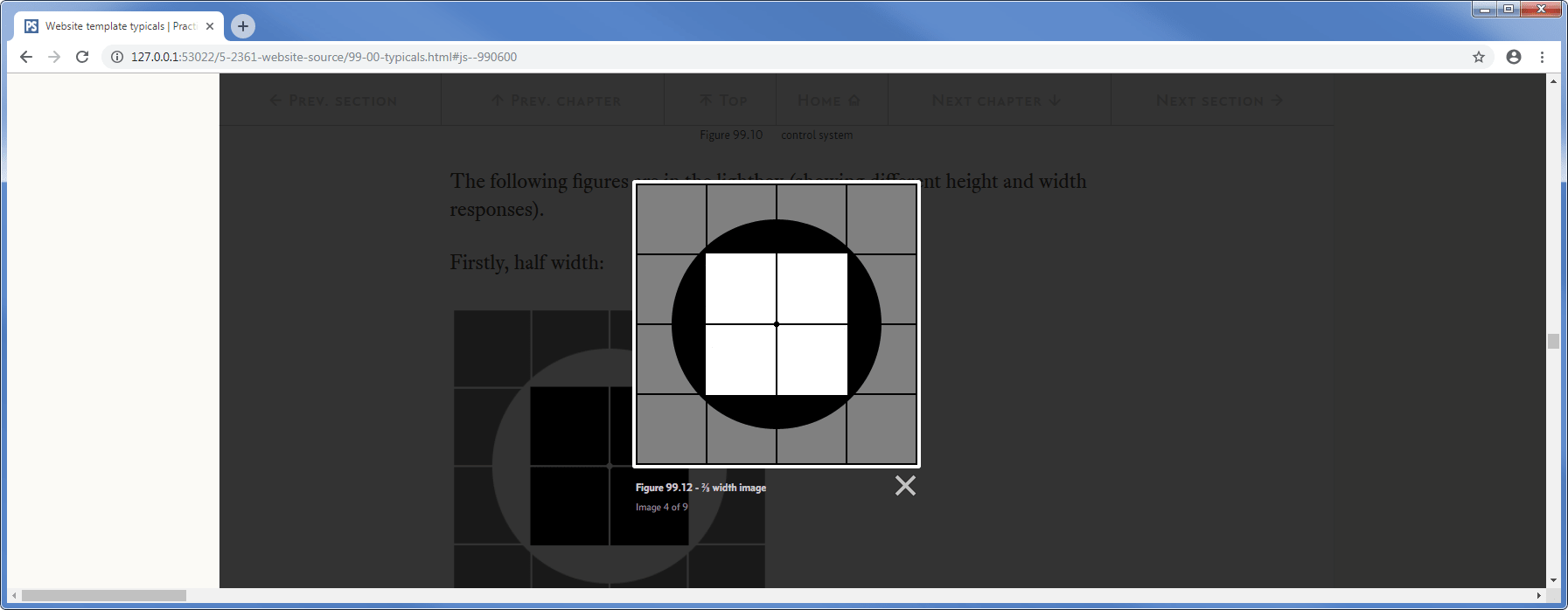
I’ve change the next and previous images. These images appear on top of the image in the lightbox to navigate through the images, I’ve highlighted two of them below:

Figure 20.8 - Lightbox images as they appear in a gallery
Figure 20.8   Lightbox images as they appear in a gallery

It doesn’t matter which you use, obviously I prefer the new ones (I wouldn’t have changed them otherwise), I changed them to make them more noticeable.

20.1.2

Modifying the CSS

The CSS file needs three types of modifications:

  1. Change the path and filename of the image files

  2. Change the fonts used to display the image captions (bottom of Figure 20.8)

  3. Change aspects of the classes to make them work with the relative positioning that is applied to the web page as a whole

I’ve included the whole CSS file below and indicated where I’ve changed things (in green):

lightbox.css
html.lb-disable-scrolling {
  overflow: hidden;
  /* Position fixed required for iOS. Putting overflow: hidden; on body not enough. */
  position: fixed;
  height: 100vh;
  width: 100vw;
}

.lightboxOverlay {
  position: fixed;                      /* MG CHANGED - WAS ABSOLUTE */
  top: 0;
  left: 0;
  z-index: 9999;
  background-color: black;
  filter: progid:DXImageTransform.Microsoft.Alpha(Opacity=80);
  opacity: 0.8;
  display: none;
}

.lightbox {
  position: fixed;                      /* MG CHANGED - WAS ABSOLUTE */
  left: 0;
  top: 25px !important;                 /* MG ADDED - MAKES IMAGE VISIBLE */
  width: 100%;
  z-index: 10000;
  text-align: center;
  line-height: 0;
  font-weight: normal;
}

.lightbox .lb-image {
  display: block;
  height: auto;
  max-width: inherit;
  max-height: none;
  border-radius: 3px;

  /* Image border */
  border: 4px solid white;
}

.lightbox a img {
  border: none;
}
.lb-outerContainer {
  position: relative;
  *zoom: 1;
  width: 250px;
  height: 250px;
  margin: 0 auto;
  border-radius: 4px;

  /* Background color behind image.
     This is visible during transitions. */
  background-color: white;
}

.lb-outerContainer:after {
  content: "";
  display: table;
  clear: both;
}

.lb-loader {
  position: absolute;
  top: 43%;
  left: 0;
  height: 25%;
  width: 100%;
  text-align: center;
  line-height: 0;
}

.lb-cancel {
  display: block;
  width: 32px;
  height: 32px;
  margin: 0 auto;
  background: url(01-css-images/lightbox/lb-loading.gif) no-repeat; 
                                /* MG CHANGED - PATH AND NAME */
}

.lb-nav {
  position: absolute;
  top: 0;
  left: 0;
  height: 100%;
  width: 100%;
  z-index: 10;
}

.lb-container > .nav {
  left: 0;
}

.lb-nav a {
  outline: none;
  background-image: url('data:image/gif;base64,R0lGODlhAQABAPAAAP///wAAACH5BAEAAAAALAAAAAABAAEAAAICRAEAOw==');
}

.lb-prev, .lb-next {
  height: 100%;
  cursor: pointer;
  display: block;
}

.lb-nav a.lb-prev {
  width: 34%;
  left: 0;
  float: left;
  background: url(01-css-images/lightbox/lb-prev.png) left 48% no-repeat;   
/* MG CHANGED - PATH AND NAME */   filter: progid:DXImageTransform.Microsoft.Alpha(Opacity=0);   opacity: 0;   -webkit-transition: opacity 0.6s;   -moz-transition: opacity 0.6s;   -o-transition: opacity 0.6s;   transition: opacity 0.6s; } .lb-nav a.lb-prev:hover {   filter: progid:DXImageTransform.Microsoft.Alpha(Opacity=100);   opacity: 1; } .lb-nav a.lb-next {   width: 64%;   right: 0;   float: right;   background: url(01-css-images/lightbox/lb-next.png) right 48% no-repeat; 
/* MG CHANGED - PATH AND NAME */   filter: progid:DXImageTransform.Microsoft.Alpha(Opacity=0);   opacity: 0;   -webkit-transition: opacity 0.6s;   -moz-transition: opacity 0.6s;   -o-transition: opacity 0.6s;   transition: opacity 0.6s; } .lb-nav a.lb-next:hover {   filter: progid:DXImageTransform.Microsoft.Alpha(Opacity=100);   opacity: 1; } .lb-dataContainer {   margin: 0 auto;   padding-top: 5px;   *zoom: 1;   width: 100%;   border-bottom-left-radius: 4px;   border-bottom-right-radius: 4px; } .lb-dataContainer:after {   content: "";   display: table;   clear: both; } .lb-data {   padding: 0 4px;   color: #ccc; } .lb-data .lb-details {   font-family: "conc-t4-b";              /* MG ADDED - USES PS FONTS */    width: 85%;   float: left;   text-align: left;   line-height: 1.1em; } .lb-data .lb-caption {   font-family: "conc-t4-b";              /* MG ADDED - USES PS FONTS */    font-size: 13px;   font-weight: bold;   line-height: 1em; } .lb-data .lb-caption a {   font-family: "conc-t4-b";              /* MG ADDED - USES PS FONTS */    color: #4ae; } .lb-data .lb-number {   display: block;   clear: left;   padding-bottom: 1em;   font-family: "conc-t4-r";              /* MG ADDED - USES PS FONTS */    font-size: 12px;   color: #999999; } .lb-data .lb-close {   display: block;   float: right;   width: 30px;   height: 30px;   background: url(01-css-images/lightbox/lb-close.png) top right no-repeat; 
/* MG CHANGED - PATH AND NAME */   text-align: right;   outline: none;   filter: progid:DXImageTransform.Microsoft.Alpha(Opacity=70);   opacity: 0.7;   -webkit-transition: opacity 0.2s;   -moz-transition: opacity 0.2s;   -o-transition: opacity 0.2s;   transition: opacity 0.2s; } .lb-data .lb-close:hover {   cursor: pointer;   filter: progid:DXImageTransform.Microsoft.Alpha(Opacity=100);   opacity: 1; }
Code 20.1   Lightbox modified CSS

The most important changes are in the classes lightboxOverlay and lightbox:

I’ve shown how it has changed; I deleted the red lines and added the green:

.lightboxOverlay {
  position: absolute;
  position: fixed;                      /* MG CHANGED - WAS ABSOLUTE */
  top: 0;
  left: 0;
  z-index: 9999;
  background-color: black;
  filter: progid:DXImageTransform.Microsoft.Alpha(Opacity=80);
  opacity: 0.8;
  display: none;
}

.lightbox {
  position: absolute;
  position: fixed;                      /* MG CHANGED - WAS ABSOLUTE */
  left: 0;
  top: 25px !important;                 /* MG ADDED - MAKES IMAGE VISIBLE */
  width: 100%;
  z-index: 10000;
  text-align: center;
  line-height: 0;
  font-weight: normal;
}

I’ve switched it from absolute to fixed, the reason for this is that the absolute position is relative to the parent container and in this case it is ultimately the body element. The body element is centred in the web page (it has cream coloured bars either side § 7.4.3. The lightbox class originally had an absolute position of top: 0; left: 0; this put it at the top left corner of the body element and on a wide screen it shifted the image over to the right, it lined up with the left edge of the body area rather than being centred on the screen.

It looked like this (there is a cream coloured bar on the left):

Figure 20.9 - Lightbox with absolute addressing
Figure 20.9   Lightbox with absolute addressing

By changing to position: fixed, I made the lightbox image be positioned relative to the view port (i.e. the browser window) rather than the body element. I did this in two places: the lightboxOverlay class and lightbox class, one positions the semi-transparent grey background and the other the image itself.

I also moved the image to the right position with the top property

  top: 25px !important;           /* MG ADDED - MAKES IMAGE VISIBLE */ 

If you are wondering why I used the !important instruction, it is because I just couldn’t get it to work without. Something was obviously overwriting the property and I couldn’t figure it out (it’s hard when it’s somebody else’s code). In the end I decided to be brutal and used the !important nuclear option.

The other changes are all either changing the path to the images and the image filename, there were four of these, one for each image.

I also changed the fonts used at various point to the Concourse font again there were four of these.

20.1.3

Modifications to the .js file

This is easy, there aren’t any, just leave it as it is.


End flourish image