23

23Landing page differences

23.3

The title and cover image

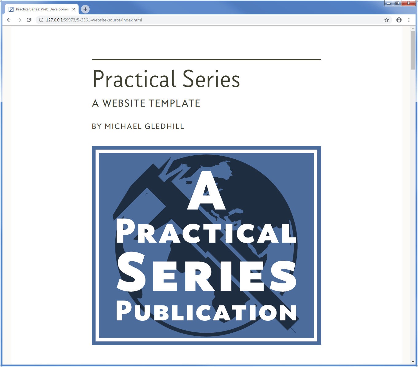
The web page title and cover image look like this:

Figure 23.3 - Landing page title and cover image
Figure 23.3   Landing page title and cover image

You probably don’t need me to tell you how this works, but I’ll run through it anyway.

First the HTML for the title and cover image:

landing page (index.html) title and cover image HTML
<!-- ********************************************************************** [WP TITLE]
     COVER IMAGE
     *******************************************************************-->

<div class="rg-row">                                <!-- Start of cover row -->
    <div class="rg-col rg-span1-5"></div>           <!-- Left col not used -->
    <div class="rg-col rg-span3-5">                 <!-- Start of Cover area column -->
        <div class="cover-overline"></div>          <!-- Overline bar -->
        <div class="cover-title">                   <!-- Start of cover title area -->
            <h1>Practical Series</h1>               <!-- Main title -->
            <h2>A website template</h2>             <!-- Subtitle -->
            <h3>by Michael Gledhill</h3>            <!-- Author -->
        </div>                                      <!-- End of cover title area -->
        <figure class="cover-fig">                  <!-- Start of cover figure -->
        <img src="01-pages/00-00-index/02-images/fig-00.svg" alt="cover logo">
        </figure>                                   <!-- End of cover figure -->
    </div>                                          <!-- End of cover area -->
    <div class="rg-col rg-span1-5"></div>           <!-- Right col not used -->
</div>                                              <!-- End of cover row -->
<!-- ====================================================================== [WP END] -->

Code 23.4   Landing page title and cover image HTML

There are a few classes to go with it:

landing page (index.html) title and cover image css
.cover-overline{                            /* creates a line above the cover titles */
    margin-top: 4rem;
    margin-bottom: 0.5rem;
    border-top: 4px solid #404030; }
}
.cover-title h1 {                           /* format h1 - MAIN TITLE */
    font-family: "conc-t3-r";
    font-feature-settings: "ss02";
    font-size: 340%;
    margin: 0 0 0.4rem 0;
}
.cover-title h2,
.cover-title h3,
.cover-title h4 {
    font-family: "conc-t4-r";
    font-feature-settings: "ss02";
    text-transform: uppercase;
    letter-spacing: 0.086rem;
}
.cover-title h2 {                           /* format h2 - SUB TITLE */
    font-size: 140%;
    line-height: 140%;
    margin: 0 0 1.5rem 0;
}
.cover-title h3 {                           /* format h3 - AUTHOR */
    font-size: 110%;
    margin: 0 0 0.4rem 0;
}
.cover-title h4 {                           /* format h4 - OPTIONAL DESCRIPTION */
    font-size: 104%;
    margin: 0 0 0rem 0;
}
.cover-fig {                                /* holder for cover image */
    width: 100%;
    margin: 2rem auto;
    padding: 0;
}
.cover-fig img {width: 100%;}               /* format cover image */
Code 23.5   Landing page title and cover image CSS

The whole thing starts with a standard rg-row, complete with two empty sidebars rg-span1-5. The same thing used in all the sections (§ 10.3).

The title lives in the central area:

<div class="rg-col rg-span3-5">

The title starts with an over-line, in this case cover-overline:

.cover-overline{
    margin-top: 4rem;
    margin-bottom: 0.5rem;
    border-top: 4px solid #404030; }
}

This is a four pixel high line the same colour as the text #404030, there is a reasonable amount of whitespace above it and some below to separate it from the following title text.

The over-line is followed by a div that contains the words of the title:

<div class="cover-title">           <!-- Start of cover title area -->
    <h1>Practical Series</h1>       <!-- Main title -->
    <h2>A website template</h2>     <!-- Subtitle -->
    <h3>by Michael Gledhill</h3>    <!-- Author -->
    <h4>Optional line</h3>          <!-- Optional line -->
</div>                              <!-- End of cover title area -->

The title itself has four components each with its own heading level:

Heading level Purpose Appearance
<h1> Main title 82 px Concourse t3 font
<h2> Subtitle 34 px Concourse t4 font all caps
<h3> Author 26 px Concourse t4 font all caps
<h4> Optional title line 25 px Concourse t4 font all caps
Table 23.1   Landing page heading levels

The height in pixels is at the maximum screen width.

All four headings have this appearance:

Figure 23.4 - Landing page titles
Figure 23.4   Landing page titles

The heading div has the class cover-title and the CSS sets the font properties for each heading. I won’t go through all the CSS, it is the basic font, font-size and spacing that we’ve used everywhere.

The final thing is the image, the landing page is the only page that has one of these. Think of it as the cover photograph on a book. The HTML is very straight forward:

<figure class="cover-fig">                  <!-- Start of cover figure -->
    <img src="01-pages/00-00-index/02-images/fig-00.svg" alt="cover logo">
</figure>                                   <!-- End of cover figure -->

It is a basic image (not a Lightbox image) in a figure element with the class cover-fig:

.cover-fig {                                /* holder for cover image */
    width: 100%;
    margin: 2rem auto;
    padding: 0;
}
.cover-fig img {width: 100%;}               /* format cover image */

The cover-fig class doesn’t do much, it adds some whitespace at the top to separate it from the heading text, it makes sure the figure spans the central column and makes sure the image it contains does the same.

23.3.1

Titles, responsive elements

Each of the title heading levels (Table 23.1) is responsive by default; they are all linked to the underlying HTML point size. However, I have made some of the headings quite large in relation to this base point size and that can distort things a bit, this is particularly evident if the heading is almost as wide as the central column area.

I noticed that for wide headings, the heading sometimes split onto two lines as the browser window narrowed (again this is just the rounding calculations as the screen narrows), I didn’t want this so I added some additional responsive @media rules for the headings:

Landing page title responsive CSS
@media all {.cover-title h1 { font-size: 340%; } .cover-title h2 { font-size: 140%; } 
.cover-title h3 { font-size: 110%; }} @media all and (max-width:1290px) {.cover-title h1 { font-size: 327%; }
.cover-title h2 { font-size: 134%; } .cover-title h3 { font-size: 105%; }} @media all and (max-width:1240px) {.cover-title h1 { font-size: 316%; }
.cover-title h2 { font-size: 129%; } .cover-title h3 { font-size: 101%; }} @media all and (max-width:1200px) {.cover-title h1 { font-size: 305%; }
.cover-title h2 { font-size: 124%; } .cover-title h3 { font-size: 97%; }} @media all and (max-width:1160px) {.cover-title h1 { font-size: 294%; }
.cover-title h2 { font-size: 119%; } .cover-title h3 { font-size: 94%; }} @media all and (max-width:1120px) {.cover-title h1 { font-size: 284%; }
.cover-title h2 { font-size: 114%; } .cover-title h3 { font-size: 89%; }} @media all and (max-width:1080px) {.cover-title h1 { font-size: 273%; }
.cover-title h2 { font-size: 109%; } .cover-title h3 { font-size: 85%; }} @media all and (max-width:1040px) {.cover-title h1 { font-size: 262%; }
.cover-title h2 { font-size: 104%; } .cover-title h3 { font-size: 81%; }} @media all and (max-width:1000px) {.cover-title h1 { font-size: 251%; }
.cover-title h2 { font-size: 99%; } .cover-title h3 { font-size: 77%; }} @media all and (max-width:960px)  {.cover-title h1 { font-size: 252%; }
.cover-title h2 { font-size: 99%; } .cover-title h3 { font-size: 77%; }} @media all and (max-width:920px)  {.cover-title h1 { font-size: 251%; }
.cover-title h2 { font-size: 99%; } .cover-title h3 { font-size: 77%; }} @media all and (max-width:880px)  {.cover-title h1 { font-size: 251%; }
.cover-title h2 { font-size: 99%; } .cover-title h3 { font-size: 77%; }} @media all and (max-width:840px)  {.cover-title h1 { font-size: 251%; }
.cover-title h2 { font-size: 99%; } .cover-title h3 { font-size: 77%; }} @media all and (max-width:800px)  {.cover-title h1 { font-size: 251%; }
.cover-title h2 { font-size: 99%; } .cover-title h3 { font-size: 77%; }} @media all and (max-width:760px)  {.cover-title h1 { font-size: 250%; }
.cover-title h2 { font-size: 99%; } .cover-title h3 { font-size: 77%; }} @media all and (max-width:720px)  {.cover-title h1 { font-size: 250%; }
.cover-title h2 { font-size: 98%; } .cover-title h3 { font-size: 76%; }} @media all and (max-width:680px)  {.cover-title h1 { font-size: 249%; }
.cover-title h2 { font-size: 98%; } .cover-title h3 { font-size: 76%; }} @media all and (max-width:640px)  {.cover-title h1 { font-size: 249%; }
.cover-title h2 { font-size: 98%; } .cover-title h3 { font-size: 76%; }} @media all and (max-width:600px)  {.cover-title h1 { font-size: 248%; }
.cover-title h2 { font-size: 98%; } .cover-title h3 { font-size: 76%; }} @media all and (max-width:560px)  {.cover-title h1 { font-size: 248%; }
.cover-title h2 { font-size: 98%; } .cover-title h3 { font-size: 76%; }} @media all and (max-width:520px)  {.cover-title h1 { font-size: 340%; }
.cover-title h2 { font-size: 140%; } .cover-title h3 { font-size: 110%; }}
Code 23.6   Landing page title responsive CSS

These responsive elements provide additional adjustments to the h1, h2 and h3 font-sizes at the standard breakpoints, they have been tuned (by eye) to make a full width heading remain as a single line as the browser width reduces.

The h4 heading, did not need any adjusting, the underlying responsiveness was adequate to keep a full h4 line as it should be.


End flourish image