Tables and Footnotes
Tables are old school html, they have been around for a long time, I think they were introduced in HTML 2.0 and that came out in 1995 — that’s older than one of my daughters — the weird second one, worryingly, she’s a policewoman now. Here she is, with the favourite son:
Tables have remained pretty much unchanged ever since they were introduced.
With the advent of HTML 5 and CSS 3 there came the CSS grid layout and flexbox arrangements; these are both harder to understand than tables and can be a bit too flexible (things can move unexpectedly and without warning). I am absolutely sure that it is good practice to use CSS grids and flexboxes in the normal course of developing websites (they can act as responsive elements by themselves, collapsing in the way the responsive rg-rows do on this website); however, they are not what I want here.
I really just want a simple table that looks and acts just like the tables you get in Word; i.e. it has individually configurable cells in a predefined number of rows and columns that all stay where they are in relation to each other.
In other words — just a simple table.
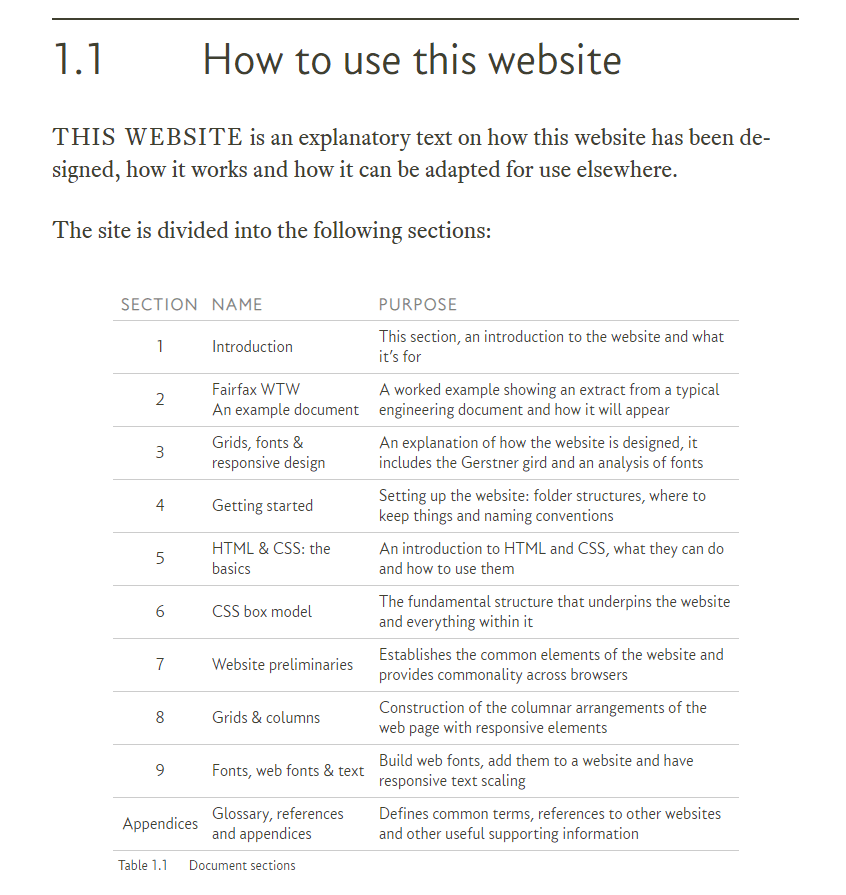
The following is an image of a typical table from the website:
Tables are used to summarise information in a concise way, and while part of the body text, are distinct from it and are easily recognisable.
Tables are a very useful way of communicating with the reader and their use is encouraged.
| The software |
|---|
|
The explanations and instructions used in this section are based around the deployable web site software; i.e. it uses the template pages for the HTML and the final versions of style.css, grid.css and other files issued with the website template software. The website template software is available here. |


