14
We haven’t looked at tables before in any context so let’s get a basic idea of how they look and how they work.
Tables are defined with the <table>...</table> element. Each row of a table is enclosed in <tr>...</tr> elements and these are stacked one on top of the other. Within a given row, each cell is enclosed in either <th>...</th> tags or <td>...</td> tags.
The <th> tags contain a single cell that acts as a header (table header is what it stands for) or label for the column. The <td> tags (table data) are standard cells within a table that contain some information.
Look at the following table, this is a very similar to a table in Word:
mileage | birmingham | liverpool | london | manchester | newcastle |
---|---|---|---|---|---|
birmingham | 0 | 113 | 126 | 221 | 146 |
liverpool | 113 | 0 | 221 | 34 | 174 |
london | 126 | 221 | 0 | 209 | 283 |
manchester | 87 | 34 | 209 | 0 | 145 |
newcastle | 146 | 174 | 283 | 145 | 0 |
This table has 6 rows and each row has 6 cells (it’s a 6×6 table). The top row is acting as a header for each of the columns and the first cell in each row is also a header.
At the most basic level, the HTML it would be constructed as follows:
If we were to build this very basic table, the HTML behind it would be:
<table> <tr> <th>Mileage</th><th>Birmingham</th><th>Liverpool</th><th>London</th><th>Manchester</th><th>Newcastle</th> </tr> <tr> <th>Birmingham</th><td>0</td><td>113</td><td>126</td><td>87</td><td>146</td> </tr> <tr> <th>Liverpool</th><td>0113</td><td>0</td><td>221</td><td>34</td><td>174</td> </tr> <tr> <th>London</th><td>126</td><td>221</td><td>0</td><td>209</td><td>283</td> </tr> <tr> <th>Manchester</th><td>87</td><td>34</td><td>209</td><td>0</td><td>145</td> </tr> <tr> <th>Newcastle</th><td>146</td><td>174</td><td>283</td><td>145</td><td>0</td> </tr> </table>
And it looks like this (it’s not much to write home about):
Mileage | Birmingham | Liverpool | London | Manchester | Newcastle |
---|---|---|---|---|---|
Birmingham | 0 | 113 | 126 | 87 | 146 |
Liverpool | 0113 | 0 | 221 | 34 | 174 |
London | 126 | 221 | 0 | 209 | 283 |
Manchester | 87 | 34 | 209 | 0 | 145 |
Newcastle | 146 | 174 | 283 | 145 | 0 |
Although it’s very basic, you can see that with a bit of tidying up it will do what we want of it.
There are a few of things to note:
Firstly, the table has been drawn without borders; this wasn’t always the case, in earlier browsers and version of HTML, tables were drawn with borders by default.
Secondly, there is a difference between entries contained within <th> elements, these are in a bold font and those in a <td> element, these are in a regular font.
Thirdly, all the rows have exactly the same number of cells (six in this case).
Now this last point isn’t an absolute rule, different numbers of cells within different rows is perfectly valid in terms of the HTML; it will just shuffle the cells up next to each other and leave a gap at the end of the row.
However, having different number of cells in different rows is really confusing to work with, so there is a rule as far as we are concerned:
the Gledhill rule for tables |
---|
Always have the same number of cells on each row within a table |
Sometimes it is necessary to merge two or more cells and there are techniques for doing this that I cover later in the section. When defining the table layout always start with the same number of cells per row.
There are also some problems with this table: it’s not very even, the cells are not all the same width, the column with London at the top is narrower than the one with Birmingham.
The centring of entries within a cell is inconsistent, some are centred within the cell (the city name in the column on the left are centred) and some are left justified (the ones with the numbers).
That said, tables are very easy to understand, the following explains the basic construction of any table within the HTML:
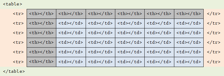
The entire table is contained within a <table>...</table> element:
<table> </table>
Each row within the table is contained within <tr>...</tr> elements (for 3 rows, there are 3 <tr> elements):
<table> <tr> <!-- Row 1 --> </tr> <tr> <!-- Row 2 --> </tr> <tr> <!-- Row 3 --> </tr> </table>
Within each row there are a fixed number of cells. These cells can be any mixture of <th> or <td> cells, generally, the first row of a table is usually a title row, giving the names or purpose of the columns, a title row will use <th> (table heading) elements and the data contained in the remaining rows will be in <td> (table data) elements. Again, this is not a hard and fast rule, in the table above; the first cell in each row is also a title and would be a <th> element.
Let’s assume we want each row to have 2 cells and that the first row is a heading row. Now we would have:
<table> <tr> <!-- Row 1 --> <th>Col 1 Heading</th> <th>Col 2 Heading</th> </tr> <tr> <!-- Row 2 --> </tr> <tr> <!-- Row 3 --> </tr> </table>
Let’s populate the rest of the table listing the row and column position of the cell:
<table> <tr> <!-- Row 1 --> <th>Col 1 Heading</th> <th>Col 2 Heading</th> </tr> <tr> <!-- Row 2 --> <td>R2C1</td> <td>R2C2</td> </tr> <tr> <!-- Row 3 --> <td>R3C1</td> <td>R3C2</td> </tr> </table>
This would give us the following:
Col 1 Heading | Col 2 Heading |
---|---|
R2C1 | R2C2 |
R3C1 | R3C2 |
You can see how it works. It’s straight forward. Declare a table with <table> put in however many rows you want, each with a <tr> element and then add the same number of cells to each row with either <th> or <td> elements.
Let’s add a border to the cells:
<table> <tr> <!-- Row 1 --> <th style="border: 1px solid black">Col 1 Heading</th> <th style="border: 1px solid black">Col 2 Heading</th> </tr> <tr> <!-- Row 2 --> <td style="border: 1px solid black">R2C1</td> <td style="border: 1px solid black">R2C2</td> </tr> <tr> <!-- Row 3 --> <td style="border: 1px solid black">R3C1</td> <td style="border: 1px solid black">R3C2</td> </tr> </table>
I’ve add a border to all four sides of each cell with the style attribute. Now we get:
Col 1 Heading | Col 2 Heading |
---|---|
R2C1 | R2C2 |
R3C1 | R3C2 |
Hmm, not really what I want; it has literally drawn a box around each cell and left a small gap between them. My first thought when I saw this was that’s stupid — and I haven’t changed my mind.
Don’t worry, someone else obviously that it was stupid too, and added another declaration that can sort it out, it’s called border collapse and it can be applied to the whole table:
<table style="border-collapse: collapse">
This collapses the borders between cells into single border.
It looks like this:
Col 1 Heading | Col 2 Heading |
---|---|
R2C1 | R2C2 |
R3C1 | R3C2 |
It looks how you would expect it to look; the property that puts it back how it was is border-collapse: separate.
So what else can we do, well we can change the cell size:
Let’s make the columns wider by setting a width property:
<table style=" border-collapse: collapse”> <tr> <!-- Row 1 --> <th style="border: 1px solid black; width: 30%">Col 1 Heading</th> <th style="border: 1px solid black; width: 30%">Col 2 Heading</th> </tr> <tr> <!-- Row 2 --> <td style="border: 1px solid black">R2C1</td> <td style="border: 1px solid black">R2C2</td> </tr> <tr> <!-- Row 3 --> <td style="border: 1px solid black">R3C1</td> <td style="border: 1px solid black">R3C2</td> </tr> </table>
This gives:
Col 1 Heading | Col 2 Heading |
---|---|
R2C1 | R2C2 |
R3C1 | R3C2 |
Ok, I’ve set the width of the cells in the first row and this has change the width of all the cells below this. Why?
Well, a column of cells in a table is always set to the width of the widest cell in the column; you could see this in the previous examples where the cells in each row had been set to match the width of the cell with the widest text content (the text in the first row in all the previous cases).
In the above example, setting a cell width to 30% makes it wider than the content of any of the cells; it wouldn’t have mattered if I’d made the row 2 cells 30% wide, the thing would look exactly the same.
This is useful, it means we only have to set the cell width for a single cell in each column, all the other cells will automatically adopt the same setting. For clarity, I always set the cell width in the first row of a table.
And again, as with most things here, I occasionally break this rule.
Like column widths, the row defaults to the height of the highest cell within the row; in this example all the cells have text that is the same height, hence all the rows are the same height adding a height declaration to any cell within a row will make the whole row that height:
<table style="border-collapse:collapse; text-align: center"> <tr> <!-- Row 1 --> <th style="border: 1px solid black; width: 30%">Col 1 Heading</th> <th style="border: 1px solid black; width: 30%">Col 2 Heading</th> </tr> <tr> <!-- Row 2 --> <td style="border: 1px solid black; height: 100px">R2C1</td> <td style="border: 1px solid black">R2C2</td> </tr> <tr> <!-- Row 3 --> <td style="border: 1px solid black; height: 100px ">R3C1</td> <td style="border: 1px solid black">R3C2</td> </tr> </table>
Col 1 Heading | Col 2 Heading |
---|---|
R2C1 | R2C2 |
R3C1 | R3C2 |
The heading cells, by default, centre any text within them, data cells left justify text.
It is perfectly easy to align text to the left, right or centre of a cell with the standard CSS text-align property. The following centres all the text in every cell:
<table style="border-collapse:collapse; text-align: center"> <tr> <!-- Row 1 --> <th style="border: 1px solid black; width: 30%">Col 1 Heading</th> <th style="border: 1px solid black; width: 30%">Col 2 Heading</th> </tr> <tr> <!-- Row 2 --> <td style="border: 1px solid black">R2C1</td> <td style="border: 1px solid black">R2C2</td> </tr> <tr> <!-- Row 3 --> <td style="border: 1px solid black">R3C1</td> <td style="border: 1px solid black">R3C2</td> </tr> </table>
Col 1 Heading | Col 2 Heading |
---|---|
R2C1 | R2C2 |
R3C1 | R3C2 |
Individual cells can also have unique text alignments, here I’ve centred everything and then right justified the R3C3 cell:
<table style="border-collapse:collapse; text-align: center"> <tr> <!-- Row 1 --> <th style="border: 1px solid black; width: 30%">Col 1 Heading</th> <th style="border: 1px solid black; width: 30%">Col 2 Heading</th> </tr> <tr> <!-- Row 2 --> <td style="border: 1px solid black">R2C1</td> <td style="border: 1px solid black">R2C2</td> </tr> <tr> <!-- Row 3 --> <td style="border: 1px solid black">R3C1</td> <td style="border: 1px solid black; text-align: right">R3C2</td> </tr> </table>
Giving:
Col 1 Heading | Col 2 Heading |
---|---|
R2C1 | R2C2 |
R3C1 | R3C2 |
To align cells vertically, use vertical-align instead of text-align, the values for this property are (amongst others), top, bottom and middle.
Cells can be merged either horizontally or vertically (or both); by making a cell span either more than one column (horizontal merge) or more than one row (vertical merge).
Let’s start by merging horizontally, this uses the colspan property; let’s make the R3C1 cell span two columns:
<table style="border-collapse:collapse; text-align: center"> <tr> <!-- Row 1 --> <th style="border: 1px solid black; width: 30%">Col 1 Heading</th> <th style="border: 1px solid black; width: 30%">Col 2 Heading</th> </tr> <tr> <!-- Row 2 --> <td style="border: 1px solid black">R2C1</td> <td style="border: 1px solid black">R2C2</td> </tr> <tr> <!-- Row 3 --> <td colspan="2" style="border: 1px solid black">R3C1</td> </tr> </table>
It looks like this:
Col 1 Heading | Col 2 Heading |
---|---|
R2C1 | R2C2 |
R3C1 |
I’ve had to do two things here:
First add the colspan="2" attribute to the cell I that I want to span more than one column.
Second I have to remove the cell or cells that are being overwritten, here I’ve added the colspan to the R3C1 cell <td> element as an attribute. I’ve also removed the R3C2 cell completely.
If I didn’t remove the R3C2 cell I would get this:
Col 1 Heading | Col 2 Heading | |
---|---|---|
R2C1 | R2C2 | |
R3C1 | R3C2 |
Yeah, remember to delete the merged cell.
Go back to the original code (with four cells), this time we’ll merge R2C2 (almost a robot in a film) with R3C2.
This time it is a rowspan attribute:
<table style="border-collapse:collapse; text-align: center"> <tr> <!-- Row 1 --> <th style="border: 1px solid black; width: 30%">Col 1 Heading</th> <th style="border: 1px solid black; width: 30%">Col 2 Heading</th> </tr> <tr> <!-- Row 2 --> <td style="border: 1px solid black">R2C1</td> <td rowspan="2" style="border: 1px solid black">R2C2</td> </tr> <tr> <!-- Row 3 --> <td style="border: 1px solid black">R3C1</td> </tr> </table>
Col 1 Heading | Col 2 Heading |
---|---|
R2C1 | R2C2 |
R3C1 |
Guess what happens:
Ok, I think that covers the basics, let’s look at the Practical Series tables.