I explained in § 1.3 that I’m not distributing the Equity fonts with the downloadable version of the this website (mainly because I don’t think I’m allowed to under the terms of my font licence). I’m replacing them with open source fonts.
Open source fonts are essentially fonts that are free to use and distribute (and in some cases even modify). The fonts I’ve chosen are also free for commercial use (I’m not even sure this is a commercial website — I certainly haven’t made any money from it).
google fonts seems to be what everyone thinks of when mentioning open source fonts; but it isn’t the only source. Some of the fonts I’m using are available on Google fonts, but not all. I actually downloaded them from font squirrel (the same site I used to convert the Equity fonts to web fonts), this does have all the font I need.
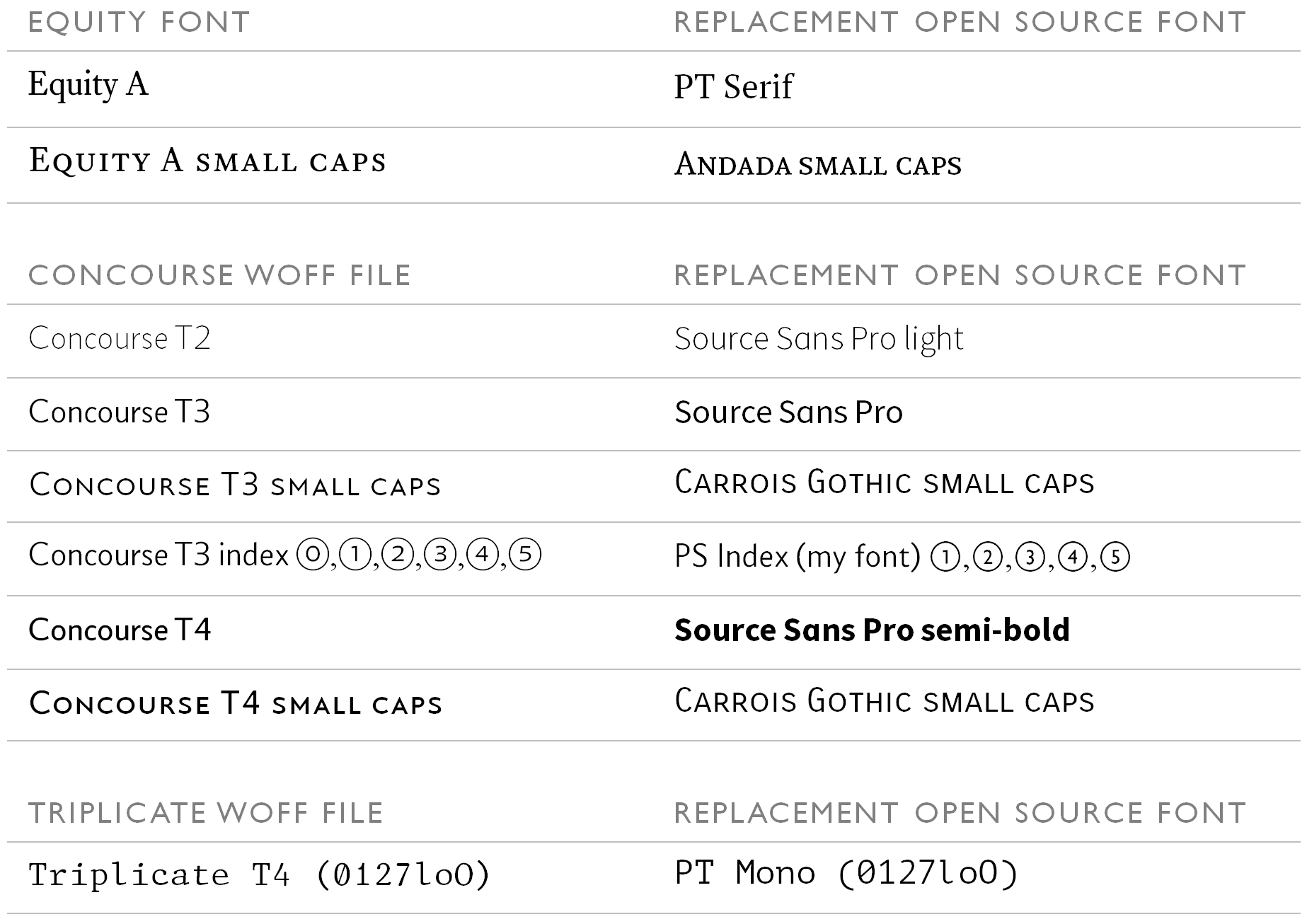
I’m using the following fonts in place of the listed Equity fonts:
Table 9.3 Open source replacements for the equity fonts
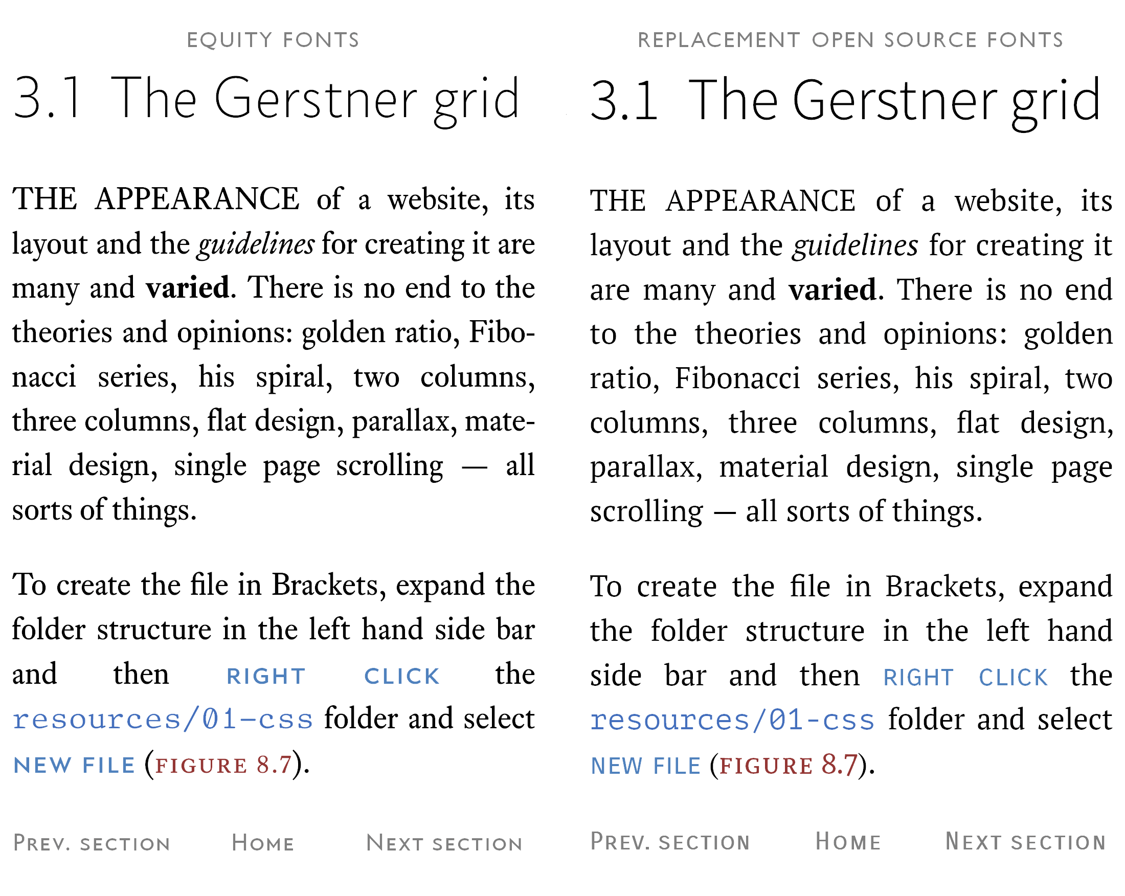
They look like this:
Figure 9.13 Equity fonts with replacement open source fonts
You’re probably wondering why I picked these fonts. The answer is that they’re the best I could find. They’re ok, but I did have to do a bit of tweaking with point size, letter spacing and line spacing to get them to look anywhere near decent.
The PT Serif font (the main body text) is, in its natural state, a bit big. I reduced the font-size by 10% (0.1 rem) on the website (ironically, this gets it nearer to the Gerstner grid point size). I also reduced the line spacing to match the Equity line spacing — surprisingly these changes greatly improve the appearance.
The open source small caps fonts (Andada and Carrois) are definitely the weak points, and I don’t like having that many different fonts in one place; however, small caps open source fonts are few and far between and these are the best available†1.
†1
I like the idea of open source fonts, the problem is they’re not really good enough — I don’t mean that from an appearance point of view, I mean it from a completeness point of view. It’s possible to find decent open source fonts, but they have restrictions: they only come in one weight, they don’t have all the styles (bold italic &c.) they don’t have a full set of features (small caps &c.).
I’m thinking about making my own set of fonts and then I don’t have to worry about it — how hard can it be? Watch this space — I’ll let you know how I get on. One thing is for sure, I won’t be using FontForge.
9.4.1
Where to get open source fonts?
Well this is easy; I’ve already said I got them from Font Squirrel. I think most of them are available from Google fonts; however, I’m recommending Font Squirrel because all the fonts I want are available there and they’re pretty easy to download.
I’ll take you through it. Let’s start with the main body text PT Serif.
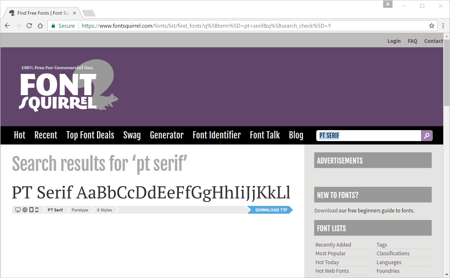
Go to the Font Squirrel website and type the font name (PT Serif) into the search box:
Figure 9.14 Font Squirrel search
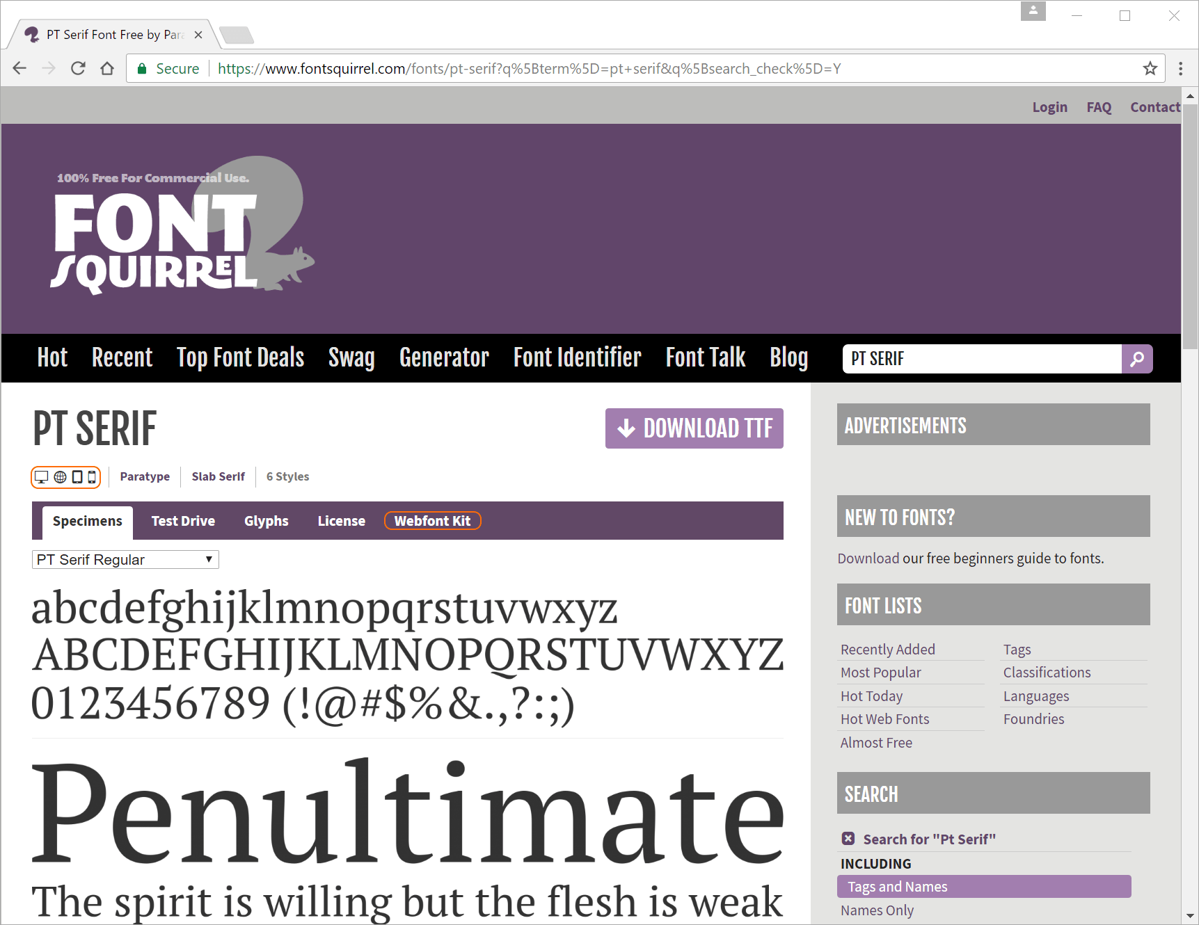
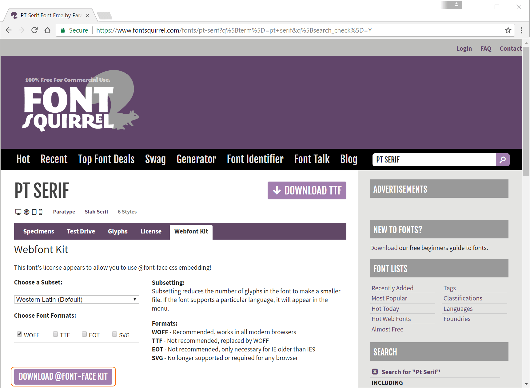
Now click where it says PT Serif AaBbCc... to open the font example page (Figure 9.15)
Figure 9.15 PT Serif page
There are a couple of things here, the first is the type of licence, the row of icons (I’ve highlighted them in orange) under PT SERIF is a basic indication of where you can use the font:
symbol
meaning
Commercial Desktop Use — Create commercial graphics and documents
@font-face Embedding — Embed the font in your websites with CSS
E-books and PDFs — Embed font in eBooks and portable documents
Applications — Embed font in applications and software
Table 9.4 Font Squirrel licencing icons
We want to use it with @font-face embedding in the website; so the second one (let’s call it the world) is the one for us.
The licencing symbols don’t give the full story; it’s best to check the actual licence itself (click the Licence button). All the open source fonts here, with the exception of PT Serif are available under the SIL Open Font License v1.10.
PT Serif has its own licence (Paratype PT Sans Free Font License v1.00).
Both licences allow the fonts to be freely used pretty much anywhere — the fonts can even be modified. There are restrictions: you can’t sell the fonts in their own right, use the author’s name to endorse your products &c. But for our purposes we can use the fonts on the website, and from my point of view I’m allowed to redistribute them — ok, so I’m not going to hell yet (well, maybe for other stuff, but not for this).
Now the main font page (Figure 9.15) has a big download button to download ttf versions of the font. Ideally we want WOFF and for the PT Serif font this is easy (less so for the others) click the webfont kit button (highlighted). This gives the webfont kit page Figure 9.16:
Figure 9.16 PT Serif webfont download
Guess what’s next. The default options are ok; I only want WOFF files, the subset Western Latin also seems to be ok. So hit the download @font-face kit button (highlighted). This will deliver a file called pt-serif-fontfacekit.zip.
If you unzip the file you will have a folder called web fonts; within this are six subfolders, one for each of the six font styles. If you look in any of these folders you will find a WOFF file, these are the files we need (but we only need four of them, don’t bother with the ptserifcaption folders)
The files needed are:
original file
renamed file
font and style
PTF55F-webfont.woff
pser-ta-r.woff
PT Serif — regular
PTF75F-webfont.woff
pser-ta-b.woff
PT Serif — bold
PTF56F-webfont.woff
pser-ta-i.woff
PT Serif — italic
PTF76F-webfont.woff
pser-ta-bi.woff
PT Serif — bold, italic
Table 9.5 PT Serif font files and renamed files
Again I’ve renamed the fonts following my convention (§ 9.2).
And that’s it, these are the Equity replacements.
The remaining fonts are all under the SIL Open Font Licence and these are a bit different to the PT Serif font. Let’s take the next main font (the replacement for Concourse) Source Sans Pro.
The process start off in the same way, type Source Sans Pro into the Font Squirrel search box and you will get Figure 9.17:
Figure 9.17 Source Sans Pro page
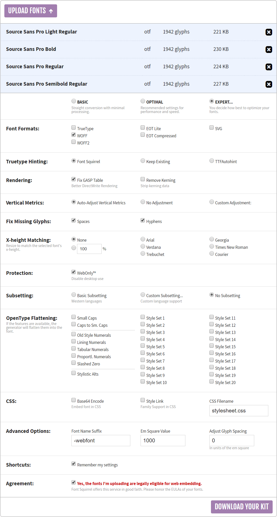
This time if you look on the webfont kit page, you will find that, due to some awkward naming requirement, the web fonts are not available; however, it does say we can make our own using the same Font Squirrel font generator we used in § 9.2 — the process is exactly the same too.
In this case we will download the OTF version of the font (some of the remaining fonts are OTF, some are TTF — just depends on the font). To do this click the download otf button. Again this will produce a zip file, this time called source-sans-pro.zip; this will contain several files, we only need four:
original file
renamed file
font and style
SourceSansPro-Light.otf
ssan-t2-r.otf
Source San Pro — light
SourceSansPro-Regular.otf
ssan-t3-r.otf
Source San Pro — regular
SourceSansPro-Bold.otf
ssan-t3-b.otf
Source San Pro — bold
SourceSansPro-Semibold.otf
ssan-t4-r.otf
Source San Pro — semi-bold
Table 9.6 Source San Pro files and renamed files
Again I’ve renamed the four files (as shown). Copy these files to a working directory.
Next thing is to convert the OTF files to WOFF files using the font generator.
Click the generator button on the Font Squirrel page. Upload the four font files in exactly the same way we did for the Equity fonts (§ 9.2). Use exactly the same options (Figure 9.6). It should all look like Figure 9.18.
Once the fonts are uploaded (they will show the font names rather than the file names), press the download your kit button to again get a zip file of the converted fonts (again, just like § 9.2).
Figure 9.18 Source Sans Pro conversion to WOFF
This conversion took about 9 minutes for some reason.
This again gives a zip file (webfontkit-20...zip), extract it and this has the WOFF files we need, this time they pretty much have the name we want, just edit the WOFF file name and takeout –webfont this will give the names specified below:
renamed file
font and style
ssan-t2-r.otf
Source San Pro — light
ssan-t3-r.otf
Source San Pro — regular
ssan-t3-b.otf
Source San Pro — bold
ssan-t4-r.otf
Source San Pro — semi-bold
Table 9.7 Source San Pro files WOFF files
We’re going to repeat this process for the remaining fonts (these have to be downloaded as TTF and OTF files and converted to WOFF files just like Source San Pro).
Using Font Squirrel in a repeat of the Source San Pro procedure, download the fonts Carrois Gothic, Andada and PT Mono.
Rename the following files according to Table 9.8:
original file
renamed file
font and style
AndadaSC-Regular.otf
anda-ca-r.otf
Andada — small caps, regular
CarroisGothicSC-Regular.ttf
carr-c3-r.ttf
Carrois Gothic — small caps
PTM55FT.ttf
pmon-t4-r.ttf
PT Mono — regular
Table 9.8 Remaining font files and renamed files
Andada is an OTF file and this is converted in exactly the same way as Source San Pro, use exactly the same options in the Font Generator.
The Carrois and PT Mono are TTF fonts, when converting these font to WOFF files, the em square value in advanced options should be set to 2048 (TTF fonts use an em square of 2048 units, OTF font use one of 1000 units).
Convert the fonts and you should have a complete set that we can use to replace the equity fonts. The complete set of WOFF files you should have is:
renamed file
font and style
pser-ta-r.woff
PT Serif — regular
pser-ta-b.woff
PT Serif — bold
pser-ta-i.woff
PT Serif — italic
pser-ta-bi.woff
PT Serif — bold, italic
ssan-t2-r.woff
Source San Pro — light
ssan-t3-r.woff
Source San Pro — regular
ssan-t3-b.woff
Source San Pro — bold
ssan-t4-r.woff
Source San Pro — semi-bold
carr-c3-r.woff
Carrois Gothic — small caps
anda-ca-r.woff
Andada — small caps, regular
pmon-t4-r.woff
PT Mono — regular
Table 9.9 Open source WOFF files
9.4.2
Replacing the Equity fonts with open source fonts
Table 9.3 broadly lists the Equity fonts and the open source fonts used to replace them in the downloadable version of the website; here I list each specific Equity WOFF file and the open source WOFF file used to replace it.
equity woff file
replacement open source file
eqty-ta-r.woff
pser-ta-r.woff
eqty-ta-b.woff
pser-ta-b.woff
eqty-ta-i.woff
pser-ta-i.woff
eqty-ta-bi.woff
pser-ta-bi.woff
eqty-ca-r.woff
anda-ca-r.woff
concourse woff file
replacement open source file
conc-t2-r.woff
ssan-t2-r.woff
conc-t3-r.woff
ssan-t3-r.woff
conc-t3-b.woff
ssan-t3-b.woff
conc-t4-r.woff
ssan-t4-r.woff
conc-c3-r.woff
carr-c3-r.woff
conc-c4-r.woff
carr-c3-r.woff
conc-i3-r.woff
ps-index.woff
triplicate woff file
replacement open source file
trip-t4-r.woff
pmon-t4-r.woff
Table 9.10 Equity WOFF files and replacement open source WOFF files
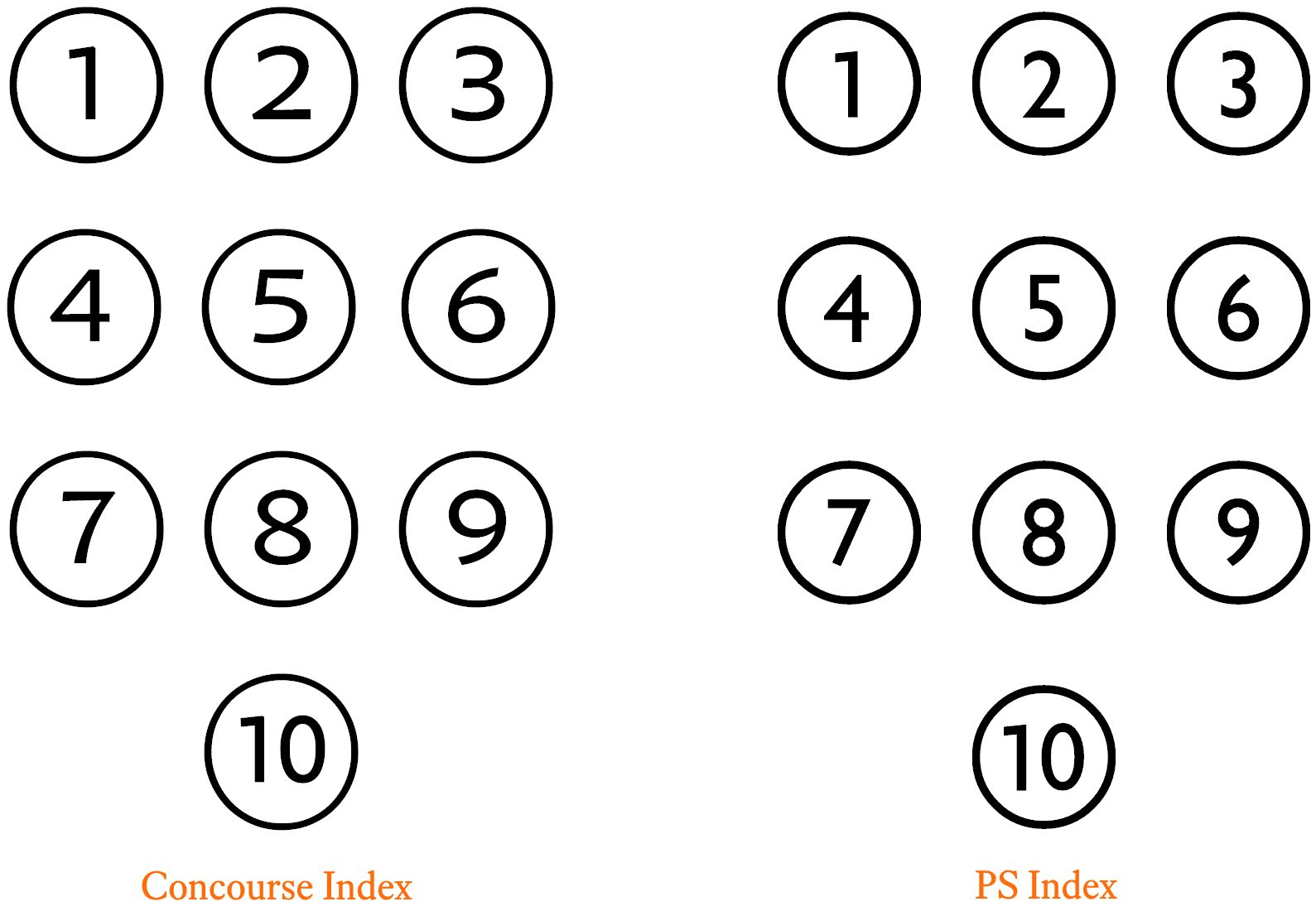
There is one WOFF file listed there that you haven’t got yet ps-index, this is one I made. It replaces the Concourse Index font. It looks like this, Figure 9.19.
Figure 9.19 A comparison of Concourse Index and PS Index
Well, it’s not brilliant and it has some restrictions, but it works (after a fashion) and I couldn’t really find a suitable open source font†2. Hence PS Index.
There are some, but they tend to map the numbers to odd keys on the keyboard (QWERTY) for example. Now at the time (I know better now); I didn’t know how to remap the characters and associated keys — so I came up with my own.
9.4.3
A small confession
After all that I’ve said in the previous sections, I’m going to suggest that you use the downloadable version of Source Sans Pro on the website (rather than getting it from Font Squirrel), the reason is I’ve modified it — just a little bit — It’s the old saying, a little knowledge is a dangerous thing. I know how to modify a font now, and the temptation to fix things that weren’t broken in the first place is compelling†3. This is what I’ve done; I change how the Source Sans Pro number 1 looks, it looked like this:
After I’d modified it, it looked like this:
I took the bottom bar off — I thought it looked nicer — I think I’m allowed to modify the font under the licence — hope so.
Download the full set of open source WOFF files here a
†3
There is an old engineering adage: “If it’s not necessary to mend it, it’s necessary not to mend it”. Or as they say more colloquially in America, “If it ain’t broke, don’t fix it”.