9
Finally, the PS fonts (Practical Series fonts). Now unfortunately, these are fonts that I made myself — and I’m sorry, they’re not very good — please feel free to use something else. For what they’re worth, you are welcome to use them however you want.
What I can tell you is that making a font is quite difficult — especially when you’re starting from scratch and know cock-all about it. It’s difficult partly because it’s a complicated process and you need to know a lot about it; and also because the font making programmes are neither intuitive nor easy to use (they could have been made by the people responsible for PhotoShop) — it took me a long time to figure out how to do it.
I made two fonts for the website, the first is a series of icons; the second is a numerical index font (numbers within circles). Looking at these in turn:
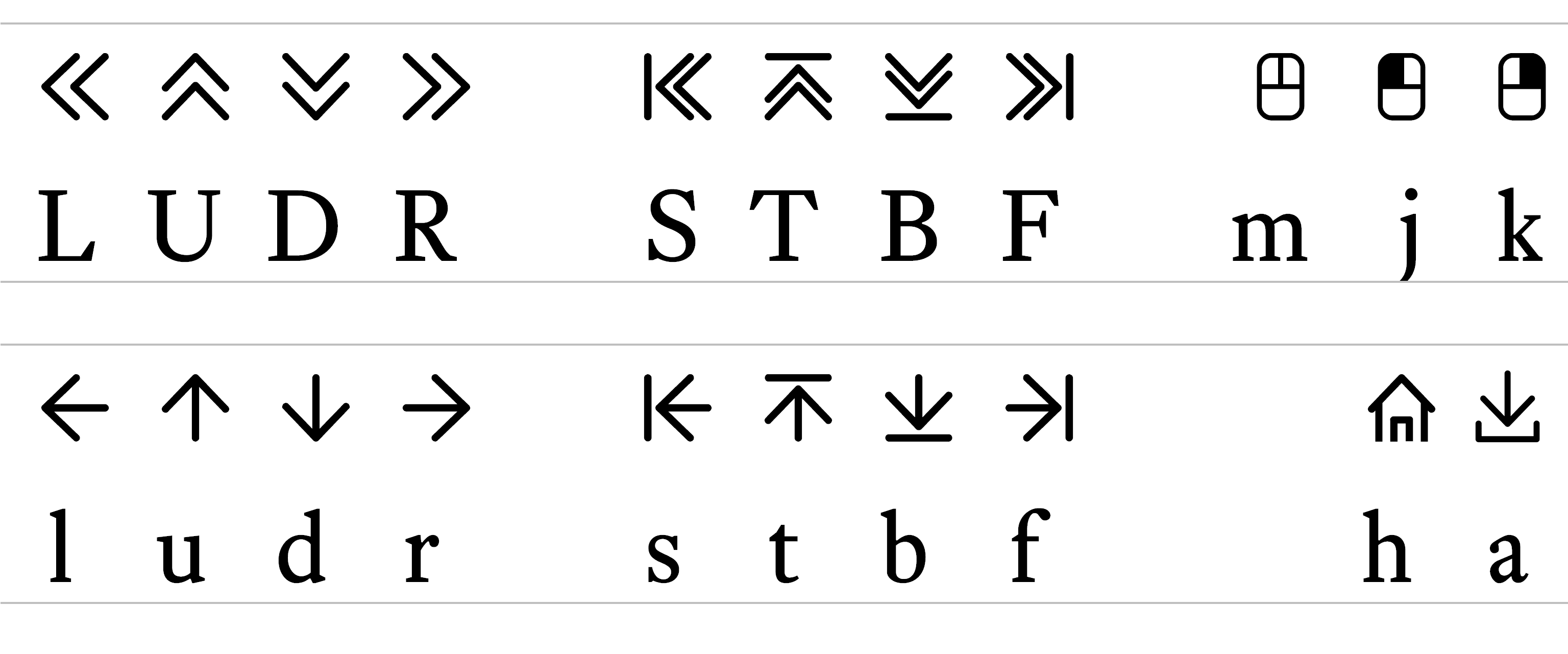
This font consists of some simple icons used for navigation. It has its own WOFF file (ps-icons.woff) and consists of the following characters:
The keys I assigned to the symbols are as follows (and this was my logic):
L/l U/u D/d R/r |
Left (uppercase - double arrow, lowercase - single arrow) Up Down Right |
|
S/s T/t B/b F/f |
Start Top Bottom Finish |
|
a h m j k |
Download (because the D was already taken) Home Mouse Left click (above and left of M key) Right click (above and right of M key) |
There are lots of Icon fonts out there that you can use instead — it’s not necessary to use mine (the ionicons site has some nice ones) — I made the font more as an exercise to see if I could rather than because I needed to.
This font is my own poor attempt to recreate Mr Butterick’s Concourse Index font: the numbers with a circle around them, like this:
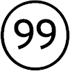
Now, Mr Butterick is a font designer and he does something clever — I’m guessing with ligatures — that allows double digit numbers to render all the way up to 99, if I type 99 in Concourse Index I get . See, clever.
Mr Butterick, I’m sure, knows this stuff backwards, but I don’t, I’m learning as I go along and this was a step too far. So I made an engineering decision to approximate what Mr Butterick did (I took a shortcut).
I don’t know how to make ligatures; but what I do know is that HTML lists (see section 12.3) that normally use numbers to indicate points: 1, 2, 3, 4 &c. can be changed to use uppercase (or lowercase) letters to indicate points: A, B, C, D, E, F...&c all the way to Z; then it starts with AA, AB &c. This gives me the option to define 26 list points and that is probably enough for most lists.
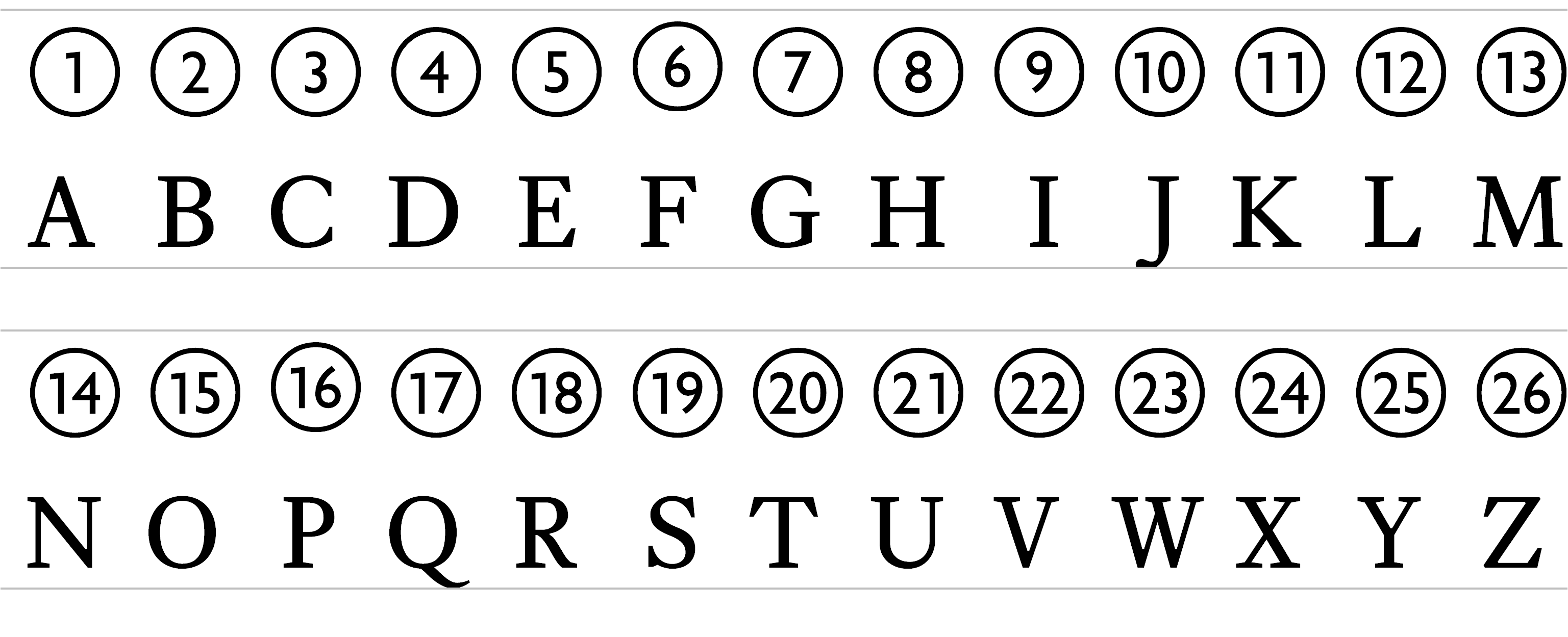
I created 26 characters (font designers call them glyphs) and mapped them to the following characters:
It means I can replicate to some extent the Concourse Index font. I also mapped the first nine glyphs (A-I) to the numbers 1-9, this means that a list will work as numbers for the first nine points. It actually works for zero too; i.e.:
Again, I make this font freely available. Use it if you want to. Get it here