12.3
The numbered list with the
PS-Index font
The numbered list in the previous section uses the index version of the Concourse font; it provides index numbers with a circular surround, like this:
1 2 3 4 5 6 7 8 9 10 11 12 13
If you are using the open source fonts supplied with the website (rather than the paid for Equity fonts), the chances are that you are using the PS-Index font that I made.
It looks like this:
A B C D E F G H I J K L M
I created 26 characters (font designers call them glyphs) and mapped them to the following characters:
| A | B | C | D | E | F | G | H | I | J | K | L | M | |
| A | B | C | D | E | F | G | H | I | J | K | L | M | |
| N | O | P | Q | R | S | T | U | V | W | X | Y | Z | |
| N | O | P | Q | R | S | T | U | V | W | X | Y | Z | |
| Table 12.1 PS Index, font characters | |||||||||||||
Side-by-side with the Concourse Index font it looks like this:
| Concourse | 1 | 2 | 3 | 4 | 5 | 6 | 7 | 8 | 9 | 10 | |
| PS-Index | A | B | C | D | E | F | G | H | I | J | |
Now the main difference is that the Concourse Index font is mapped to the numbers (with some clever jiggery-pokery when a double digit is entered).
My font is nowhere near as clever as that (I don’t know how ligatures work and I think that that is how the Concourse Index handles the double digits); I just mapped 26 index characters to the letters A to Z
Now you may be wondering how this helps with the numbered lists, these list use numbers (starting at 1 and going up to however many entries are in the list) so what’s the use of mapping the characters to the letters?
Well, numbered lists don’t have to use numbers, they can also use letters:
There are various options for this, in this case it is using uppercase letters, it could use lower case (a, b, c,…, &c.), Roman numerals (i, ii, iii, iv, v,…, &c.) and lots of other things. I want to use the uppercase letters option. This will use the letters starting with A, B, C, D,… and once it gets to Z, it will carry on with AA, AB, AC…&c.
You can probably see where this is going. If the list uses the letters A to Z in order and if I tell it to use a font where the A to Z characters are mapped to glyphs that go from A to Z then it will look just like the Concourse Index version (at least if you only have 26 list entries).
And that is just what I’ve done; in the open source font version, the PS-Index font is used in place of the Concourse Index font. The problem is to tell the list to use uppercase letter rather than numbers.
I do this at the end of the style.css file in the open source font version of that file; this is where I modify certain character styles to manipulate the open source fonts, making them look better.
It is actually very easy; I just add another property to the list-num class:
.list-num { list-style-type: upper-alpha; }
The list-style-type: upper-alpha tells the list to start with uppercase letters rather than numbers — and that’s all there is to it.
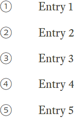
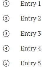
It looks like this:
Side-by-side they look like this:
- Again, the main restriction of the open source font version is that a numbered list can only have 26 entries.


