11.4
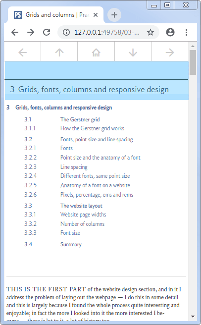
The chapter title bar
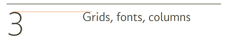
The chapter title is displayed at the top of each page within the chapter.
Here it is on the first two sections (web pages) for section 3 of the website
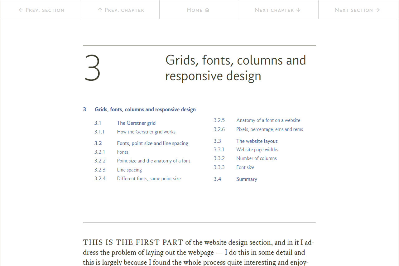
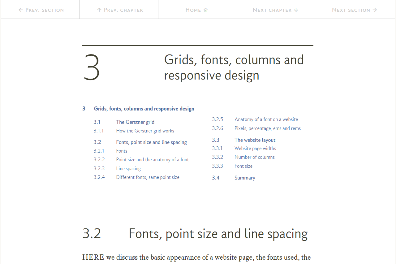
I’ve highlighted it in blue below:

Under normal circumstances the number is about twice the height of the title text; however, under responsive conditions, as the web page narrows, the number just becomes an inline part of the text (the big number is replaced with a small number that is the same height as the text):
You’ve probably got a very good idea of how to do this now, but for completeness I’ll run through it. If I’m boring you, skip to the next section: table of contents, that’ll keep you awake.
Again there is both HTML and CSS behind the title bar, HTML first:
<!-- ****************************************************************** [WP TITLE]
     TITLE BAR (Section number and text)
     ***************************************************************-->


    <div class="rg-row title-row">                      <!-- Start of title row       -->
        <div class="rg-col rg-span1-5"></div>           <!-- left column (not used)   -->
        <div class="rg-col rg-span3-5 title-centre">    <!-- Start of title           -->
            <div class="title-num-box"><p>3</p></div>
<div class="title-text-box"><h1><span class="title-small-num">3</span>Grids, fonts, columns and responsive design</h1></div>
        </div>                                          <!-- End of title             -->
        <div class="rg-col rg-span1-5"></div>           <!-- right column (not used)    -->
    </div>                                              <!-- End of title             -->
<!-- ======================================================================= [WP END] -->
And the CSS:
.title-row {                                /* container for whole row */
    margin-top: 3rem;
    margin-bottom: 1rem;
}

.title-centre {                             /* container for central column */
    border-top: 2px solid #404030;
}

.title-num-box {                            /* container for large number */
    display: inline-block;
    float: left;
    width: 33.3%;
    text-align: left;
    font-family: "conc-t2-r";
    font-feature-settings: "ss02";
    font-size: 500%;
    color: #404030;
}

.title-text-box {                           /* container for heading text */
    display: inline-block;
    float: left;
    width: 66.6%;
    font-family: "conc-t3-r";
    font-feature-settings: "ss02";
    font-size: 190%;
    line-height: 110%;
    padding-top: 2.6%;
    padding-left:2%;
    color: #404030
}

.title-small-num { display: none; }         /* span for small number */
Ok, let’s work our way through it.
The first thing in the HTML is a standard rg-row, this is to be expected, it is a normal row within the web page:
<div class="rg-row title-row">
As well as the rg-row class, it also has a title-row class; this last class simply adds a big margin above (creating whitespace between the title bar and the navigation bar), 3 rem (72 px on a full width page) and a smaller 1 rem gap below — easy:
.title-row {                                /* container for whole row */
    margin-top: 3rem;
    margin-bottom: 1rem;
}
Next (in the HTML) is an empty left column, the left and right columns are not used in the title bar:
<div class="rg-col rg-span1-5"></div>
And now we have the central area that holds the title bar proper:
<div class="rg-col rg-span3-5 title-centre">
Again this is a standard central column with classes: rg-col and rg-span3-5, just like any other central area column.
It also has the class title-centre, all this class does is put a border above the number and text:
.title-centre {                             /* container for central column */
    border-top: 2px solid #404030;
}
It is a two pixel high solid row in the same colour as the body text: #404030; and that is all it does.
The next two HTML lines are the only interesting thing with the title, here they are:
<div class="title-num-box"><p>3</p></div>
<div class="title-text-box"><h1><span class="title-small-num">3</span>Grids, fonts, columns and responsive design</h1></div>
The first line holds the large number and has the class title-num-box.
If you are wondering why there is a <p>...</p> element in there (and I must admit when I came back to write this bit up I couldn’t think for the life of me why), I’ve concluded that it’s because I’m an idiot. It’s not needed at all (leaving it in does no harm, it makes no difference), I think it’s there because this was one of the very first things I did and I was still learning, if I were doing it again I would leave it out — unfortunately it’s in on every page so I’ve left it.
The title-num-box class is fairly straight forward:
.title-num-box {                            /* container for large number */
    display: inline-block;
    float: left;
    width: 33.3%;
    text-align: left;
    font-family: "conc-t2-r";
    font-feature-settings: "ss02";
    font-size: 500%;
    color: #404030;
}
The number is in an inline-block that floats to the left side and is ⅓ of the central area wide:
    display: inline-block;
    float: left;
    width: 33.3%;
The rest of it sets up the text, it sets the text to the Concourse font with the British settings (ss02), the text is left aligned and is of the standard dark grey colour (#404030).
The font is set to 500% (big, 120 pixels on a full width page):
    text-align: left;
    font-family: "conc-t2-r";
    font-feature-settings: "ss02";
    font-size: 500%;
    color: #404030;
The second line of the HTML contains the text of the title:
<div class="title-text-box"><h1><span class="title-small-num">3</span>Grids, fonts, columns and responsive design</h1></div>
This is held in another <div> and this time it has the class title-text-box.
Within the <div>, everything is contained within a <h1> element, this makes sense, the <h1> entry on a page should hold the main title for the page; in this case it is the “Grids, fonts, columns and responsive design”. It also holds the chapter number (3 in this case); this is a repeat of the big number held in the title-num-box class above. In this case it is contained in a <span> element with class title-small-num.
Examining these classes in turn, title-text-box first, this is very similar to the title-num-box class and has the following:
.title-text-box {                           /* container for heading text */
    display: inline-block;
    float: left;
    width: 66.6%;
    font-family: "conc-t3-r";
    font-feature-settings: "ss02";
    font-size: 190%;
    line-height: 110%;
    padding-top: 2.6%;
    padding-left:2%;
    color: #404030
}
The text is in an inline-block that floats to the left side and is ⅔ of the central area wide:
    display: inline-block;
    float: left;
    width: 66.6%;
The rest of it sets up the text, it sets the text to the Concourse font with the British settings (ss02), the text is left aligned and is of the standard dark grey colour (#404030).
The font is set to 190% (45 pixels on a full width page):
    font-family: "conc-t3-r";
    font-feature-settings: "ss02";
    font-size: 190%;
    color: #404030
The rest of it just makes thing line up and look right:
    line-height: 110%;
    padding-top: 2.6%;
    padding-left:2%;
Firstly, the line height; the text may be too long for a single line (as in this case) and the line height has been set to 110%, this means that if the text runs onto two lines the baseline of the second line will exactly align with the bottom of the large number.
The padding top is set to 2.6%; this makes the top of the text align with the top of the big number. The left padding just ensures that there is always a gap between the big number and the title text. The effect of this is visible in the next figure:
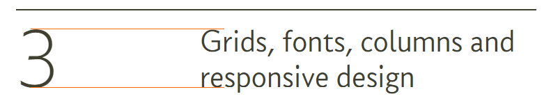
The padding and line height have been set to make things line up properly, if the text did not span two lines, the top of the ascenders would align with the top of the big number:
There is one more thing to this, the number 3 that is in the <span> with the class title-small-num is not visible and this is explained with the last bit of the CSS:
.title-small-num { display: none; } /* span for small number */
Under normal circumstances, the number that is in the <span> with the class title-small-num is set not to be displayed display: none and that’s why we can’t see it. I only want this to be visible at narrow screen widths and that is handled by the responsive components (next):
