11

11Headers, footers and basic navigation

11.3

The basic navigation bar

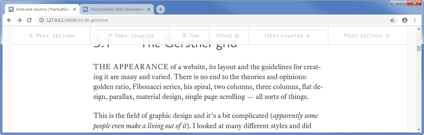
The navigation bar that I describe here is a simple navigation bar that is located at the very top of the web page (it is the first visible thing on the page). It has several buttons that allow navigation to the next or previous section, the next or previous chapter and back to the home (landing) page. You can see it at the top of Figure 11.14 below:

Figure 11.14 - Web page with navigation bar at the top
Figure 11.14   Web page with navigation bar at the top

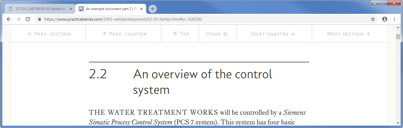
The problem with this type of navigation bar is that if you scroll down the page, the navigation bar disappears off the top. If you look at the section 3 page on the actual website (here) and scroll down (slowly), you will see that this is exactly what happens, it disappears off the top (Figure 11.15):

Figure 11.15 - Web page with navigation bar scrolled off the top
Figure 11.15   Web page with navigation bar scrolled off the top

But then, if you keep scrolling down it comes back again (with an extra button) and sits there at the top of the screen (Figure 11.16):

Figure 11.16 - Web page with “sticky” navigation bar
Figure 11.16   Web page with “sticky” navigation bar

This behaviour is called “sticky navigation” — I agree, it’s not the nicest description — and it’s achieved by manipulating the classes assigned to the navigation bar with JavaScript. Sticky navigation gets its own section (section 18). For the time being we will just have a navigation bar that disappears off the top of the page when we scroll down.

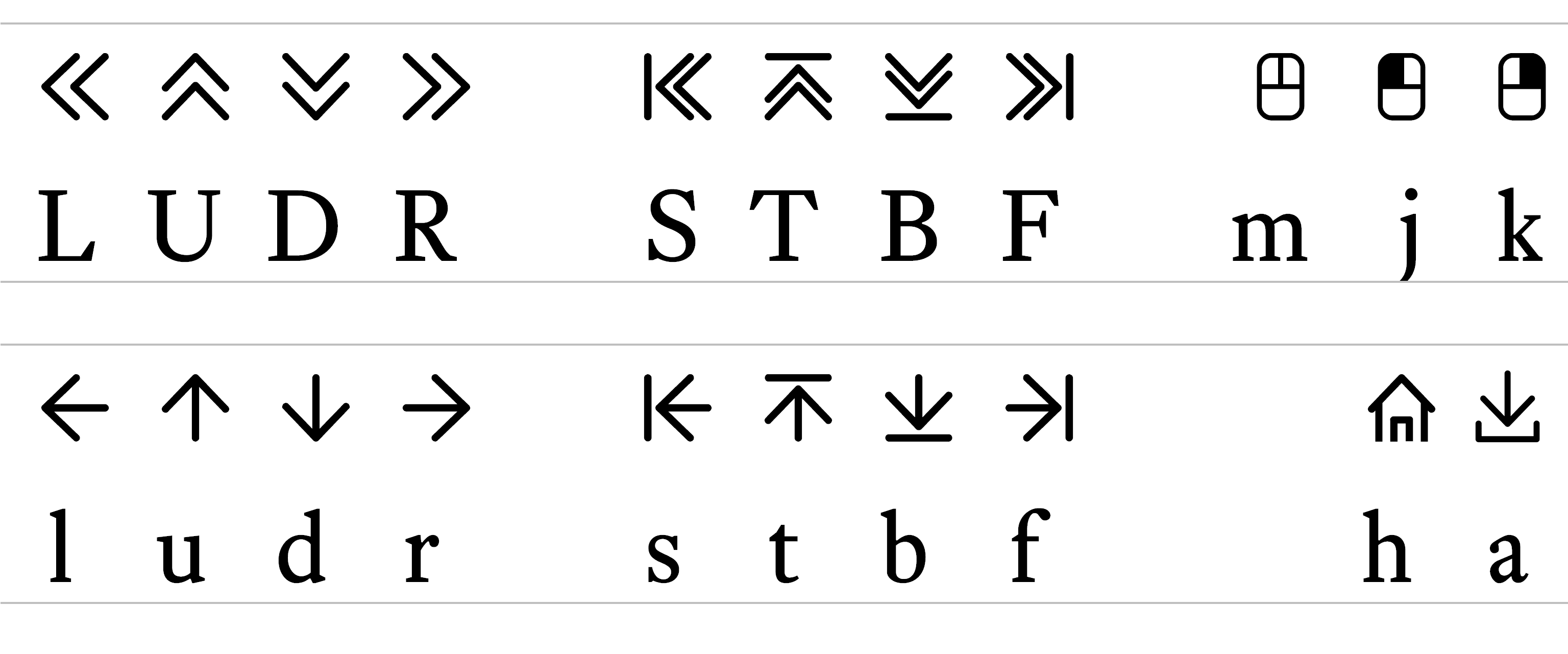
The navigation bar is also responsive, if you narrow the browser window, the text is eventually replaced with icons (my icons from the PS icons font, see § 9.6.1 — sorry, they’re not very good):

Figure 11.17 - Responsive navigation bar
Figure 11.17   Responsive navigation bar

I’m going to explain this navigation bar from the basic point of view where it appears at the top of the page and scrolls off the page as the browser scrolls down, it looks like Figure 11.14 and it has five buttons (in order from the left):

  1. Previous section

  2. Previous chapter

  3. Home (goes back to the landing page for the whole website)

  4. Next chapter

  5. Next section

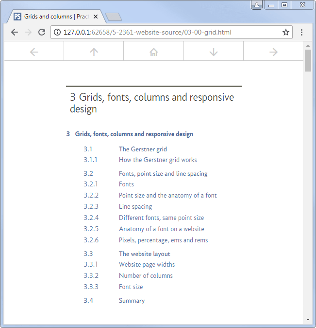
Later on, when we do the sticky navigation, there will be six buttons:

  1. Previous section

  2. Previous chapter

  3. Top (back to the top of the page))

  4. Home (goes back to the landing page for the whole website)

  5. Next chapter

  6. Next section

The two buttons in the middle (Top and Home) are half the width of a normal button, the difference is shown here:

Figure 11.18 - Basic navigation bar at top of page (five buttons)
Figure 11.18   Basic navigation bar at top of page (five buttons)
Figure 11.19 - Sticky navigation bar (six buttons)
Figure 11.19   Sticky navigation bar (six buttons)

This means that at some point that wide middle button gets replaced by two narrow buttons and the following code anticipates this (it’s why I’ve split things up as I have), don’t worry about it for the time being — it’s a sticky navigation problem and I explain that in section 18.

basic navigation bar html
<header id="js--000000">

<!-- ****************************************************************** [WP TOPNAV]
     TOP NAVIGATION (ABOVE CONTENTS LIST)
     ***************************************************************-->

<nav>                                               <!-- Start of top nav bar     -->
    <div class="top-nav">                           <!-- Start of top nav row     -->
        <div class="rg-row">                        <!-- Start of nav button row  -->
            <!-- Button 01 - Previous Section -->
<a class="nav-wide" href="02-02-fairfax.html#js--020200"><span class="top-nav-icon">l</span><span class="top-nav-text">Prev. section</span></a>
            <!-- Button 02 - Previous Chapter -->
<a class="nav-wide" href="02-00-fairfax.html#js--000000"><span class="top-nav-icon">u</span><span class="top-nav-text">Prev. chapter</span></a>
            <!-- Button 03 - Home wide (hidden when fixed nav activates) -->
<a class="nav-wide nav-home" href="index.html#js--000000"><span class="top-nav-text">Home</span><span class="top-nav-icon">h</span></a>
            <!-- Button 04 - Next Chapter -->
<a class="nav-wide" href="04-00-starting.html#js--000000"><span class="top-nav-text">Next chapter</span><span class="top-nav-icon">d</span></a>
            <!-- Button 05 - Next section -->
<a class="nav-wide" href="03-02-grid.html#js--030200"><span class="top-nav-text">Next section</span><span class="top-nav-icon">r</span></a>
        </div>                                      <!-- End of nav button row    -->
    </div>                                          <!-- End of top nav row       -->
</nav>                                              <!-- End of top nav bar       -->
<!-- ============================================================== [WP END]      -->

   ...
Code 11.7   HTML associated with the <nav> element

There are four basic CSS classes that go with this: top-nav, nav-wide, top-nav-text and top-nav-icon. The full CSS for this lot is shown below:

basic navigation bar css
.top-nav {                                  /* top-nav is the row holding the */
    max-width: 1276px;                      /* navigation areas               */
    margin: 0 auto;
    width: 100%;
    background-color: rgba(255, 255, 255, 1.0);
    color: #CCCCCC;
    font-family: "conc-c4-r";
    font-feature-settings: "ss02";
    font-size: 80%;
}

.nav-wide {                                 /* nav-wide navigation buttons */
    display: inline-block;
    float: left;
    height: 60px;
    padding-top: 18px;
    text-decoration: none;
    text-align: center;
    border-bottom: 1px solid #CCCCCC;
    border-right: 1px solid #CCCCCC;
}
.nav-wide { width: 20%; }                   /* nav-wide is 20% of top-nav */

.nav-wide:last-child { border-right: 0; }   /* remove right border on last area */

.nav-wide:link,                             /* navigation link options */
.nav-wide:visited {
    color: #cccccc;
    transition: background-color 0.2s, color 0.2s;
}
.nav-wide:hover,                            /* navigation hover options */
.nav-wide:active {
    color: #686868;
    background-color: #f8f8f8;
}

.top-nav-text { visibility: visible; }

.top-nav-icon {
    font-family: "icon-ps-r";
    margin-left: 5px;
    margin-right: 5px;
}
Code 11.8   CSS associated with the <nav> element classes

11.3.1

The navigation bar row containers

The first thing in the HTML is the <nav> declaration itself, simply:

<nav>

Then comes a <div> that effectively holds the navigation bar:

<div class="top-nav">

This <div> has the class top-nav and this holds the basic properties of the row that holds the navigation bar, it’s all fairly standard stuff:

.top-nav {                         /* top-nav is the row holding the */
    max-width: 1276px;             /* navigation areas               */
    margin: 0 auto;
    width: 100%;
    background-color: rgba(255, 255, 255, 1.0);
    color: #CCCCCC;
    font-family: "conc-c4-r";
    font-feature-settings: "ss02";
    font-size: 80%;
}

The maximum width is set to match the full page width (1276px), the top and bottom margins are set to zero and the left and right margins to auto to centre the <div> on the page.

The width is set to 100%, making the bar span the full width of the web page (or 1276px if the browser window is wider than this).

Next is the only oddball thing, the background-color, I’ve defined this using the rgba format that allows for transparency (although in this case I’ve set the transparency to 1.0 making it opaque), the background colour has been set to white (255, 255, 255).

I could just have easily set the background colour to white using: background-color: #fff, it would give identical results. The reason for using rgba is that it gives the option of using transparency and (when the sticky navigation is in place) allowing the text to appear behind the navigation bar, it’s a subtle effect, it looks like this:

Figure 11.20 - Transparency in the navigation bar
Figure 11.20   Transparency in the navigation bar

It’s up to you what you do, I’ve set my navigation bar to be opaque (the 1.0 at the end of the rgba property), Figure 11.20 has the transparency set to 0.9, any less than this and it gets confusing.

The rest of the CSS sets the text colour to a light grey (#cccccc), the font to Concourse with the British settings (ss02) and the font size to 80% (19.2 px if the browser window is 1276 pixels or more wide

Pretty straight forward.

The next line of the HTML declares another <div>, this time using a standard rg-row class:

<div class="rg-row">

This doesn’t actually change anything (the rg-row margins already match those specified in top-nav); however it does apply the clearfix hack (see §§ 6.4.1 and 8.3.1) and this is generally necessary with the inline blocks that we are about to use for the navigation buttons.

11.3.2

The navigation bar buttons

There are five of these and they all work in the same way, let’s look at the first one. The HTML is:

<!-- Button 01 - Previous Section -->
<a class="nav-wide" href="02-02-fairfax.html#js--020200"><span class="top-nav-icon">l</span><span class="top-nav-text">Prev. section</span></a>

This is just a link (anchor) element <a>...</a>, it looks a bit confusing though, there are a lot of classes in there, but it’s basically the same as that used in the first website (code 5.3) let’s take it apart.

The first bit <a class="nav-wide" href="02-02-fairfax.html#js--020200"> is just the opening tag of the <a> element, this time it has been given the class nav-wide (short for “navigation wide button”) and links to a page within my website 02-02-fairfax.html (I don’t have to specify the https:// at the start, if the http bit is missing it will look for the file in the same directory as the current HTML page).

The bit after this (#js--020200) is new. The # is the ID marker and the js-020200 is an ID marker setup within the sections (see here), it means that the navigation will go to a particular point on a web page (rather than the start), in this case it will open the web page 02-02-fairfax.html and will put the bit of the page (section) that has ID js--020200 at the top of the page in the web browser:

Figure 11.21 - Linking to a point on a page
Figure 11.21   Linking to a point on a page

I use this type of thing to go to exactly the right section on a web page.

Let’s look at the nav-wide class to see what this does, the first bit looks like this:

.nav-wide {                                 /* nav-wide navigation buttons */
    display: inline-block;
    float: left;
    height: 60px;
    padding-top: 18px;
    text-decoration: none;
    text-align: center;
    border-bottom: 1px solid #CCCCCC;
    border-right: 1px solid #CCCCCC;
}
.nav-wide { width: 20%; }                   /* nav-wide is 20% of top-nav */

.nav-wide:last-child { border-right: 0; }   /* remove right border on last area */

The nav-wide class is effectively a button that holds a link to some other part of the web site (in the case of the first button being looked at here, it is to the previous section which in this instance is section 2.2)

Each nav-wide link is simply a button in a row of buttons (five in this case) and we want all these to be in a single horizontal line with each button being to the right of the preceding button and if you remember from § 6.1.3 and § 6.4, the best way to do this is to make the element display as an inline-block and (in this case) make it float to the left (first two line of the class):

    display: inline-block;
    float: left;

The next line sets the height of the button; it is set to an absolute height of 60px

    height: 60px;

The padding line forces a gap above the link text; this pushes the text down to make it appear vertically centred in the box:

    padding-top: 18px;

Next I remove any text decoration (remember links have a default underline) and centre the link text horizontally in the button:

    text-decoration: none;
    text-align: center;

Finally I add a border to the bottom of the button and to the right edge:

    border-bottom: 1px solid #CCCCCC;
    border-right: 1px solid #CCCCCC;

Each border is 1 pixel wide and is a light grey. This gives a button that looks like this:

Figure 11.22 - Single nav-wide button
Figure 11.22   Single nav-wide button

Now this isn’t quite right, I want five equally sized buttons to span the top of the web page, the web page (at its maximum size) is 1276 pixels wide, for five equally sized buttons I want each button to be a fifth (20%) of this value i.e. 255 pixels; the button above is only 148 pixels wide and that is because it is just wide enough to hold the text within it. I haven’t told it to do anything else. That’s the next line:

.nav-wide { width: 20%; }

I’ve declared the nav-wide class again and added a width property (20%), I might be wondering why I’ve done this, I could just have added the width property to the previous group and I would have worked just as well.

The reason I’ve declared the width property as a separate item for the nav-wide class is to do with the sticky navigation (section 18), this has a narrow button as well as the wide ones discussed here and that narrow button has all the same properties as the wide button with the exception of the width property (this is different for the narrow button, it’s, er..., narrower). It just means I can add the narrow button class to the same list of properties.

Setting the nav-wide class width to 20% means the button is now the correct width.

The final thing here is the right border, I want a right border to separate each button from the one that follows, the exception is the last button, this does not have a right border. Hence I deactivate it with the child pseudo class (see § 8.3.4)

.nav-wide:last-child { border-right: 0; }

I turn off the right hand border on the last button (last-child) by giving it a width of 0.

Those of you who look closely will see that there is in fact a very thin and faint border to both the left and right edges of the first and last buttons (this is fainter than the borders specified for the buttons); this has nothing to do with the buttons themselves but is because the body element that sets the maximum web page width defines a left and right border for the page (see § 7.4.3).

The above defines the basic properties of the navigation bar buttons, the next bit is to do with manipulating the appearance of the link contained within the button.

The CSS looks like this:

.nav-wide:link,                             /* navigation link options */
.nav-wide:visited {
    color: #cccccc;
    transition: background-color 0.2s, color 0.2s;
}
.nav-wide:hover,                            /* navigation hover options */
.nav-wide:active {
    color: #686868;
    background-color: #f8f8f8;
}

It is the link, visited, hover and active pseudo classes we looked at in § 11.2.1.

I’ve already set the base background colour and text decoration properties for all nav-wide elements in the previous declarations; what I’m doing here is defining how the link changes when the mouse hovers over the link. The basic link looks like this (no mouse hovering):

Figure 11.23 - Navigation bar with no mouse hovering over a button
Figure 11.23   Navigation bar with no mouse hovering over a button

When the mouse hovers over a button it looks like this:

Figure 11.24 - Navigation bar with mouse over left most button
Figure 11.24   Navigation bar with mouse over left most button

The text is darker and the button background turns to a light grey. Moreover, these effects fade in over a short, but noticeable period.

It’s basically a copy of what we did in the previous section (§ 11.2.1).

I set the link and visited selectors to have a text colour of #cccccc:

    color: #cccccc;

I also set the transition conditions (it will change the background colour and text colour):

    transition: background-color 0.2s, color 0.2s;

The changes fade in over a period of 0.2s

The text colour changes from #cccccc to the colour specified for the hover and active pseudo classes (#686868). The background colour changes from whatever was specified in the nav-wide class (in this case white) to the hover/active colour (#f8f8f8):

    color: #686868;
    background-color: #f8f8f8;

That’s it for the nav-wide button and how it appears, now let’s look at the text that goes in the button.

11.3.3

The navigation bar link text

The link text is defined in the HTML:

<!-- Button 01 - Previous Section -->
<a class="nav-wide" href="02-02-fairfax.html#js--020200"><span class="top-nav-icon">l</span><span class="top-nav-text">Prev. section</span></a>

It’s the bit between the <a> and the </a> tags. For the first button it is:

<span class="top-nav-icon">l</span><span class="top-nav-text">Prev. section</span>

There are two bits to it: the first is the letter l (lower case L) in the class top-nav-icon and the second is the words Prev. section in the class top-nav-text.

If no <span> classes were present, the link text (for the first button) would look like this:

Figure 11.25 - Navigation button text without classes
Figure 11.25   Navigation button text without classes

It’s pretty much what you would expect, it says lPrev. section in the text style inherited from the top-nav class, Concourse small caps.

So, what’s the l for? You ask.

Well if you remember in § 9.6.1, I specified my own icon font (PS Icons) and this has various icons for forwards, backwards, up, home &c.

Table 11.1 - PS Icons, font characters
Table 11.1   PS Icons, font characters

Each character is mapped to a particular key; the left arrow (l) is mapped to the lower case L (l).

So now we go back to the CSS for the top-nav-icon class which is this:

.top-nav-icon {
    font-family: "icon-ps-r";
    margin-left: 5px;
    margin-right: 5px;
}

It sets the font to my icon font: icon-ps-r (it’s part of the website download), and adds a small margin to the left and right to space it from any preceding or following characters. It turns the l into a l.

Finally, the top-nav-text class. This doesn’t have much in it:

.top-nav-text { visibility: visible; }

It just makes sure the text is visible; this is to do with the sticky navigation section 18.

The reason it’s so empty is that all the properties it requires have already been defined elsewhere (specifically in top-nav). The only reason to have this class is for the responsive bit of the navigation bar (that’s in the next section).

All five buttons have the same format, the only differences being the text and the href link. The text is common to all pages (they all say prev. section, prev. chapter &c.), but the href links are unique to each web page and have to be set up for that page (each section has different previous and next sections &c.).

11.3.4

Making the basic navigation bar responsive

A lot of the responsive elements of the navigation bar, specifically the width and the text size are already responsive by virtue of the basic responsive properties setup for the html element (see § 10.1.1), there are however, one or two other things that have to be handled separately.

basic navigation bar responsive css
@media all {.nav-wide { height: 60px; }}
@media all and (max-width:1276px) {.nav-wide { height: 60px; padding-top: 18px; }}
@media all and (max-width:960px)  {.nav-wide { height: 57px; padding-top: 17px; }}
@media all and (max-width:920px)  {.nav-wide { height: 54px; padding-top: 16px; }}
@media all and (max-width:880px)  {.nav-wide { height: 54px; padding-top: 16px; }}
@media all and (max-width:840px)  {.nav-wide { height: 51px; padding-top: 15px; }}
@media all and (max-width:800px)  {.nav-wide { height: 50px; padding-top: 15px; }}
@media all and (max-width:760px)  {.nav-wide { height: 47px; padding-top: 14px; }}
@media all and (max-width:720px)  {.nav-wide { height: 44px; padding-top: 13px; }}
@media all and (max-width:680px)  {.nav-wide { height: 41px; padding-top: 12px; }}
@media all and (max-width:640px){
    .top-nav-text { display: none; }        /* hide text in navigation bar */
    .nav-wide { height: 40px; padding-top: 6px; font-size: 24px; }}
Code 11.9   Navigation bar responsive components

The majority of this just reduces the button height and the top padding for the text (keeping it centred in the button) as the screen narrows, the break points are the same as those for the body text (see § 10.1.1), but they only go down as far as a screen width of 640 px (instead of 520 px).

The reason is that at 640 px I get rid of the text in the buttons and just have the icons. This is all contained in the following declaration:

@media all and (max-width:640px){

The first thing that happens at this screen width is the text disappears. This is handled by the line:

    .top-nav-text { display: none; }

The text in the navigation bar buttons is of class top-nav-text and at screen resolutions of 640 px or less, the display property is set to none.

We have used the display property before (§ 10.4), setting it to none simply stops the object being displayed on the web page (it is as if the text wasn’t there at all). This single line removes all the text from the buttons, just leaving the PS Icons. This is the only reason for putting the text in the top-nav-text class, just so it can be hidden below a certain screen resolution.

The only other thing is a house keeping exercise:

nav-wide { height: 40px; padding-top: 6px; font-size: 24px; }}

This fixes the height of the navigation buttons (they don’t change below 640 px), the padding keeping things vertically centred and at point size of the icons.

That’s it a responsive, if basic, navigation bar.


End flourish image