8

8Grids & columns

8.3

Building the responsive grid CSS file

The first thing to do is create the grid.css file. The grid.css file is a file that we are creating for the website (it is not a third party file) and so it will live in the 11-resources folder; and since it is a CSS file it will be stored in the 01-CSS subfolder — this is the same place as style.css.

To create the file in Brackets, expand the folder structure in the left hand side bar and then right click the 11-resources/01-css folder and select new file (Figure 8.7).

Figure 8.7 - Create the grid.css file
Figure 8.7   Create the grid.css file

Rename the new file as grid.css and we’re ready to go.

Ok, how to do it? Any ideas?

This is what I thought of, and to demonstrate I’m just going to build the arrangement I want for the website (that is row 1 in Figure 8.2). I’ll then expand it for all the other combinations — it’s ok, won’t take more than a week or two.

My idea is that each set of columns should be held in a row container. In the HTML this would be a <div> element and it would have a class called rg-row (responsive grid row — boundless imagination).

Then within the row <div>, there would be another <div> for each column. Like this (this is the index.html file we created in Code 7.1):

index.html
    <body>
        <div class="rg-row">               <!-- ROW CONTAINER -->
            <!-- LEFT  COLUMN -->
            <div class="rg-col rg-span1-5>
                Col L
            </div>
            <!-- MIDDLE COLUMN -->
            <div class="rg-col rg-span3-5">
                Col M
            </div>
            <!-- RIGHT COLUMN -->
            <div class="rg-col rg-span1-5">
                Col R
            </div>
        </div>
    </body>
Code 8.1   index.html a

And boy does it look good:

Figure 8.8 - index.html (column div elements)
Figure 8.8   index.html (column div elements)

I’m showing the results in a browser that is wider than the maximum body width of 1276 px; hence the cream coloured edges.

The text shows where the columns are, Col L is in the left column, Col M the middle column and Col R the right column (they will be columns when we’ve finished).

Let’s add a bit of colour to each column area to make things clearer (this is similar to what I did in § 6.4.This time I will use inline styling in the HTML, add the following background style to each of the column div elements:

index.html
    <body>
        <div class="rg-row">               <!-- ROW CONTAINER -->
            <!-- LEFT  COLUMN -->
            <div class="rg-col rg-span1-5" style="background-color: #c57">
                Col L
            </div>
            <!-- MIDDLE COLUMN -->
            <div class="rg-col rg-span3-5" style="background-color: #7c5">
                Col M
            </div>
            <!-- RIGHT COLUMN -->
            <div class="rg-col rg-span1-5" style="background-color: #57c">
                Col R
            </div>
        </div>
    </body>
Code 8.2   index.html a

The inline style attribute is another way of applying CSS to an HTML element, in this case it is applied directly from within the HTML file itself (I discussed it briefly § 5.3, point 1 in the list).

By adding the style attribute, it’s possible to insert CSS rules that style the element, directly in the element in the HTML file:

<div class="rg-col rg-span1-5" style="background-color: #c57">

The style="background-color: #c57" applies a colour of #c57 (reddish) to the background of the <div> element, the entry in quotes is just CSS code, if you need more than one declaration, just put a semicolon after each (just like CSS but without the braces).

The style attribute in the first column <div> turns it red, the second <div> green and the last blue. Now we get:

Figure 8.9 - index.html (coloured div elements)
Figure 8.9   index.html (coloured div elements)

Ok, now we do the rest in CSS — rg-row first:

8.3.1

The rg-row class

Open the grid.css file created above in Brackets and add the following code:

grid.css
/* **************************************************************
   RESPONSIVE GRID - ROW DEFINITION (.rg-row)
   **************************************************************
   Each row can contain up to six columns (if the number of
   columns is to change for different parts of the page, a new
   row must be defined for each).

   The first column does not require this left margin and this
   is set to zero using the :first-child pseudo class.

   The subsequent before and after pseudo elements force the .row
   class to self-clear (clearfix hack) to prevent floating
   problems.
   ----------------------------------------------------------- */

.rg-row {                   /* sets the basic row properties */
    margin: 0 auto;
    padding: 0;
}

.rg-row:before,             /* IE 9 support */
.rg-row:after {             /* ClearFix */
    content:"";
    display:table;
}
.rg-row:after { clear:both; }
Code 8.3   grid.css (rg-row) a

This basically does two things: it sets the margins and padding and it applies the clearfix hack (discussed in § 6.4.1 & § 6.4.2).

The first bit is straight forward:

.rg-row {                   /* sets the basic row properties */
    margin: 0 auto;
    padding: 0;
}

The first line sets the top and bottom margins to zero, and the left and right margins to auto — this ensures the row <div> is always in the middle of its parent element (which in this case is the body element, again like I did in § 7.4.3).

The second line removes all padding: top, right, bottom left — all set to zero.

  • It’s important that the row does not have any margins or padding; we will add these with the column classes.

Next is the clear fix hack. This is a slightly more advanced version of that in § 6.4.1

The version I discussed in § 6.4.1 looked like this:

.clearfix:after{
    content: "";
    display: table;
    clear: both;
}

And the new one is:

.rg-row:before,             /* IE 9 support */
.rg-row:after {             /* ClearFix */
    content:"";
    display:table;
}
.rg-row:after { clear:both; }

I know it looks different, but it isn’t that different really, essentially all that’s happened is there is a :before pseudo element that applies the content and display properties.

I’ve combined the common :before and :after declarations; if I separated them out it would look like this:

.rg-row:before {            /* IE 9 support */
    content:"";
    display:table;
}

.rg-row:after {             /* ClearFix */
    content:"";
    display:table;
    clear:both;
}

The second bit, the :after is identical to that used previously in § 6.4.1. The :before bit is to provide support for Internet Explorer 9†1 .

  • There are lots of versions of clearfix about, this seems to be a fairly common one and it works well.
†1 It’s always bloody Internet Explorer that cocks things up. I’m not even sure I’m supporting IE9 (I can’t remember what I’ve said or in what particular rant I said it). IE9 has a 4% market share of browsers — do you want to support it? — probably not, I leave it up to you. If you don’t, simplify the clearfix to the one that just has the :after pseudo element.

Now we need to call grid.css. Add it into the index.html file — add it in before the style.css link (I still want style.css to be the last CSS file called, I want it to have priority over all the others, see § 7.3.7)

Add the following to index.html:

index.html
<!-- ********************************************************
     HEAD CSS LOAD
     ******************************************************** -->
<link rel="stylesheet" type="text/css" href="21-global/01-css/normalise.css">
<link rel="stylesheet" type="text/css" href="11-resources/01-css/grid.css">
<link rel="stylesheet" type="text/css" href="11-resources/01-css/style.css">
Code 8.4   index.html (link to grid.css) a

If we look at this in live preview, exactly nothing has happened:

Figure 8.10 - website with rg-row in place
Figure 8.10   website with rg-row in place

This is largely to be expected, the margins and padding were probably already zero and because there is only one row element that spans the full page, the clearfix hack has no visible effect.

All the work is done in the column classes; let’s look at those, but first.

8.3.2

Assigning more than one class to an element

It’s perfectly possible to assign any number of classes to an element; this is evident in the assigning of classes to the column <div> elements in the HTML:

<div class="rg-col rg-span1-5">

Here I’ve assigned the class rg-col and the class rg-span1-5 to the same <div> element.

To assign multiple classes to an element, just separate the class names with a space (this is why class names themselves cannot contain spaces).

If the classes apply conflicting rules, the last class in the list will take priority (this is similar to the order in which the CSS files are applied § 7.3.7, last one gets priority).

8.3.3

The rg-col class

Look at the first column <div> (Col L) element

<div class="rg-col rg-span1-5">

The column <div> (and all the other column <div> elements too) has two classes associated with it (rg-col and rg-span1-5). The first rg-col contains all the common declarations that apply to every column; the second rg-spanS-C has the column specific declarations (essentially the width of the column).

First let’s add the rg-col code to grid.css:

grid.css
/* **************************************************************
   RESPONSIVE GRID - COLUMN DEFINITION (.rg-col)
   **************************************************************
   Each column in a row is defined with the KG Grid margin of
   3.45% on the left.

   The first column does not require this left margin and this
   is set to zero using the :first-child pseudo class.

   At low screen widths (<=520 px), the columns stack vertically
   and at this point all column margins are removed (by media
   query).
   ----------------------------------------------------------- */

.rg-col {       /* sets the basic column width and properties */
    display: block;
    float: left;
    margin: 1% 0% 0% 3.45%;
}
                /* remove left margin from first column */
.rg-col:first-child { margin-left: 0; }
Code 8.5   grid.css (rg-col) a

This makes an immediate difference, just look (Figure 8.11):

Figure 8.11 - website with rg-col in place
Figure 8.11   website with rg-col in place

Hey, now were getting somewhere.

So what have we done?

Well the first bit is to make the columns display as blocks with the display: block declaration (<div> elements are already block elements, so this is a bit superfluous here, my thinking being that the class could be applied to something that isn’t a block element by default).

Next I make all the blocks float to the left (with the float: left command), this is identical to setting up the box model § 6.4. It makes all the column <div> elements float to the left, they are in a line and each <div> is just as wide as its content (the “Col L” &c.).

The reason the columns are only this wide, is because we haven’t told them to behave any differently (we do that with the rg-spanS-C class, § 8.3.5).

There is also a white band between each of the columns and the columns have moved down slightly (there is a thin white band above the columns in Figure 8.11 that wasn’t there in Figure 8.10, it separates the columns from the top edge of the browser window).

These white gaps are the margins that I set with the declaration:

margin: 1% 0% 0% 3.45%;

This sets the margins in the order top, right, bottom, left (§ 6.3.1) as follows:

Top margin 1%
Right margin zero
Bottom margin zero
Left margin 3.45%

The top margin is 1% of the parent element’s width†2 (this is the rg-row div and this is as wide as its own parent element — in this case the body element and this is limited to a maximum width of 1276 px — essentially, the top margin is 1% of the body width, if all the body width is visible in the browser this will be 1% of 1276 px), this gives the top white band above the columns.

†2 It’s odd, I know, to set a height property based on a width, but that is exactly what it does.

The bottom margin is zero, this can be seen by the fact that the cream html background colour is adjacent to the bottom of each column area.

The right margin is also zero, this is harder to see but just take my word for it.

This just leaves the white gaps either side of Col M. This is the left margin setting of 3.45%. I’ll come to why it is this value, but first I want to explain about the margins.

The white gap to the left of Col R is its left margin setting of 3.45%. Similarly, the white gap to the left of Col M is its left margin setting of 3.45%.

There is no gap to the left of Col L (the first column) and this is odd because there is clearly a left margin defined by the declaration:

margin: 1% 0% 0% 3.45%;

So what’s going on?

The answer is in the last line:

rg-col:first-child { margin-left: 0; }

Here we have another pseudo element (:first-child).

8.3.4

first-child, last-child and nth-child pseudo elements

These pseudo elements are fairly straight forward, but the syntax can be a bit confusing so I’ve put them in their own section — so you can find them again.

The :first-child element detects the first time the specified class (in this case rg-col) is used within a parent element (the parent element in this case is the rg-row div, the next one up as it were).

What it does here, is it sets the left margin to zero the first time rg-col is used; this is why there is no white gap to the left of Col L, Col L is the first-child of rg-col, and this has its margin set to zero:

rg-col:first-child { margin-left: 0; }

There are other such pseudo elements: :last-child and :nth-child(x).

The :last-child is the last instance of the class being used in a parent element.

  • If the class exists only once in a parent element then it is both the :first-child and the :last-child; indeed, such a class has its own special pseudo element of (would you believe it) :only-child — seriously.

:nth-child(x) selects the xth occurrence of the class, Col M for example would be :nth-child(2). Col R would be :nth-child(3) &c.

The :nth-child(x) can be used to specify ranges — you’ll like these:

:nth-child(n+6) Selects the 6th to the last occurrence (inclusive)
nth-child(-n+6) Selects the first occurrence to the 6th occurrence (inclusive)
:nth-child(n+3):nth-child(-n+8) Selects the 3rd occurrence to the 8th occurrence (inclusive)
Table 8.1   nth-child examples

There’s loads more — you can select odd and even children (want to say childs) every third even child &c. check them out at the nthmaster site.

That’s enough of that. In short, I use :first-child to remove the left margin from the first column in a row.

8.3.5

The rg-spanS-C class

The last bit, and the easiest bit — nothing complicated here, just some maths.

The rg-spanS-C is only concerned with setting the width of the columns. Different columns widths have different values of S and C. In this particular example, we need values for:

  • rg-span1-5

  • rg-span3-5

Although we have three columns, two of them are the same size — rg-span1-5.

So how do we work out the widths?

Well let’s consider the Gerstner grid of § 3.1.1. The Gerstner gird has the following rules:

  1. The grid is 58 units wide

  2. When the grid is split into columns, each column is separated from its neighbour by 2 units

In our case, at the maximum width, the grid is 1276 px wide, this makes 1 unit 22 px wide.

`1" unit"=(1276" px")/(58)=22" px"`
(8.1)

So 1 unit is 22 px and we know (point 2 in the list) that the gap between columns is 2 units or 2 × 22 = 44 px.

So we want the margin that is on the left of the columns to be 44 px wide when all the body area (all 1276 px) is visible; but what happens if less than 1276 px is visible? Well, we want the margins to get narrower but to keep in proportion and we do this by setting the margin as a percentage of the body area width.

Now at the full body width of 1276 px, a margin of 44 px is 3.448% of the body width:

`(44)/(1276) xx 100=3.448%`
(8.2)

Rounding to two decimal places this is a left margin of 3.45% — sound familiar? This is the margin that was set for the rg-col class:

margin: 1% 0% 0% 3.45%;

It’s coming together.

Next is the width of the column itself; for the first column we want this to be the width of one column in a five column arrangement, here is the column arrangement from the Gerstner grid diagram of Figure 3.3 — reproduced below:

Figure 8.12 - Gerstner grid as columns
Figure 8.12   Gerstner grid as columns

So the first (and last) columns are 10 units wide (the blue row, second from bottom).

In this case, 10 units is 10 × 22 px = 220 px. As a percentage of the maximum screen width this is:

`(220)/(1276) xx 100=17.24%`
(8.3)

So the first column rg-span1-5 has a column width of 17.24%.

The middle row is three columns wide so that is 3 × 10 units = 30 units. Plus it also spans the two gaps in the middle; this adds another 4 units (two for each gap). So the total width is 34 units, as a percentage this works out at 58.62%

`(34" units" xx 22" px")/(1276" px") xx 100=(748)/(1276) xx 100=58.62%`
(8.4)

The formula for working out the percentage width of any span and column arrangement is:

`SpanWidth_%=(100 xx S)/(C) - "Margin"_% (1 - (S)/(C))`
(8.5)

The Margin% is the two unit gap worked out in (8.2), it has a value of 3.45%; so:

`SpanWidth_%=(100 xx S)/(C) - 3.45 (1 - (S)/(C))`
(8.6)

In the first instance rg-span1-5, S = 1 and C = 5, using (8.6) this give

`(100 xx 1)/(5) - 3.45 (1 - (1)/(5))= 20-(3.45 xx 0.8) = bb17.24%`

I.e. rg-span1-5 has a column width of 17.24%. This is exactly the same answer obtained empirically above (8.3).

For the middle column rg-span3-5, S = 3 and C = 5, using (8.6) this gives:

`(100 xx 3)/(5) - 3.45 (1 - (3)/(5))= 60-(3.45 xx 0.4) = bb58.62%`

I.e. rg-span3-5 has a column width of 58.62%. Again, exactly the same as the empirically answer above (8.4).

So all that is needed is to put these in the code:

grid.css
/* **************************************************************
   RESPONSIVE GRID - SPAN CONTROLLS
   *********************************************************** */


/* --------------------------------------------------------------
   Five column span arrangements
   ----------------------------------------------------------- */

.rg-span1-5 { width: 17.24%; }
.rg-span3-5 { width: 58.62%; }
Code 8.6   grid.css (rg-spanS-C) a

Bet that was easier than you thought. It gives us this:

Figure 8.13 - website with rg-span in place
Figure 8.13   website with rg-span in place

Well bugger me, it’s only gone and worked — I was surprised too.

There is a bit left to do, mainly working out the widths for all the different combinations (I’ll come to this, but don’t worry about it yet — it’s just plugging the numbers into equation (8.6) for each span and column value).

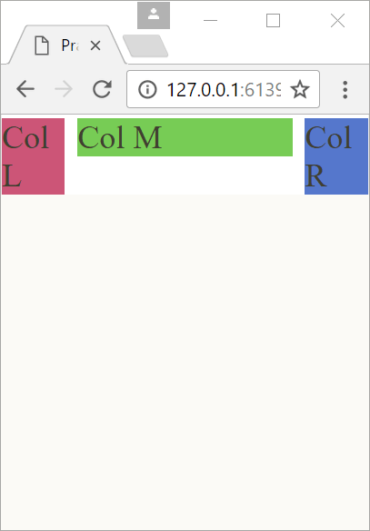
The bit we have to look at is the responsiveness of the columns, to demonstrate, grab the right edge of the browser and drag it to make the window narrower; things start out well, the columns get narrower, but keep the relative proportions — this is just what we wanted to happen.

The problem is they just keep going until we hit the minimum browser window width†3. It eventually looks like this:

Figure 8.14 - website with minimum width
Figure 8.14   website with minimum width

So the website is responsive up to a point, but if you remember, when we get below 520 px wide, we want the columns to stack (§ 8.2), so how do we do this? — Read on.

†3 With Chrome, the minimum width of the browser window on a PC seems to be about 150 px, it just doesn’t go any smaller. I don’t know if it is Chrome or Windows that sets this limit?

8.3.6

Making the columns stack

It’s actually pretty easy to make the columns stack; we do it by making the width of every column 100% and setting the margins to zero when the browser is 520 px wide or less.

The problem is: how does the code know the width of the browser?

Well CSS comes to the rescue with media queries. These are funny looking things that start with an @ symbol (@media). Media queries were introduced in CCS 2 and have been around for a while. They give information about the device that is viewing the website; this can be things like the width of the device, the resolution of the device, whether it is monochrome — even if it is a speech based screen reader — all sorts of things.

The media query has a slightly unusual syntax; it’s different to what we’ve used so far in CSS. I show it in full in Figure 8.15:

Figure 8.15 - media query rule structure
Figure 8.15   media query rule structure

So what does it all mean, well basically it is a logical test that returns a true or false answer, if it’s false nothing happens, if it’s true then the CSS in the declaration block at the end gets executed.

The first bit @media NOT | ONLY mediatype is a test for how the website is being experienced, the valid mediatypes are:

Mediatype Function
screen The page is being viewed on a screen (computer, tablet, smart phone &c.)
print Specifies a printer — the page is being printed
speech Specifies a screen reader (a device that reads the page out loud)
all All devices, any of the above
Table 8.2   Mediatypes in media queries

There used to be some others (braille, embossed, tty &c.) but these are no longer supported by the CSS standard and should not be used (most browsers do still support them though).

The only one we are interested in is screen (I guess responsive design could apply to screen readers by determining the order in which things are read, in our case it would be the same order as the columns when stacked — i.e. the same as the visual order).

So our media query will start

@media only screen

This statement will be true if the web page is being viewed on some form of computer screen (PC, Mac, smart phone, tablet &c.)

The next bit tests some feature of the mediatype, for a screen there are a lot, there is a full list here; I think some of the explanations are a bit misleading, I give my own interpretation in § 8.4. The one we want (and we are going to use it a lot) is max-width. It’s used like this:

@media only screen and (max-width: 520px) { /* execute if width ≤520px */ }

The max-width property is followed by a number (520 px in this case) and the property is true if the browser width is less than or equal to the max-width value (in this case if it is 520 px or less).

Now, in our case, if the browser window is 520 px or less we want the column width set in rg-span1-5 and rg-span3-5 to be set to 100%. And we do this by adding the media query to grid.css:

Add the following:

grid.css
/* **************************************************************
   RESPONSIVE GRID - SPAN CONTROLLS
   *********************************************************** */


/* --------------------------------------------------------------
   Five column span arrangements
   ----------------------------------------------------------- */

.rg-span1-5 { width: 17.24%; }
.rg-span3-5 { width: 58.62%; }

@media only screen and (max-width: 520px) {
    .rg-span1-5 { width: 100%; }
}

@media only screen and (max-width: 520px) {
    .rg-span3-5 { width: 100%; }
}
Code 8.7   grid.css (responsive rg-spanS-C) a

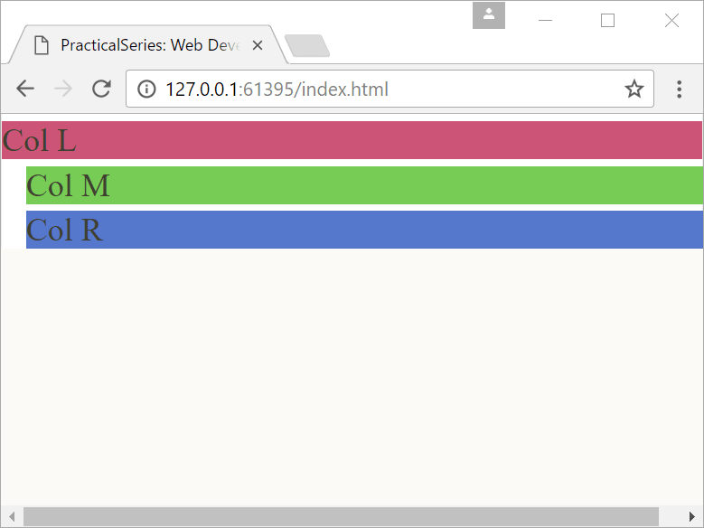
If you drag the browser edge in now, at a width of 520 px, the columns stack and we get this

Figure 8.16 - Initial column stacking
Figure 8.16   Initial column stacking

Ignore the margins at the left of the green and blue columns (that we should now call rows), this is because we haven’t addressed the margins yet.

If you open the browser out again they go back to normal (three columns in a horizontal line).

Let’s look at the first media statement and make some sense of it:

@media only screen and (max-width: 520px) {
    .rg-span1-5 { width: 100%; }
}

The top line:

@media only screen and (max-width: 520px)

This returns a true value if we are looking at the website on a screen AND the max-width of the browser window is 520 px or less.

So if the browser is less than or equal to 520 px the code within the first set of braces gets executed (I’ve shown these braces in bold).

That code .rg-span1-5 { width: 100%; } is just a perfectly normal bit of CSS code it sets the width of class rg-span1-5 to be 100% of its parent element’s width (in this case it will be the full width of the browser) — this forces the next column onto the line below, this column is 100% wide so there is no room for anything else on this line.

And that’s how it works.

There are a couple of other things to do: firstly get rid of those margins. We do this with another media query, but this time for the rg-col class, that’s where those margins are coming from, add the following:

grid.css
.rg-col {       /* sets the basic column width and properties */
    display: block;
    float: left;
    margin: 1% 0% 0% 3.45%;
}
                /* remove left margin from first column */
.rg-col:first-child { margin-left: 0; }

/* --------------------------------------------------------------
   Remove margins at lower screen widths ( 520 px or less)
   ----------------------------------------------------------- */

@media only screen and (max-width: 520px) {
    .rg-col { margin: 0; }
}
Code 8.8   grid.css (responsive rg-col) a

This works in exactly the same way as the rg-span media query, if the website is being viewed on a screen AND the max-width of the browser window is 520 px or less, set the rg-col margins to zero.

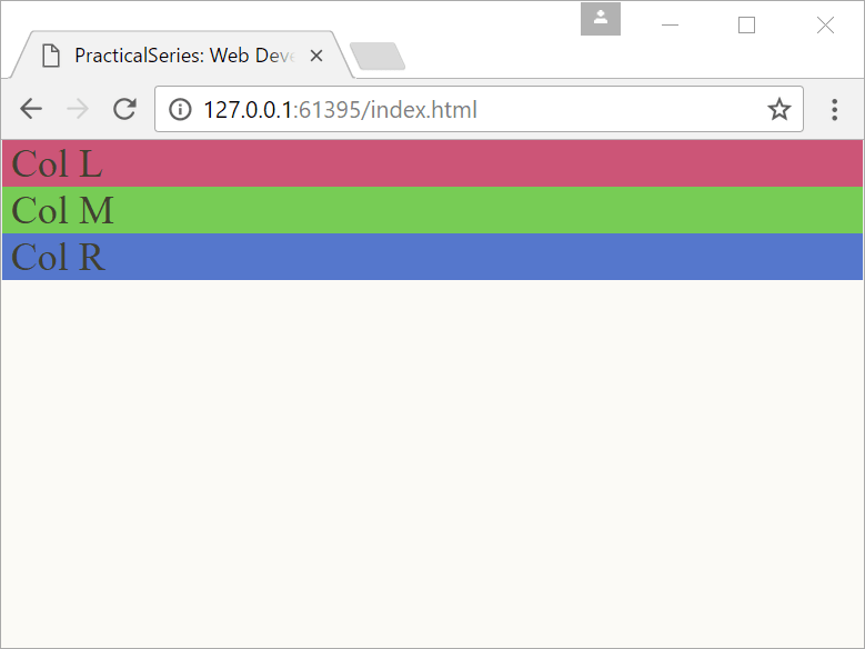
We get:

Figure 8.17 - Responsive margins
Figure 8.17   Responsive margins

Without the margins — just what we want.

There is one last adjustment that I want to make; this is just for the sake of appearance.

With the columns stacked on top of each other, any text in those columns is right up against the side of the browser window.

I want to move the text away from the edge slightly and I do this by adding some padding to the left and right of the rg-span classes in the media query:

grid.css
/* **************************************************************
   RESPONSIVE GRID - SPAN CONTROLLS
   *********************************************************** */


/* --------------------------------------------------------------
   Five column span arrangements
   ----------------------------------------------------------- */

.rg-span1-5 { width: 17.24%; }
.rg-span3-5 { width: 58.62%; }

@media only screen and (max-width: 520px) {
    .rg-span1-5 { width: 100%; padding:0 1%; }
}

@media only screen and (max-width: 520px) {
    .rg-span3-5 { width: 100%; padding:0 1%; }
}
Code 8.9   grid.css (add padding to collapsed columns) a

I’ve put the old and new version of the website side-by-side to show the difference:

Figure 8.18 - Collapsed grid without padding
Figure 8.18   Collapsed grid without padding
Figure 8.19 - Collapsed grid with padding
Figure 8.19   Collapsed grid with padding

It’s just moved the text in from the edge (you can only see it on the left side — if you put more text in you would see it on both).

The next thing is to tidy the media queries, we have two for the rg-span classes at the minute, they do the same thing, but they do it to different classes, we can combine these into a single media query like this:

grid.css
/* **************************************************************
   RESPONSIVE GRID - SPAN CONTROLLS
   *********************************************************** */


/* --------------------------------------------------------------
   Five column span arrangements
   ----------------------------------------------------------- */

.rg-span1-5 { width: 17.24%; }
.rg-span3-5 { width: 58.62%; }

/* stack columns at <=520 px by making all columns 100% wide */
@media only screen and (max-width: 520px) {
    .rg-span1-5,
    .rg-span3-5 { width: 100%; padding:0 1%; }
}
Code 8.10   grid.css (combined media query) a

I’ve just applied the media query to multiple classes by separating them with a comma (this is just like the h1, h2 elements in § 5.5).

We can also put the rg-col media query on a single line:

@media only screen and (max-width: 520px) {.rg-col {margin: 0;}}

Keeping media queries on a single line tends to be the norm — I don’t know why, it’s just what people do — I do think it looks a bit neater though.

8.3.7

Finishing off with the other column arrangements

The next bit is just the boiler plate stuff, we have to replicate what we did with rg-span1-5 and rg-span3-5 with all the other combinations; there are a fair few of these, but not an unmanageable amount. This is a table of all the different variations with their widths worked out as a percentage using equation (8.6).

Class No. of columns Span arrangement Width (%)
.rg-span1-1 1 column arrangement spans full width 100.00
.rg-span1-2 2 column arrangement spans 1 of the columns 48.27
.rg-span2-2 2 column arrangement spans both columns 100.00
.rg-span1-3 3 column arrangement spans 1 of the columns 31.03
.rg-span2-3 3 column arrangement spans 2 of the columns 65.51
.rg-span3-3 3 column arrangement spans all columns 100.00
.rg-span1-4 4 column arrangement spans 1 of the columns 22.41
.rg-span2-4 4 column arrangement spans 2 of the columns 48.27
.rg-span3-4 4 column arrangement spans 3 of the columns 74.13
.rg-span4-4 4 column arrangement spans all columns 100.00
.rg-span1-5 5 column arrangement spans 1 of the columns 17.24
.rg-span2-5 5 column arrangement spans 2 of the columns 37.93
.rg-span3-5 5 column arrangement spans 3 of the columns 58.62
.rg-span4-5 5 column arrangement spans 4 of the columns 79.31
.rg-span5-5 5 column arrangement spans all columns 100.00
.rg-span1-6 6 column arrangement spans 1 of the columns 13.79
.rg-span2-6 6 column arrangement spans 2 of the columns 31.03
.rg-span3-6 6 column arrangement spans 3 of the columns 48.27
.rg-span4-6 6 column arrangement spans 4 of the columns 65.51
.rg-span5-6 6 column arrangement spans 5 of the columns 82.75
.rg-span6-6 6 column arrangement spans all columns 100.00
Table 8.3   All column variations in the Gerstner grid

I’ve put these into grid.css; I’ve shown it here, don’t bother typing it in, just download grid.css from the link at the bottom — this is the fully commented version (hence the change in the line numbers).

grid.css
/* **************************************************************
   RESPONSIVE GRID - SPAN CONTROLLS
   **************************************************************
   Each column spans an area of the row, taking a three columns
   width arrangement, this can be arranged in four different ways

    - three columns of single column width
      span1-3 (span 1 column of 3)

    - one double width column - span2-3 (span 2 columns of 3)
      and a single column (span1-3)

    - one single width column - span1-3
      and a double column (span2-3)

    - finally a single triple width column
      span3-3 (span 3 columns of 3)

     |<------------------- width of screen  ------------------>|

     |<--- span1-3 --->| |<--- span1-3 --->| |<--- span1-3 --->|

     |<------------- span2-3 ------------->| |<--- span1-3 --->|

     |<--- span1-3 --->| |<------------- span2-3 ------------->|

     |<----------------------- span3-3 ----------------------->|

   The widths of each column are determined by the table in the
   header above and implemented in the following classes.

   At screen widths of 520 px and less, all spans are set to 100%
   width (columns stack at this point)
   ----------------------------------------------------------- */


/* --------------------------------------------------------------
   One column span arrangements
   ----------------------------------------------------------- */

.rg-span1-1 { width: 100%; }

/* stack columns at <=520 px by making all columns 100% wide */
@media only screen and (max-width: 520px) {
    .rg-span1-1 { width: 100%; padding:0 1%; }
}

/* --------------------------------------------------------------
   Two column span arrangements
   ----------------------------------------------------------- */

.rg-span1-2 { width: 48.27%; }
.rg-span2-2 { width: 100%; }

/* stack columns at <=520 px by making all columns 100% wide */
@media only screen and (max-width: 520px) {
    .rg-span1-2,
    .rg-span2-2 { width: 100%; padding:0 1%; }
}

/* --------------------------------------------------------------
   Three column span arrangements
   ----------------------------------------------------------- */

.rg-span1-3 { width: 31.03%; }
.rg-span2-3 { width: 65.51%; }
.rg-span3-3 { width: 100%; }

/* stack columns at <=520 px by making all columns 100% wide */
@media only screen and (max-width: 520px) {
    .rg-span1-3,
    .rg-span2-3,
    .rg-span3-3 { width: 100%; padding:0 1%; }
}

/* --------------------------------------------------------------
   Four column span arrangements
   ----------------------------------------------------------- */

.rg-span1-4 { width: 22.41%; }
.rg-span2-4 { width: 48.27%; }
.rg-span3-4 { width: 74.13%; }
.rg-span4-4 { width: 100%; }

/* stack columns at <=520 px by making all columns 100% wide */
@media only screen and (max-width: 520px) {
    .rg-span1-4,
    .rg-span2-4,
    .rg-span3-4,
    .rg-span4-4 { width: 100%; padding:0 1%; }
}

/* --------------------------------------------------------------
   Five column span arrangements
   ----------------------------------------------------------- */

.rg-span1-5 { width: 17.24%; }
.rg-span2-5 { width: 37.93%; }
.rg-span3-5 { width: 58.62%; }
.rg-span4-5 { width: 79.31%; }
.rg-span5-5 { width: 100%; }

/* stack columns at <=520 px by making all columns 100% wide */
@media only screen and (max-width: 520px) {
    .rg-span1-5,
    .rg-span2-5,
    .rg-span3-5,
    .rg-span4-5,
    .rg-span5-5 { width: 100%; padding:0 1%; }
}

/* --------------------------------------------------------------
   Six column span arrangements
   ----------------------------------------------------------- */

.rg-span1-6 { width: 13.79%; }
.rg-span2-6 { width: 31.03%; }
.rg-span3-6 { width: 48.27%; }
.rg-span4-6 { width: 65.51%; }
.rg-span5-6 { width: 82.75%; }
.rg-span6-6 { width: 100%; }

/* stack columns at <=520 px by making all columns 100% wide */
@media only screen and (max-width: 520px) {
    .rg-span1-6,
    .rg-span2-6,
    .rg-span3-6,
    .rg-span4-6,
    .rg-span5-6,
    .rg-span6-6 { width: 100%; padding:0 1%; }
}
Code 8.11   The final grid.css code a

So there we are, that is the responsive grid. This will form the basis of every page in the website.

8.3.8

Chrome Inspect Element feature

Chrome has several useful features for web developers (let’s call ourselves web developers, who doesn’t want to be a web developer? — it’s nearly as good as being a pirate) and we will look at some of them as we progress. The first one I’m going to show you is Inspect Element; this gives you a lot of information about your web page.

Open the website (the one we made in the previous section) in Live Preview and make the window quite large (large enough to see the cream coloured edges). Now right click anywhere in the page area and select Inspect from the pop-up menu (Figure 8.20).

Figure 8.20 - Chrome, open Inspect Elements
Figure 8.20   Chrome, open Inspect Elements

This will open the Inspect Elements window on the left hand side, it will be similar to Figure 8.21; the exact information just depends where you clicked in the main window.

Figure 8.21 - The Inspect Elements window
Figure 8.21   The Inspect Elements window

The Inspect Element window has a lot of useful information; the little diagram shows the margin, padding and dimensions of the element clicked.

The thing I want to show you is how to find out the size of browser window; to do this drag the bar between the web page and the Inspect Elements panel, the mouse will turn into mouse cursor when it hovers over the divider; I’ve highlighted it in orange in Figure 8.22:

Figure 8.22 - The Inspect Elements window
Figure 8.22   The Inspect Elements browser dimensions

If you drag the divider, an indicator will open showing how wide and how high the web page is in the browser window, in my case it is 863 px wide by 306 px high. You can just see it on top of the blue Col R bit of the page.

The problem with Inspect Elements

Yes, there is a problem.

The trouble is when you use Inspect Elements, it breaks the link to Live Preview, this means that any changes you make in Brackets no longer automatically update in chrome. This is a pain, but there is a work around.

If you make a change in Brackets while Inspect Elements is active, just press F5 in Chrome to refresh the window, this will then show the changes.

Once you’ve finished with Inspect Elements, kill Chrome and retrigger Live Preview in Brackets.


End flourish image