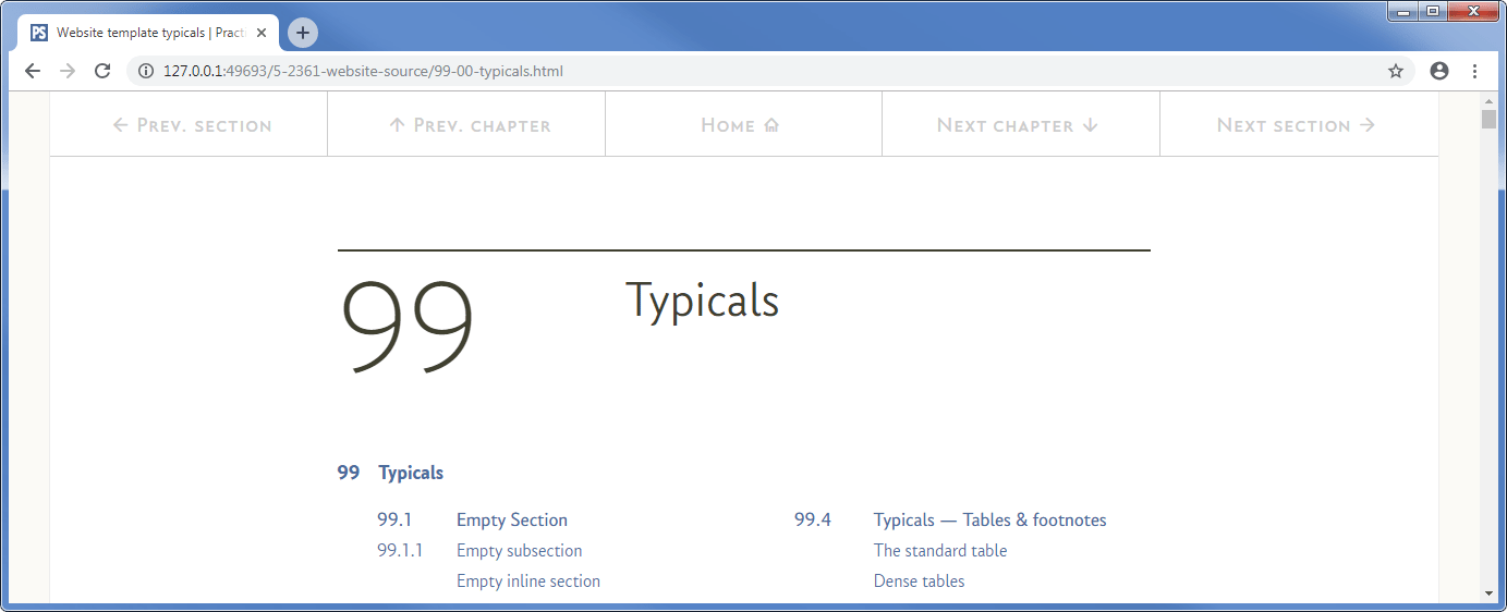
18.4
Making the navigation “sticky”
At this point, we’ve loaded the Waypoints JavaScript file and written a bit of code ourselves that adds or removes the class fixed-nav to the <nav> navigation element when a particular ID (js--fixed-nav) passes a point that is 70 pixels below the top of the browser window.
I created the navigation bar in § 11.3, let’s remind ourselves what is in there:
    <nav>                                               <!-- Start of top navigation bar -->
        <div class="top-nav">                           <!-- Start of top navigation row -->
            <div class="rg-row">                        <!-- Start of navigation button row -->
<!-- Button 01 - Previous Section -->
<a class="nav-wide" href="98-00-blank.html#js--000000"><span class="top-nav-icon">l</span><span class="top-nav-text">Prev. section</span></a>
<!-- Button 02 - Previous Chapter -->
<a class="nav-wide" href="98-00-blank.html#js--000000"><span class="top-nav-icon">u</span><span class="top-nav-text">Prev. chapter</span></a>
<!-- Button 03 - Home wide (hidden when fixed nav activates) -->
<a class="nav-wide nav-home" href="index.html#js--000000"><span class="top-nav-text">Home</span><span class="top-nav-icon">h</span></a>
<!-- Button 04 - Next Chapter -->
<a class="nav-wide" href="#js--000000"><span class="top-nav-text">Next chapter</span><span class="top-nav-icon">d</span></a>
<!-- Button 05 - Next section -->
<a class="nav-wide" href="#js--000000"><span class="top-nav-text">Next section</span><span class="top-nav-icon">r</span></a>
            </div>                                      <!-- End of navigation button row -->
        </div>                                          <!-- End of top navigation row -->
    </nav>                                              <!-- End of top navigation bar -->
<!-- ========================================================================== [WP END] -->

   ...
The CSS behind this is:
.top-nav {                                  /* top-nav is the row holding the */
    max-width: 1276px;                      /* navigation areas               */
    margin: 0 auto;
    width: 100%;
    background-color: rgba(255, 255, 255, 1.0);
    color: #CCCCCC;
    font-family: "conc-c4-r";
    font-feature-settings: "ss02";
    font-size: 80%;
}

.nav-wide {                                 /* nav-wide navigation buttons */
    display: inline-block;
    float: left;
    height: 60px;
    padding-top: 18px;
    text-decoration: none;
    text-align: center;
    border-bottom: 1px solid #CCCCCC;
    border-right: 1px solid #CCCCCC;
}
.nav-wide { width: 20%; }                   /* nav-wide is 20% of top-nav */

.nav-wide:last-child { border-right: 0; }   /* remove right border on last area */

.nav-wide:link,                             /* navigation link options */
.nav-wide:visited {
    color: #cccccc;
    transition: background-color 0.2s, color 0.2s;
}
.nav-wide:hover,                            /* navigation hover options */
.nav-wide:active {
    color: #686868;
    background-color: #f8f8f8;
}

.top-nav-text { visibility: visible; }

.top-nav-icon {
    font-family: "icon-ps-r";
    margin-left: 5px;
    margin-right: 5px;
}
And the whole thing looks like this:
If I scroll down the page it disappears:

And that is to be expected, although the Waypoints code is in there, there is no ID to trigger it and no CSS to do anything with the new style.
So let’s address those two point, I’m going to add the ID just before the very first section of the web page (in practice, this is just after the </header> tag):
        </header>                                               <!-- End of header -->
<!-- ===================================================================== [WP END] -->

<!-- ********************************************************************* [WP fixed-nav]
     FIXED NAVIGATION BAR CHANGEOVER POINT
     *********************************************************************-->
        <div id="js--fixed-nav"></div>         <!-- Determines fixed navigation point -->
<!-- ===================================================================== [WP END] -->
   ...
It is just an empty div, it goes in that position on every web page.
Now let’s add some CSS for the new fixed-nav class:
.fixed-nav {                                /* fixed (sticky) navigation */
    position: fixed;
    display: inline;
    top: 0;
    left: 0;
    width: 100%;
    z-index: 9999;                          /* Ensure nav is at top level */
}
Now reload the page and scroll down, now we get this:
As we scroll down, the navigation bar disappears from the top of the screen, as we get closer to the first in-line section, it comes back exactly as it was (all five buttons).
To understand why, we need to look at the CSS for the new class that was applied to the <nav> element:
.fixed-nav {                                /* fixed (sticky) navigation */
    position: fixed;
    display: inline;
    top: 0;
    left: 0;
    width: 100%;
    z-index: 9999;                          /* Ensure nav is at top level */
}
The first thing:
position: fixed;
Is similar to the relative and absolute positioning we looked at ages ago in § 6.7.
This property fixes the object at a given position relative to the browser window, in this case it is positioned at the top left corner, I’ve done this by given it the position:
    top: 0;
    left: 0;
This means that the <nav> bar now always stays in the same position on the screen; I’ve also set the width to be 100% of the body width.
The display: inline; just makes sure it behaves as an inline block
The last thing is new:
z-index: 9999; /* Ensure nav is at top level */
A z-index (sounds impressive), the z-index is the stacking order of positioned elements, (it is z as in depth into the screen), it is a bit similar to bring forward and send back in a drawing package.
If we had two positioned elements that overlapped with each other, the one with the higher z-index number would be on top.
Normally, we don’t have to worry about z-index numbers, they are applied automatically by the browser in the order in which they occur in the HTML, if it occurs later it has a higher number and is on top of elements that preceded it. It generally just works without us having to think about it.
The problem with the sticky navigation is that the <nav> element is one of the first thing on the page, so everything that comes after it has a higher z-index and would therefore overwrite the nav bar, it would look like this:
Everything is in front of the now sticky navigation bar.
That’s not what we want so I set the z-index for the sticky navigation (in the fixed-nav class) to 9999 (a big number), it effectively brings it to the front.
That makes it look like this
Getting there.
The next thing is that central (home) button, that takes us back to the landing page for the website (the index.html page) and that is fine if we are at the top of the page, everything else is available through the TOC.
Now, when we scroll down the page and the sticky navigation bar appears, I want to have an extra button, I want a top button that takes us back to the top of the page. I want the sticky navigation bar to look like this:

Instead of:

I do this by having two smaller buttons and replacing the central home button with two buttons half the width.
To do this, I need to modify the HTML for the basic navigation bar:
    <nav>                                               <!-- Start of top navigation bar -->
        <div class="top-nav">                           <!-- Start of top navigation row -->
            <div class="rg-row">                        <!-- Start of navigation button row -->
<!-- Button 01 - Previous Section -->
<a class="nav-wide" href="98-00-blank.html#js--000000"><span class="top-nav-icon">l</span><span class="top-nav-text">Prev. section</span></a>
<!-- Button 02 - Previous Chapter -->
<a class="nav-wide" href="98-00-blank.html#js--000000"><span class="top-nav-icon">u</span><span class="top-nav-text">Prev. chapter</span></a>
<!-- Button 03 - Home wide (hidden when fixed nav activates) -->
<a class="nav-wide nav-home" href="index.html#js--000000"><span class="top-nav-text">Home</span><span class="top-nav-icon">h</span></a>
<!-- Button 03a - Top narrow (hidden until fixed nav activates) -->
<a class="nav-narrow js--sc-000000" href="#"><span class="top-nav-icon">t</span><span class="top-nav-text">Top</span></a>
<!-- Button 03b - Home narrow (hidden until fixed nav activates) -->
<a class="nav-narrow" href="index.html#js--000000"><span class="top-nav-text">Home</span><span class="top-nav-icon">h</span></a>
<!-- Button 04 - Next Chapter -->
<a class="nav-wide" href="#js--000000"><span class="top-nav-text">Next chapter</span><span class="top-nav-icon">d</span></a>
<!-- Button 05 - Next section -->
<a class="nav-wide" href="#js--000000"><span class="top-nav-text">Next section</span><span class="top-nav-icon">r</span></a>
            </div>                                      <!-- End of navigation button row -->
        </div>                                          <!-- End of top navigation row -->
    </nav>                                              <!-- End of top navigation bar -->
<!-- ========================================================================== [WP END] -->

   ...
So what have I done?
The first thing is I’ve added another class to button 3 (the wide home button):
<a class="nav-wide nav-home" href="index.html#js--000000"><span class="top-nav-text">Home</span><span class="top-nav-icon">h</span></a>
The new class is called nav-home (In bold with a red underline).
I’ve also added two new buttons (button 3a which will be the narrow top button and button 3b which will be the narrow home button):
<!-- Button 03a - Top narrow (hidden until fixed nav activates) -->
<a class="nav-narrow js--sc-000000" href="#"><span class="top-nav-icon">t</span><span class="top-nav-text">Top</span></a>

<!-- Button 03b - Home narrow (hidden until fixed nav activates) -->
<a class="nav-narrow" href="index.html#js--000000"><span class="top-nav-text">Home</span><span class="top-nav-icon">h</span></a>
The original (wide) buttons were all links with the class nav-wide, the new buttons work in exactly the same way, but have the class nav-narrow.
The nav-narrow buttons have all the same properties as the nav-wide button, with the exception of width (if you remember, in § 11.3.2, I set the nav-wide button width in a separate declaration), so I’ve just combined the common properties for nav-wide and nav-narrow by adding nav-narrow to the selectors.
.nav-wide,                                  /* nav-wide/nav-narrow are the */
.nav-narrow {                               /* navigation buttons          */
    display: inline-block;
    height: 60px;
    padding-top: 18px;
    float: left;
    text-decoration: none;
    text-align: center;
    border-bottom: 1px solid #CCCCCC;
    border-right: 1px solid #CCCCCC;
}
.nav-wide { width: 20%; }                   /* nav-wide is 20% of top-nav */

.nav-narrow { width: 10%; display: none; }  /* nav-narrow is 10% of top-nav */

.nav-wide:link,                             /* navigation link options */
.nav-wide:visited,
.nav-narrow:link,
.nav-narrow:visited {
    color: #cccccc;
    transition: background-color 0.2s, color 0.2s;
}
.nav-wide:hover,                            /* navigation hover options */
.nav-wide:active,
.nav-narrow:hover,
.nav-narrow:active {
    color: #686868;
    background-color: #f8f8f8;
}

.nav-home { display: inline-block;; }        /* make the wide home button visible */
The new class nav-narrow has exactly the same properties as nav-wide, the only difference being the nav-narrow width is set to 10%, half the width of nav-wide:
.nav-narrow { width: 10%; display: none; }
I’ve also stopped the nav-narrow button from being displayed by setting display: none, under normal circumstances, I don’t want to display the narrow button (not until the sticky navigation activates).
All the anchor properties: link, active, hover and visited are the same for the nav-narrow and nav-wide buttons (I’ve just make them common to both classes).
Finally, the nav-home class that applies uniquely to the wide button is set to make it display the button as an inline block (yes, I know it already was an inline block, just bear with me for the last bit).
The last bit.
So, I’ve now added two invisible buttons (top and home) both with the class nav-narrow and I’ve made sure an inline block button is, well, an inline block button.
The next thing is to add the very last bit of CSS. This is again is to do with the fixed-nav class that gets applied by Waypoints; you can probably guess what’s coming:
.fixed-nav .nav-home { display: none; }     /* hide large home button */
.fixed-nav .nav-narrow { display: inline-block; }  /* display narrow buttons */
.fixed-nav .nav-wide:first-child { border-left: 1px solid #ededed; }
.fixed-nav .nav-wide:last-child { border-right: 1px solid #ededed; }
Ok, the first thing is we turn off the wide home button by setting it not to display (this is why I turned it on again in the nav-home class):
fixed-nav .nav-home { display: none; }
And we display the two narrow buttons by turning them into inline blocks:
fixed-nav .nav-narrow { display: inline-block; }
You might think that that is it, and it very nearly is; the last two lines apply borders to the first and last buttons on the sticky navigation, these borders look exactly like the borders applied by the body element.
I noticed, that when the sticky navigation appeared, the body border lines disappeared, I don’t know exactly why, but I think it is because of the z-index placing the sticky nav above everything else, anyway they disappeared, I didn’t like it so I added them back in.
That is it for the sticky navigation.
It will just work on every web page; you don’t need to do anything with it at all. The only thing to do with the navigation is change the href in the <a> elements to point at the correct web pages.
The most important lesson here is to understand the usefulness of using jQuery to change the classes applied to a particular element.
