9
This is a more methodical view of working within the GitHub environment; we’ve looked at some aspects of this in the previous sections, but not in as much detail.
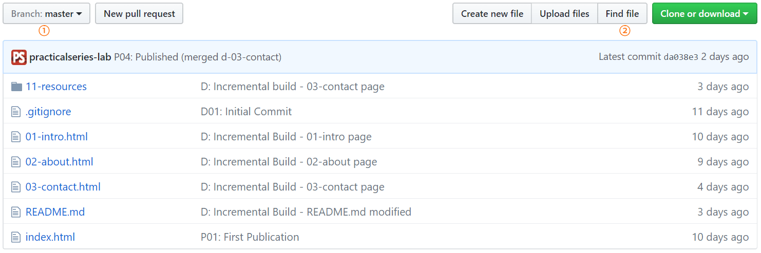
The basic view of the project (repository) contents is that of Figure 9.3 and below:
This view shows the contents of the repository for the currently selected branch, in this case the master branch (this can be seen in the button point 1 above).
This view just shows the root folder and its contents, files are given the symbol and folders the symbol . The most recent commit comment associated with the file or folder is displayed in the centre of the area and the time of its last modification displayed on the far right (in relative time).
This is similar to a Windows Explorer view, if you click the 11-resources link, it will drill down into that folder:
Once you have drilled down to a sub-directory, the link back to the root level is available by clicking the lab-01-website link next to the branch button (highlighted in Figure 9.5).
As you drill down further, the parent folders become clickable links in their own right in the same area.
It is also possible to go up a directory level by clicking the two full stops (
) that are listed as the first line of the (always just below the pale blue ) .Go back to the root level of the project (Figure 9.4); now click the button, point 2 above (an alternative is to press the key, this does the same).
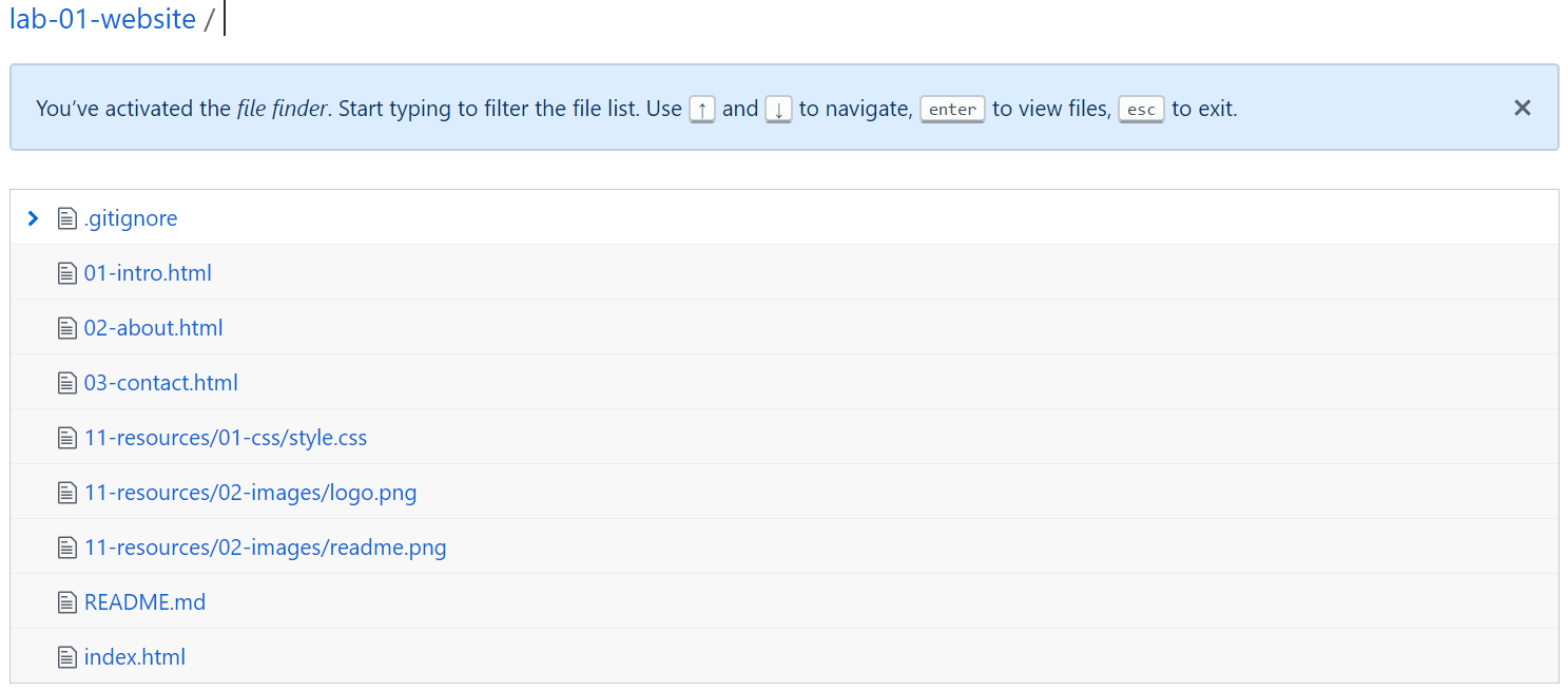
This shows a list of all the files (along with the path) within the repository.
The cursor is by default positioned after the lab-01-website / (at the top), if you start typing something it will filter the list by that search (type 0, and you will have all the files and folders that start with a zero). Just press to return back to the normal view.
The file view can be useful, it saves you having to drill down through multiple folders (with a page load each time) and it means you don’t have to know which folder a file is in. It does however, become a bit cumbersome if you have a lot of files.
Viewing the contents of a file is easy; just click its name in either the content area or the file view and it will load the file in a viewer.
To view style.css, either drill down to it 11-resources/01-css/style.css or find it in file view and just click its name.
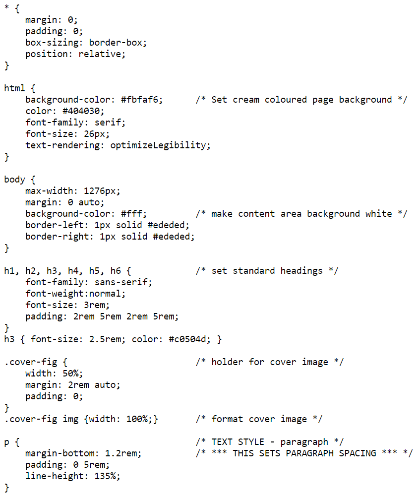
This will open a view of the file contents; it will look like Figure 9.7.
The view shows all the lines in the CSS file, these are semantically coloured (see § 9.2.3).
There are also three buttons and three icons at the top of the file contents area:
The three buttons are used to examine different views of the file. The icons do things to the file. I look at each in turn.
The 1 shows a view of the file contents without any formatting. It looks like this:
buttonI’m not entirely sure what this is for, but it’s there if you need it.
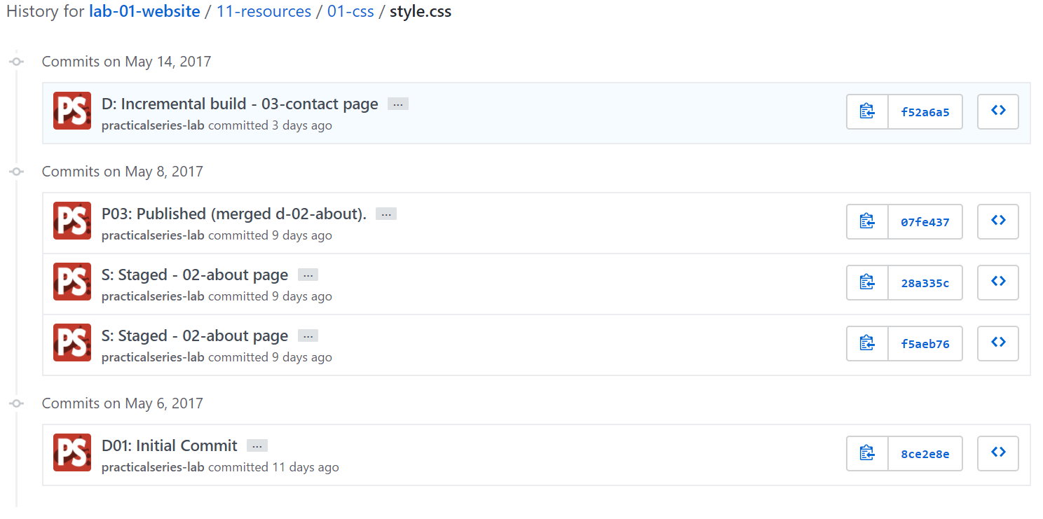
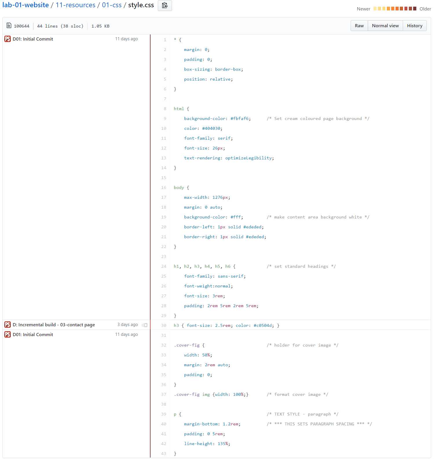
This is blame as in whose fault is it? It’s button 2, and it gives a more detailed version of the file history; it shows how the contents of the file have changed. Here it is:
This is a listing of the file contents and its showing that lines 1 to 29 are all associated with the first commit (D01 commit), lines 31 to 43 are the same. Line 30 however is listed as an incremental build. This is from when we were changing files to generate conflicts.
Clicking the icon will move the view of the file back to that commit (it shows the version of the file at the time of that commit), it will show the commits associated with each line of the file at that time. It allows changes to be viewed in turn all the way back to the first commit of the file.
The colour of the central vertical bar gives some indication of how recent the file was modified (newest yellow, oldest dark red).
I get the idea; it makes it possible to view every change to any file through the commit history. In practice, I’ve never used it.
This is the 4 on the list.
icon ( ), pointGitHub has a desktop application (a GUI frontend for Git and GitHub). I don’t use it, I use Brackets instead. I can offer no opinion on it, I haven’t tried it—from the reviews I’ve read, it has certain restrictions (I don’t know what these are); but then again so does Brackets.
The file we looked at in the previous section was a CSS file, essentially this is a text file and it was displayed as such in Figure 9.7. GitHub knows it’s a CSS file and is able to colour it semantically†1 to make it easier to read. It does this for all the common web languages HTML, JavaScript, jQuery &c.
Let’s view a different type of file, open the README.md file:
GitHub doesn’t show the source code behind the file, it interprets it and renders it according to the rules of the mark-up language.
Similarly, if you open an image GitHub renders the image for you to see, here is logo.png:
GitHub tries to do the right thing when you view any file in the repository.
†1 | Symantec colouring or highlighting is the technique of colouring elements of the source code to reflect the category of the item, in CSS this might be rules, declarations, class names, element names units and arguments—they are all coloured differently to make the code more readable. |